home about me our home

Monday, August 30, 2010

Using Wooden Cutting Boards For Fall Decor

One of the elements that I listed on my Fall Decor list was wooden cutting boards. They add a warmth to a space and they are also very utilitarian. I don’t need to go over all the ideas of how to use a cutting board in the kitchen, but I thought it would be fun to see how to display them to add a touch of warmth for the Fall/Winter months.
mixing textures
I really like the mix of textures in this all white kitchen. The smoothness of the white dishes, the shine of the Hotel silver and the warmth of the old cutting boards. This has three of the elements I want to add to my kitchen for the Fall. White dishes(already have those), Hotel silver and cutting boards.
country living
Simple and clean! I love the backdrop the cutting board creates in this kitchen by just leaning against the tile backsplash.
OLD
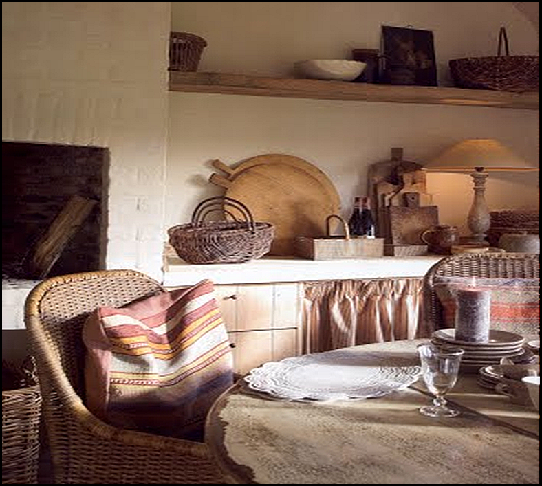
This is obviously in a very old rustic looking kitchen. The homeowner must love older pieces with great patina. I love the way the cutting boards are different shapes and sizes casually leaning on the stone wall.
round cuttingboard
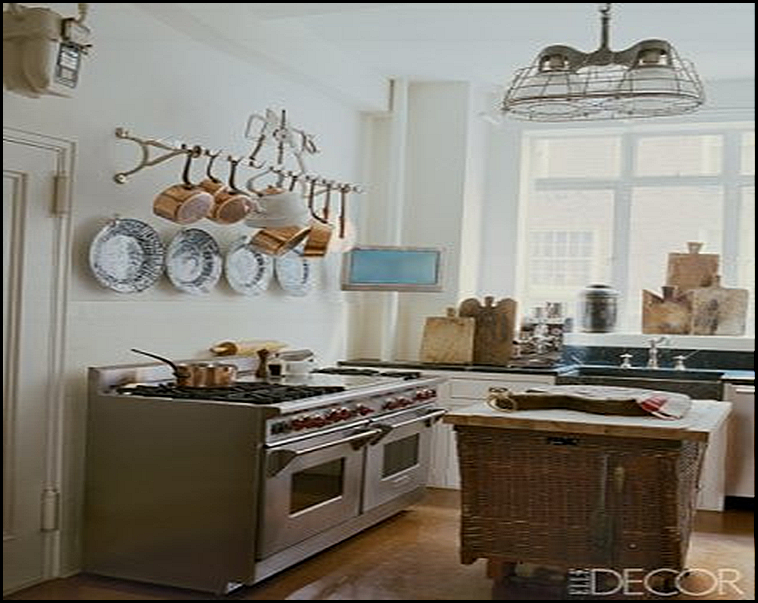
This is a very functional cook's kitchen. Here the cutting boards are sitting like soldiers against the cook top stainless back. I am in love with the very large oversized round board on the shelf with the great basket in front of it. I might have used a white pitcher for a contrast of textures, but none the less it looks amazing.
untitled
Elle Decor
I am noticing a pattern in my processing. I like when cutting boards are placed one in front of the other. How about You?
vignette
Notice all the shapes and sizes. Great rough textures going on in this setting. Here we see several boards stacked one in front of the other and sitting on a nice thick board.
Belgian pearls
Belgian Pearls
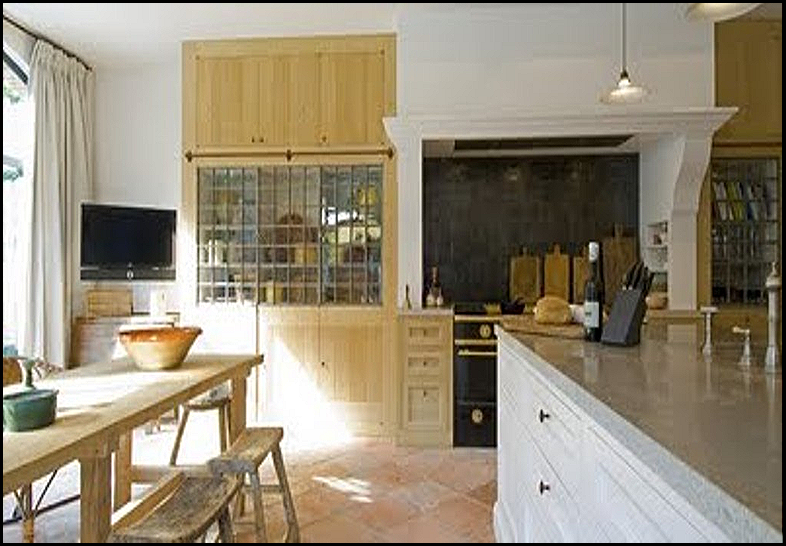
There are a lot of wonderful elements to look at in this kitchen. Notice the table and the rough hewn benches? Amazing glass front cupboards on each side of the  gorgeous stove. Old worn tiled floors with a beautiful patina. This kitchen is all about texture. Here the boards are lined up like soldiers. I don’t mind two boards lined up, but more than that, I like them stacked in front of each other. You see I am learning something about how I like my cutting boards through writing this post. Hopefully in design we will always remain on the learning curve.
untitled
A great storage idea for racks and cutting boards if you lack cupboard space.

COUNTRY
Country Living
All stacked up one in front of the other and even a wooden bowl in the stack. This is a few too many for my liking, but perfect in this country setting.
colonial
Can a vignette get any warmer or textural than this? Perfect for a country or colonial setting. It might look really cool with a more contemporary back drop  for fun.
3
As you can see cutting boards can come in all different sizes, shapes and patinas. So I have decided I like cutting boards side by side in two different sizes, but no more than that. My favorite configuration is stacked one in front of the other, probably no more than three or four.
How do you like your cutting boards displayed? 

“Enjoy the Process” Of:
Shopping for cutting boards and finding fun ways to display them in your kitchen.
Kathysue

Sunday, August 29, 2010

Fall is Definitely In the Air and On the Ground

I know many of you are holding onto the last days of summer and I don’t blame you. I think some are wondering why I have been doing some Fall Inspiration post!!

Our weather in California has been so different this summer. We have had cooler days with a few verrry hot days interspersed.

Yesterday was one of those cool days with a lot of wind. I had to share a picture of my backyard and how falling leaves/needles from the cypress tree has added to the look of my backyard.
fall leaves 001 (800x600)

Notice how all the debris is at one end of the pool, that is because the wind was blowing it all down to one end.
fall leaves 003 (800x600)
fall leaves 005 (800x600)
Crazy isn’t it!! Oh what fun the clean-up will be today!!
“Enjoy the Process” Of:
Fall Clean-Up!!
Kathysue

Saturday, August 28, 2010

This Made Me Stop and Look Twice!!

Do you ever see something at a glance and then your brain kicks into gear and you say, “Wait a minute, that is interesting!”
This image did that to me……..
wall grouping

wall grouping
Of course, the black, green and white combination caught my eye. That is a given. What surprised me was all the rough textures and natural elements that caught my eye. I usually prefer a softer finer lined combination in a vignette.

 To be honest I probably would not use anything, but the plants in my home. Did you notice the highs and lows? All in all I think this is a totally interesting wall grouping. It is completely outside my box and I think that is what is so interesting. Never close the door to a good design or an interesting design. There is always something to be learned or inspired by.

Here is another image that made me take a second look. I would do this look. It has colors and elements that I do love. I love the symmetry. The large piece of art is a stand-out and the flowers in the green vases completes the look for me.


This is another room that made me stop and look twice. I love many of the elements in this room, but I probably would not do this in my own home.

The point is, although I would not do it in my home, it still makes me stop and look twice. If a room makes you take a second look, stop and take the time to figure out why? Your initial reaction might be, " I would never do that!" and that might be true,but there was still something that made you stop and look twice. Take the time to figure out what it was.

  •  In the first picture what stopped me were the colors and the overall composition of textures and live plants.
  • The second picture it was the colors, the large piece of art and the pop of green in the vases filled with flowers.
  • The last picture the softness of the colors, the feminine quality of the furniture lines and the elegance.
What do you think? Did anything in the above imaes  catch your eye or would you just have turned the page and dismissed all of these images? Next time you go back and take a second look at something that you really don't think you like. STOP!! and study it and see which elements made you go back for a Second Look!!

“Enjoy the Process” Of:
Discovering something outside the box that draws you in and studying it!
Kathysue

Thursday, August 26, 2010

Using Candles In Fall Decor

When the candle lighting ceremony begins that is when I know I am now officially in the mood for Fall. It is a funny occurrence that usually starts around the time of football season. All of the sudden I start putting candles on the mantle,humming along and lighting them at nightfall. You see Fall is more of an internal occurrence for me than just a seasonal change. My mood starts wanting a cozier, warmer feel to my home. So, out come the candles!!!

Candles are an inexpensive way to add to your decor for the fall. They bring a touch of warmth not only in the ambiance of a room , but if scented, can set the stage for cozy and welcoming space. I like to find different and unusual ways to use candles. I am sure you have seen most of these, but since it is the beginning of the season, I thought it would be a good reminder and inspiration for all of us. I hope you see something new and inspiring………
stairs
twighurricane[1]
ss_BHG138787[1]
in plants
bottles
nuts and wheat
votives
coffee beans 
untitled


words
“Enjoy the Process” Of:
Adding candles for color, texture, scent and ambiance to your fall decor.
Kathysue

Wednesday, August 25, 2010

They Have Arrived!!

I am sooooo excited. My living room sconces have arrived and they are even more beautiful in person than they were on-line.
Winchester Mirrored Sconce
The brass is antiqued to warm golden patina that makes you just want to touch it. The etching is a nice heavy etching, the shades are beautifully made.  I am in love with these sconces.

I realized the other day after talking to a blogging buddy that I wasn’t sure if you all realized I do not know when these will be going into my living room. That was the dilemma on whether to order them now or not. I realized I could not get this great price in the future so I bit the bullet and purchased them even though they might be sitting in the boxes for awhile.

That never stops me from making plans so I went out into cyberspace looking at rooms with Golds, creams and whites to see what I was attracted too. Here is a sampling of my inspiration images……

house beautiful
House Beautiful
gold and gray
sarah richardson 
Sarah Richardson
David Jiminez 
David Jiminez
kitchen
untitled
Sarah Richardson
soft blue
sunburst
with gray
pink
veranda
Veranda
texture
6480211
Ashley Whittaker
After looking at these images and studying them I realized a few things about what I seem to be gravitating towards. I like a gold gilded frame or even a sunburst mirror. I also think I will be looking for an open antique brass framed table with maybe a marble top. The other thing I noticed is gold looks amazing with gray. I won’t be doing any gray in my life, but found it very interesting how lovely gold looks with gray. So much of what we see with gray is a monochromatic look with gray furniture, gray textures and gray walls. The pop of gold really is attractive to me and adds another dynamic to a room of all gray.

Speaking of gray, if you want to read an absolutely wonderful post on the use of gray go over to Cote De Texas and read her post. As always Joni hits the nail on the head. She has such a discerning eye and teaches her readers to look at every little detail in a room.

I think there is always a learning process in design, whether it is in your own surroundings or a clients. I love design! It has definitley given me an extra bonus in my life.

I hope this shows you we are all on a learning curve and to be open to new discoveries about yourself and your world of design,

“Enjoy the Process” Of:
The world of discovery in Design!!
Kathysue

Monday, August 23, 2010

HGTV Design Star Wins with Outfit to Room Idea!!


Emily Henderson HGTV's New Design Star!
(Emily has her very own blog, The Brass Petal)

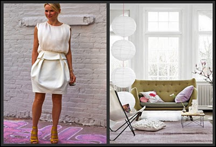
I knew once I heard Emily’s idea for a HGTV show that she would be a shoe-in. After all, there are no shows on the air where they take a homeowner's outfit or look and turn it into a room or in the case of her new show, a “Lifestyle”.

It just made me wonder if Emily and HGTV producers have been reading blogs?  I have seen bloggers do amazing outfits to room blog post. Although I am not sure Emily’s idea is an original one, it is still a good one. I think this should make a very interesting show if done well.

It is quite obvious that HGTV is hurting for some new ideas. I am so tired of the real estate shows and the fixer-upper handyman shows( You know exactly what I mean don't you?)

I think HGTV must also be hurting in the budget category. Did you notice on Design Star this season every task was done in teams so there were only two rooms being done on each show? I have a feeling there was lack of funds for this years contestants. I felt like we never really got to see the individuals abilities or talents with this kind of competition until the final three.

I would love to see some shows with some REAL inspiration!! Not the shows where only a college student would want to apply some of DIY ideas. I would like to see some real quality design shows  on HGTV.
We need more of Candace Olsen and Sarah Richardson type shows. I hope HGTV is reading this!

Until Emily, HGTV’s New Design Star, show appears I thought I would leave you with some of the amazing Outfit to Room  images that I have found throughout blog land done by some very talented bloggers. As I said before not a new concept, but could prove to be an interesting show!

Jenna Lyons
Jenna Lyons
Anne Sage
Anne Sage
untitled
anthro Augus
Anthropologie August 2010
anthropologie
Anthropologie
Erin Elements of Styleoutfit by Erin Elements of style
Erin from Elements of Style
Debby Inspired Design
Debby from Inspired Design
Harmony and Home 2
Harmony and Home
Harmony and Home
Harmony and Home
gold pink
I even did a post on my own clothes matching them to a room in a post titled, Do Your Clothes Ever Remind You Of A Room?!
blouse
my clothes
So there you have it!! My take on Design Star and the new show that Emily will be doing! So what do you think? What kinds of shows do you think HGTV should be putting on the air? Did you like the format they had on this season's Design Star?  I think they need our in-put!!!

“Enjoy the Process Of:
Looking at your wardrobe to get clues of what you should have in a room!!
Kathysue