I thought it would only be fair to do a post on small entry halls, or no entry at all, and what to do with them.
I went looking through my files, and online, I think I found a pretty good line-up of examples of ways to deal with small spaces.
 This is a very small corner and yet the homeowner has used every inch of space. We have light, flowers, mirror and even an umbrella stand. Each piece makes a wonderful statement and the two urns underneath the console table are gorgeous.
Another very small area, and yet it has all the components of a good entry. I think the mirror could be a bit larger.
Wallpaper
Adding wallpaper to the walls in an entry can make it feel separate from the other areas. If it is a shared wall to your living room, use molding to divide the space by putting a border of molding around the wallpaper in the form of a panel.
Statement Art/Pieces
Using statement artwork can make a small entry to be a stand-out!!
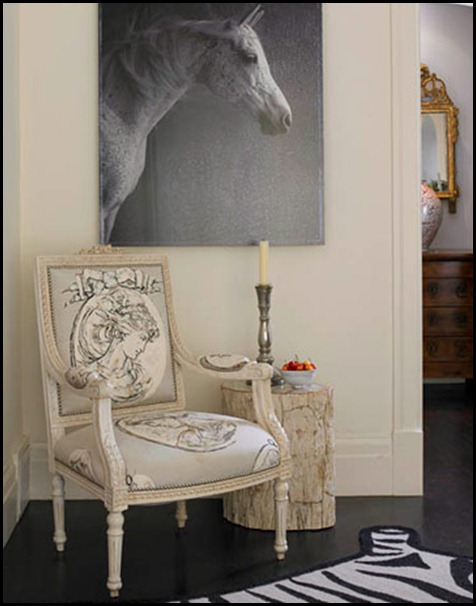
Here they have used some great statement pieces. The artwork is nice and large, and unusual. The zebra rug makes it’s own statement. There is a place to sit in a small chair and even ambient light from a candle with real cherries for a pop of color and life.
The homeowner has chosen to use their very narrow entry as a gallery wall for family photos. What makes this work so well is the large matting that has been used and notice how closely they are hung together. This makes it seem like one large piece of art and keeps the eye flowing gently.
Reflection
Although this entry is obviously large it is showing a concept that I think any entry can use. The over scaled floor mirror. Of course you would have to use a mirror that would fit on your wall, but think of using a floor mirror to open up the space and place a narrow console table in front to place a vignette.
I love the above image. It uses the floor mirror in back of a clear lucite table. Since the table is clear it does not take up any visual space. Keep that in mind for small space decorating. Use an open legged piece that you can see under to keep it more open. You can see it also allows a place for a very small stool to sit on to remove your shoes if need be.
A very small wall that makes a, "Wow" statement. The homeowner has chosen to incorporate the mirror into the wall treatment with moldings. This could be a great way to make an entry when there really isn’t one. I love everything about this entry. It shows small can look Grande!!
Speaking of mirrors how about an actual mirrored piece of furniture. If you notice all of our entries have fresh flowers or fruit. There is also a source of ambient light with candles or lamps.
Things that Inspire blog
A small wall and it is beautifully appointed.
The Practical side of things......
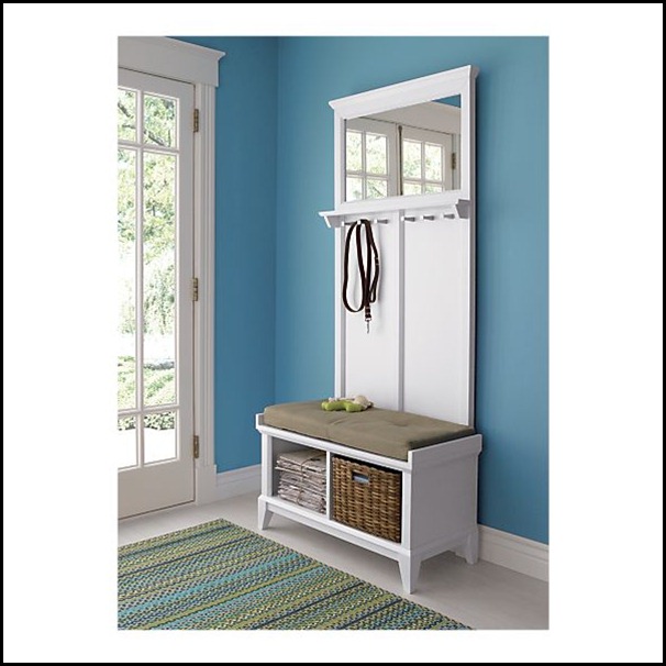
If your entry needs to be more practical choose a unit like this. It offers a mirror,storage and a place to sit in a very small area.
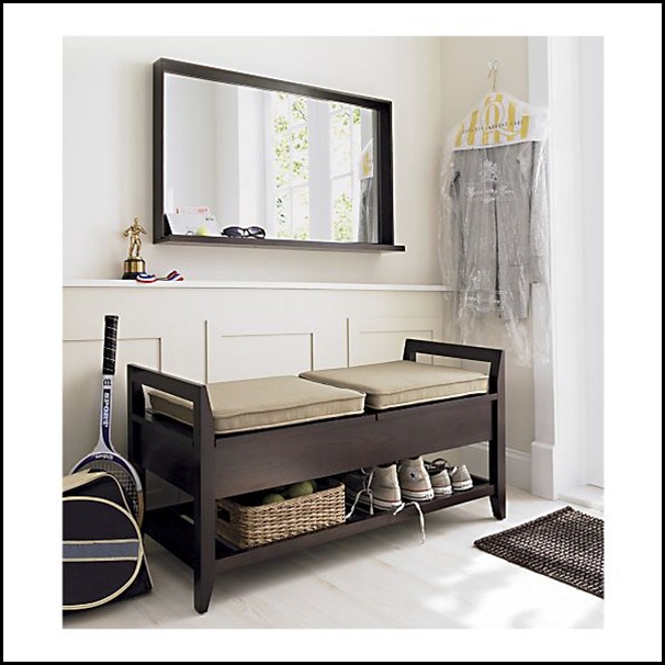
This is another image that shows a very interesting and useful element. Notice how the mirror and the chair railing are a ledge that items can be placed on. This is a very practical entry utilizing a great storage piece and useful mirror.
This idea is for my friend Erica at Tiptoe Butterfly blog. She wanted a solution for shoe storage. I think this is a great piece from Ikea for a practical and very useful storage piece that takes very little space. Notice the hooks on the wall for purses, backpacks etc. Very practical indeed!
I love the way they created a niche to sit in. It is almost like a little hideaway.
Carve out Space.......
I love the way they created a niche to sit in. It is almost like a little hideaway.

This homeowner borrowed some space between the studs in the wall to make a little alcove and added a ledge. This is a great idea. I would have mirrored the alcove to really open up the space. A great way to carve out some extra space.
Statement floors or rugs......
Another way to make an entry when you don’t actually have a designated space is to add a statement rug to delineate the area.
Very small area with everything you would need. The fun striped rug gives the area more importance and life.
I have shown you formal, practical and casual all done in a small space.In all of the above spaces there were certain elements and issues addressed. Try to keep in mind:
- Lighting: over head and ambient in the form of candles or lamps on dimmers.
- Mirrors for viewing and for opening up the space. Big is better in this situation.
- Separate the area with the use of moldings or a piece of furniture.
- Use a live plant, flowers or fruit to bring life and color to the space.
- A large piece of artwork or an unusual piece of furniture to make a statement.
- A statement rug to delineate the area.
- Something for storage if you need to be practical. A piece to hold shoes, keys, mail etc.
"Enjoy the Process" Of:
Looking at your Entry/Foyer with new possibilities.
Kathysue


