Graham Brown Wallpaper
We have been seeing wallpaper for quite awhile in design magazines and more and more designers are using it in their projects .
We all have a love/hate relationship with wallpaper, thanks to the horrible over-use of it in the late 80’s early 90’s!! Remember all the co-ordinates?
Why use one paper in a room when you can use three and don’t forget the border and the matching fabric, YIKES!!! No wonder wallpaper had a bad reputation. Then there is the dreaded removal process, Urrggh!
Wallpaper for 2011 is much more graphic than it’s floral frou-frou predecessors. The colors range from soft tone on tones to bright and cheerful clear colors.
I found a few examples of looks that I think are current and fun for today’s homes.
Meg Braff House Beautiful
Bright graphic floral!!
Graphic Chinoiserie
Beautiful metalic damask in panels
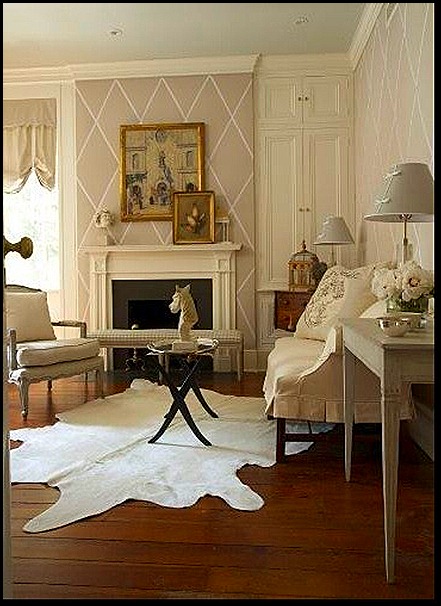
Over-scaled lattice pattern makes this look more current.
Thibaut Wallcovering
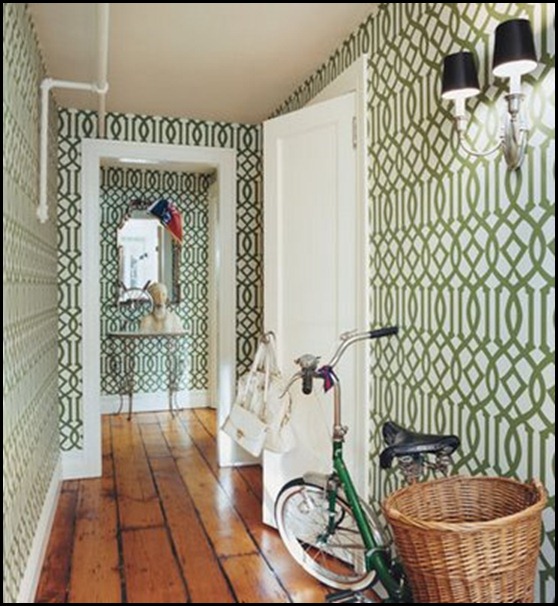
Imperial Trellis
Be still my heart. I love, love this entry hall!!!
Restoration Home Blog
Kelly Wearstler Imperial Trellis
Another favorite of mine.
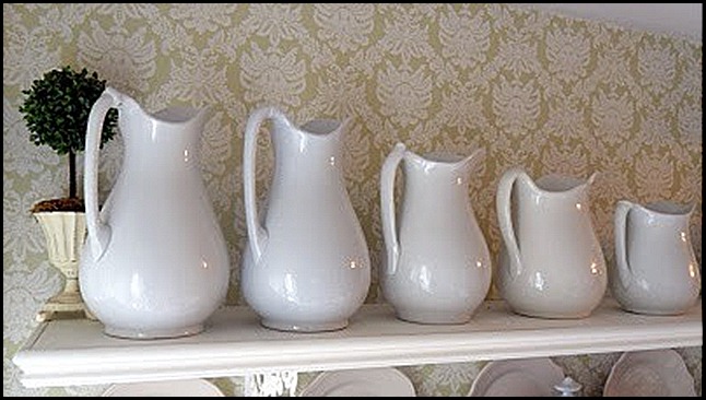
Thibaut Wallcovering Pattern Addison
Osborne And Little
Talk about over-sized, I would say this is super-sized!!
Which one of the above pictures is your favorite? It is hard for me to just pick one!!
Do you see yourself using wallpaper in the future?
Remember never say never!!
“Enjoy the Process” Of:
Looking at an old friend in a new way!!
Kathysue

![391c70f1fb39[1] graham brown wallpaper (329x402) 391c70f1fb39[1] graham brown wallpaper (329x402)](https://blogger.googleusercontent.com/img/b/R29vZ2xl/AVvXsEiWxMEbiWIiPr0nbQylnolmyp5H9zPYXJXmPzfq-zzApFcJhfZVPJsOGmni4wx9dK9fBUirN04kf5dVBt1AB5hLTFLJHnT8dO-sCOIe2zIzBx1S6mBgSIO3D3n5LF9ukr7feLz93WftVnM/?imgmax=800)


![8eb4af96e5d6[1] Kelly Wearstler (500x375) 8eb4af96e5d6[1] Kelly Wearstler (500x375)](https://blogger.googleusercontent.com/img/b/R29vZ2xl/AVvXsEhJby1ZEboeXmt8Bjg-35oelFYIZWEQPy03LuUDpZS2jXjWIhVhKy4GM1B_Dc0kbS-ZfsZbGqXrmYvCqWZLhalcBSZQKiPcAArsufbnmxCY7ERwLTtyv-rMKTkkEznUOPwFGr8rqcZ2aXk/?imgmax=800)
![509a7220b4c0[1] (380x572) 509a7220b4c0[1] (380x572)](https://blogger.googleusercontent.com/img/b/R29vZ2xl/AVvXsEiRunFxDCBnA9g_MlcnQ1DfMkkpMqiSX12ZH4vD47MvEqRVXyOL8-UhEZT_6PD7OdyPeLPP6af36fI3QuE1VxTAZiXHA5PWUd7KZeL8UGcLR8_fR7XWR7rnteAE8NxJvaADh53nkyve7to/?imgmax=800)
![42365456b9ca[1] Thibaut Wallpaper Pattern Addison Damask CollectionRiver Road (532x600) 42365456b9ca[1] Thibaut Wallpaper Pattern Addison Damask CollectionRiver Road (532x600)](https://blogger.googleusercontent.com/img/b/R29vZ2xl/AVvXsEioTsO_aPCv3fwbqD_8bSnr6VmKXrzDpshMUaBtPMALHgoQHy0rvGjZIvyP7taqL-5eOEsFYTNohtZD0WQ712AQMaFNNT4k4hQxWxp5NoiyU4_BUnsRqgHkA_zrBj8VRYnzut6wu1fb4HY/?imgmax=800)
![abbott-houston-1108-3_lg[1] Veranda Osborne and Little (375x500) abbott-houston-1108-3_lg[1] Veranda Osborne and Little (375x500)](https://blogger.googleusercontent.com/img/b/R29vZ2xl/AVvXsEgRN5YkAkwuKuNo2tmUDkUiihyphenhyphenAOrFgtXk5dRCuaOoxKiCYFBk7DB3ry4yS8hABQvPOgsGD4vJ9qJhLbTnGBRAAh24gmmck7rTgDWYeX5mLPsqxYhZQjcAW9NBlaVAW3M-1QK4VqwuoYuc/?imgmax=800)
![wallpaper_2[1] wallpaper_2[1]](https://blogger.googleusercontent.com/img/b/R29vZ2xl/AVvXsEhO-YJ_ZyYnF2uZNjCS5a4r0aC7_LTCy-Ws_nIIMdM1Cex6AW-YXv9aaGR3EFgaZZNMJgx0OY0rOt3qJ_cxPkB47Te-XIMIocRhNcYVavrOQMhF81rEY8Z2dsiA2U_af_H3HNEYX67ok7o/?imgmax=800)
![8e7e847c6b63[1] (300x400) 8e7e847c6b63[1] (300x400)](https://blogger.googleusercontent.com/img/b/R29vZ2xl/AVvXsEhnsliphhpbOO8XjutSo3fKhqugMiDy0ZnwK69BJI-RIn_nQnYfA0gx_VzDXh6okqpCYG5HPaQKYwnDGHSnsFkvdAOMXYq8s8XxF002pf7BwdXozptbVgcLMYhNvX9QbY2h1TX721iPpFw/?imgmax=800)
