Have you ever looked at a designer’s portfolio and thought, “ I could work with her/him easily?”
Since
I am retired from doing design work for others, I know I won’t be
hiring a designer, but if I did, I found one that I would hire.
I was reading a post on Chic Coles yesterday, and they did a blog post profiling Lynn Morgan. I immediately knew I had to go and check out her portfolio, and study her work.
Here is just a snippet of her design philosophy:
Lynn
Morgan Design caters to the specific needs and tasted of each client.
Lynn's design concept and philosophy for decorating is to have a clean,
crisp, dramatic look with a touch of whimsy while maintaining a
traditional approach.
When
asked to characterize her decorating style, Lynn states "That's a
difficult question but I'd say my 'hallmark' is what I'd describe as
refined simplicity with dashes of color and modernism- but
sophisticated. Although I'd characterize my taste as traditional, I do
have great appreciation for contemporary details, and what and how they
contribute to the overall design effect."decorating is to have a clean,
crisp, dramatic look with a touch of whimsy while maintaining a
traditional approach.
Just
reading this sounded like ME! Especially the first paragraph, I have
used those exact words to describe my design aesthetic.
I knew I was in for a treat when I went looking through her portfolio.
As each picture came up I had to agree with what she had done for her clients. Her overall design concept is what I love.
Let’s take a look and see what it is that I love about her work……
This first picture had me at, “HELLO!”
Simple elegance, well edited, black and white, everything I love.
She
adds textural interest with shine in her mirror, lamp, and the
bubble-orb on the table. There is also rough texture added by putting
the fiddle leaf in a basket. I always love a good basket in a room.
Black
and white is her base with a pop of color, she is using lavender where I
would probably use blue for my own personal taste, but she is designing
for her client, and they obviously love lavender. She is a wonderful designer that always keeps her clients in mind when executing a room.
The large scaled coffee table unites the room, and the display on top of the table is well edited.
There is nothing in this room I do not love.
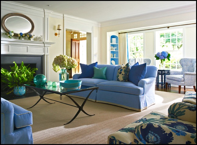
Simple elegance again. Blue and white always is a classic in my book, and she chose to do it in a simple elegant manner.
There
is a casualness added by using the large rectangular table. The table
legs of the chairs, and the flooring are in a dark wood which help
ground the room.
A simple but unusual iron chandelier was used, which adds that touch of black that I love so well.
There
is elegant artwork framed in gold that adds to the elegance. But,
before the room got to serious a sporty plaid rug was added to take it
down a notch, and make it more approachable.
Again, there is nothing in this room I do not LOVE!
Dark floors with a striped rug always looks right. This kitchen is uncluttered, fresh, and crisp.
The touch of black is in the windows, and the light fixtures which are a very simple unassuming shape.
The
interest is brought in with the metal, and wood barstools. A simple pop
of color is added with natural elements of lemons, and flowers. How
many times have I said to add natural elements in a room!?
There is a touch of life brought in with live plants, always a must in a room.
Lynn Morgan does not disappoint!
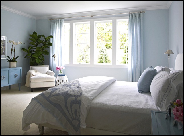
A
bedroom with a soft blue, and white color scheme is always appealing to
me. In my very own home this is my color choice for my master bedroom.(you can see it HERE!)
You have probably noticed that she uses patterns that are more linear, or geometric in design. This is right up my alley.
I am not a floral kind of gal when it comes to patterns, but will always have real flowers in a room.
As you can see, most of her rooms will have real plants and flowers added to each room.
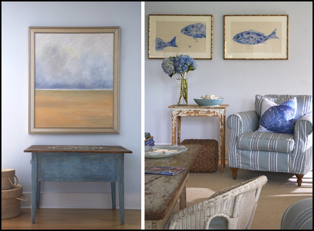
In
these two images you can pick up immediately that it is probably a home
by the water, or at least the homeowner loves the look of a beach home.
It is thematic in a simple tasteful manner without beating you over the head that it is a beach house.
Simple stripes are used for a casual feel with the addition of painted chippy furniture. Baskets are added for more texture.
The artwork is of sea-life, and the water, and yet it never becomes overdone or kitschy.
Lynn Morgan is my kind of designer.


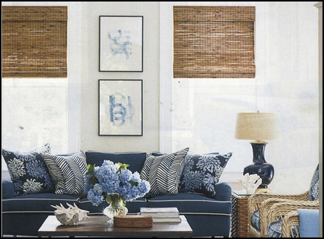
I have to point out the horizontal stripe on the pillow which is repeated in the detail of the tailored skirt on the chair. Notice the basket!


I realize that design will always be subjective, but for this California girl, Lynn Morgan is my kind of designer.
All of the above images are the designs of Lynn Morgan. If you would like to see more of her amazing work you can go to her website HERE!


