The other night I was watching Candace Olson on TV. She was designing an open concept home. The familyroom was connecting to the kitchen architecturally but not visually. You can see the episode HERE!
The kitchen had been recently renovated in a beautiful, sleek modern feel. The family room or great room had no connection other than its location to the kitchen. There was no flow from one space to the other. It made me think back to a phrase I used often while working with clients.
“It visually flows,” is a phrase I have used throughout my career in design. In fact I used it so frequently, those who knew me or worked with me, knew it was one of my catch phrases and one that was very important to me.
There is nothing worse than going into a room where the eye does not know where to look first. A room that will make your eye jump from one object to another without any flow at all.
How do you attain a room that will visually flow?
I think it has a lot to do with the feel of a room and also the colors and patterns that are used.
If you are using color in your rooms it is important that the colors are dispersed throughout the room in an easy flowing manner. The same goes for patterns they need to coordinate or have some connection in pattern and in color.
The room should maintain the same feel as the adjacent room if they are open to each other. For instance it would not look like a well designed space if a person had a kitchen that looked like this……..
A charming cottage kitchen with country accents has absolutely no continuity or “Visual Flow” to this more modern sleek looking room.
There is no connection in style, color or feel.
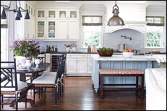
Here is an example of a room that visually flows gently into the next room.
This home has an open concept. You can see the edge of the sofa that is in the family room. Let’s look into the family room………
Notice how one room visually flows into the next. There is no jolt to the eye, there is a soft transition from one room to the next. How did they get such continuity?
The homeowner has chosen a common color pallete. They have chosen a soft neutral color scheme with a touch of blue.
There are also some similar textures from one room to the next. Take notice of the linen fabric on the sofa and chairs,it is also repeated in the cushions in the eating area of the kitchen.
Look at the chandelier, the small table by the chair, the eating area chairs and the hardware on the door. Notice they are all made out of black wrought iron, and a little of the metal is used in each room.
They mixed in another metal in both rooms by repeating the sink fixtures finish in nickel by also using it in the hanging fixture and the two sofa table lamps.
Next look at the simple accessory of the wooden vine ball it is textural just like the natural weave of all the roman shades on the windows.
The small wooden log tables texture is repeated in the kitchen counter where they used a wooden bowl to hold the green apples.
As you can see by studying images of a room you can learn a lot about how to make a room “Visually Flow.” It is all about repeating colors and textures and the feelings in a room in relation to the adjacent room or rooms.
Now that you have done a quick study with this room, how is your own home visually flowing? Take a look around and see if you need to make a few adjustments.
Sometimes it is as simple as removing something that pulls the eye to abruptly. Also, maybe taking some accessories from another room and adding them to the mix in the adjacent room will give you some continuity.
Have fun, play around a little. Who knows you might come up with a whole new look by adjusting just a few things in your home.
“Enjoy the Process!” Of:
Making a few adjustment so your rooms will, “Visually Flow!”
Kathysue


