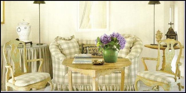
“A Study In Cuteness”
When I think of cute I think of a darling child or the saying, “She’s a cute young thing.”
I am obviously not young therefore I don’t think I can be cute any more.
Cute is a word that I use from time to time, but when it is used in referring to me or my home it kind of makes me cringe a little.
I use to have people say my home was darling or cute and that bothered me. How about sophisticated, pretty or elegant? I liked those words better.
I had a friend that was also a designer and we had a discussion about the word “Cute.” She came up with what I like to call the adult word for cute.
“CHARMING”
Charming, now that is a word that I can handle. So why am I having a dialog about the word cute? Well, there is a pattern that I love and it is often looked at as being “Cute.”
“CHECKS”
I love checks or gingham. I always have and I would love to use it in a room I have planned for the future. I don’t want the room to look cute, but I surely would not mind it looking charming.
I did a little research on checks and saved some images that I found attractive and appealing.
I started looking at how checks were used in these images and a couple of things stood out to me on why they looked sophisticated and charming vs cute and darling.
Let’s look at some of the images I have saved and i will try to tell you about my observations…………..
There is not only one color of checks in this room, but two. I find this room charming but it is not cute to me. Why? because in this room the lines and the style of the furniture keep it more sophisticated.
This image has furniture with a totally different style and lines than the first image and yet I still find this sophisticated. I think the grounding factor of the black and the addition of the nail heads keep this from being “cute!”
via Southern Accents
This borders on cute for me. I think the trim on the pillows points it towards that direction. The use of color here makes it stay out of cute territory. The size of the check is also a noticeable element that makes it a bit more sophisticated.
Color plays a big part here in keeping this from going towards cute for me. The scale of the check is large enough to make an important statement in the room and yet the subtle beige color keeps it from being cute.
Hmmmmm? This is interesting to me. I am a lover of blue and white and pops of green. I have always found blue and white porcelain to be a classic accessory, so why is this is looking a bit cute to me? Two things jump out to me. The scale of the check is smaller and the fun little church takes this into “Cute -land” for me.
Neutral colors and the style of the modern looking take on the wing chair is the driving force away from cute. Yet, this is a small scaled check just like the blue so maybe it is more color choice than scale that will make the difference to me.
I like the large scale of the blue and white check here and yet it goes a little towards cute!! Why? Because of the colors it is paired with. The wall color is too matchy and bright. Adding the touch of shell pink on the inside of the shelf definitely takes it towards cute.
I am a lover of black and white as you all know that by now. I am finding this almost cute, and in this image it is because of the style of the over-sized chair. I think the larger rolled arm is what is making it almost cute, but I still really like this image. The black grounds it and the rope table adds a nice element of texture here.
I like the larger scale of this check. The golden-beige and cream color of the check are what keep this from being cute.
Although this is a bit too many checks for me I still find the color and scale of this check to stay away from cute.
Simple lines and large scale make this sophisticated to me. Looking more closely at this room you will see stripes in the table and polka-dots in the cache’ pots holding the topiaries.
I will have to admit, it is hard to make a polka-dot look anything but cute, but I am sure it probably can be done.(note to self, good idea for a future post!)
I am finding this to be a bit cute. The ruffled pillows and the overtly thematic sea-side room makes it go into cuteness for me.
In this image we have the same scale and color of the previous image. I know the blue is a bit more grayed in this image, but it is still in the blue family.
However, this room is so classically beautiful because of the amazing lines of the antique gold gilded bed. There are ruffles in the room and yet this room does not read cute at all.
Red and white checks can read very cute to me and this one borders on cute. I think the lines of the furniture keep it from being too sweet. The bedding pushes it towards cute with its small scale and floral pattern.
Color, scale, style and the lines of the chairs in this image make this anything but cute. This room is full of character and texture and nice neutral color palette. I love this room.
via Cote de Texas
Same room different angle.
This image has curves and ruffles and yet the neutral palette and texture in the surrounding objects keep it from being cute.
This has more checks than I can handle and it it mixed with a darling Swedish floral stripe on the vintage bench. I think because of the abundance of the checks and the sweetness of the bench fabric this is almost cute to me. I am finding there is a fine line for me that will take a check into cute-land.
So, there you have it!! My study on why some checks look cute to me and others can still remain sophisticated and charming.
Here is what I discovered:
- Larger scaled checks look less cute to me.
- A small scaled check will be charming if done in a neutral color.
- By pairing a check to cute accessories whether the check is large or small it will still look cute to me.
- The lines of the furniture need to be more on the straight side if upholstered in a check.
- Upholstering a classic piece of furniture in a check will still not make it look cute.
- Furniture that is too curved or overly stuffed can tend to go towards cute more easily than a straight lined piece.
- Certain colors of checks will look cute to me. The color and the scale combination is what I have to be aware of.
- A red and white check will almost always feel cute to me unless it is in a large scale. The same thing with blue and whites or yellow and whites.
I am now very aware of what types of checks will remain sophisticated and charming to me for the future.
Thank you for taking this journey with me!!
Enjoy the Process Of:
Deciding what is acceptable to you when it comes to certain patterns and designs.
Kathysue

![ceedd50c3b33[1] (562x422) ceedd50c3b33[1] (562x422)](https://blogger.googleusercontent.com/img/b/R29vZ2xl/AVvXsEgy8PJgbIgj4nIPy0wNEtcng1WVeXby3A3wI9wzAknnT2hVFwrz8jyg8GhtFOy6Ke9kdQoEcqFGGmi8qhH-Mg4L7f90MkesgNQYSEUOrkdF-ol7Nbfp17Qo29g5VFqmTzXcz814DQ7x0x8/?imgmax=800)
![ce8f44b4-398d-4100-8959-d22ff0f8e768_493x693[1] (493x693) ce8f44b4-398d-4100-8959-d22ff0f8e768_493x693[1] (493x693)](https://blogger.googleusercontent.com/img/b/R29vZ2xl/AVvXsEgGD924IXJOv-1Uz35qZH_GmUGwILpU_xaWCC25eWLxHOQbt-8JaX7wYhJW5QpB5CjHy8QfxINbbKje0wXir670gjE1_NUhlcyN303x3bk6zWdE6uj6Lwdt2L_ZxcDFk4jogLXv2wj5pWQ/?imgmax=800)
![782762_brown_xl[1]Southen Accents (400x420) 782762_brown_xl[1]Southen Accents (400x420)](https://blogger.googleusercontent.com/img/b/R29vZ2xl/AVvXsEhMuoXeQICUcTwBcKydumeF0qjQLROPNbHjHiFRQ-Jz8SUSOpvvwWNfF9Jp3JCh01KYKh1RoZmFfmWn5sxtJnhGvx4OSDEpkJbFPVm-xLUuPUrLYMbhJf4zOammcb0jWr4fdjKoT7bRj44/?imgmax=800)
![CT0303030d_1_y[1] (450x600) CT0303030d_1_y[1] (450x600)](https://blogger.googleusercontent.com/img/b/R29vZ2xl/AVvXsEgJ6GVFH32BKKg2cWI0lEnuNH-dw2YoiqUco7JujyG7OlEBYkciRtF4NS9v21Z9zvU8iNNVFrLICA4n6cWAKhdGnEUT2knpx-zgchycGfi6YoJ752jA4F27jeDzzCX4giO243Mk86X9bos/?imgmax=800)
![6a00e54fccb6d2883401157022bf75970c[1] (465x465) 6a00e54fccb6d2883401157022bf75970c[1] (465x465)](https://blogger.googleusercontent.com/img/b/R29vZ2xl/AVvXsEgmCYtxI6F0FEDpT9uGIROFPY_0uoooPgCOZ2BODL9dQLiYo6EYJ2sqpYc0qeq869Jmf6jjB3QgP8mbA8-FjQjdW0r00IJ-z0fjD_peRRkpgbUGODVSfJXeb6mwDELPpL75HhBqGZGFLfw/?imgmax=800)
![DP01_07[1] (794x537) DP01_07[1] (794x537)](https://blogger.googleusercontent.com/img/b/R29vZ2xl/AVvXsEi8T7w4kQKklwXVXJFL-0IcW7HAkhD8Ql7U8lY8woq7_yy1xp3iAsZxu3-WWVuS4EFJtM6vVuBNCbp9LsOQ3_NW24G_EgBRgqC2FnypKDlGT64XTuDkOS6zJHzG1b1RFa4nRxd-tlNN_Xg/?imgmax=800)
![CT0403116d_1_x[1] (600x450) CT0403116d_1_x[1] (600x450)](https://blogger.googleusercontent.com/img/b/R29vZ2xl/AVvXsEiCuJN8vD3x9f7ysm2zQFqKjW5YbKBYxTfpPQ1DbI2yBnrgwJ3GjNhCo7lO_2mXhpYNBNVOz-DerEl5X5a4rX05-FsIosxPIKpHieUvZfxFSYeQtC3CULMBNZSMOKX89NSw_2UlO7Ka81g/?imgmax=800)
![LW479_2[1] (368x368) LW479_2[1] (368x368)](https://blogger.googleusercontent.com/img/b/R29vZ2xl/AVvXsEjfmcE6lDaqchFURdl8u7TRydlXkrbLZu6IYQ8ohWTmYIgHBaFaoFeOd2sHti9tPN0A52Msm4W-j4AsOsbzUJ3cRKu5iVhh3_z9efFKnp_HgIxBeY67ziM-lD_jQZTCSJdO9OXmteIR_t8/?imgmax=800)
![hbx-decorating-barber-3-0709-xlg[1] (2) (360x460) hbx-decorating-barber-3-0709-xlg[1] (2) (360x460)](https://blogger.googleusercontent.com/img/b/R29vZ2xl/AVvXsEh1QkxZ8gupw0Eot016Ar_TW1V1xncqgq_J0ZMR1qKCOBCOeZnFu2E4v3SzGN7WnBawtW4F1BfJk2PtF_IFVWqvSbfuC_lF-MheG5ddVyPQB7J15Pvo8l5UBNXFYdxE_zE25eLwuQRF4t4/?imgmax=800)
![Picture-71[1] (412x508) Picture-71[1] (412x508)](https://blogger.googleusercontent.com/img/b/R29vZ2xl/AVvXsEhNeBFvvv2KeEZqMDNN2txPoKTyBaWuHEBy0-6JHmPKAJL-7LwzxOC_6rqzj2THwjjbqvQ2Fta8Knl5NMNCyGzBg8aEHlJcRNHIN7fQ80d9qaCdtj-OTdyBDlRFvrNzar3adOjGBuP-uNY/?imgmax=800)
![fcfda996-da23-4d00-b41f-7293593a2aca_493x693[1] (493x693) fcfda996-da23-4d00-b41f-7293593a2aca_493x693[1] (493x693)](https://blogger.googleusercontent.com/img/b/R29vZ2xl/AVvXsEhqNWsOEzEsh9NaHBzamE_3kOWhz_hT09yJdq41krAtRAHcoICmOeG08j4HIb54m4l8RIQ4_X4jupeVBBMuHUiqhpbEObM7Woh5wgHr2t4lLAZOOwcZ_p6spZvFqaq_OAIrxpaAyL4cEg8/?imgmax=800)
![SL0307102l_1_x[1] (600x450) SL0307102l_1_x[1] (600x450)](https://blogger.googleusercontent.com/img/b/R29vZ2xl/AVvXsEiUeDJFddjS9eSkebYw_B1wacjd_W_S4U2hb8IHNmcN56raWXQ4vCz6xKU2YCSGjb23T0RhpLZxIBBSrRgH_EJH4-fQJYtzP2fIymsSCpPqdYH0Ghg_XJ984pMQY5_JqjUv_kEMgj1fWHo/?imgmax=800)


