Artwork
and lighting are like the jewelry in a room and since my new home had
absolutely NO jewelry except for a few lights we decided to hang a few
pictures.
I have a theory about walls and artwork…….
“If
you want someone to stop and look at the wall and what is on it, then hang
something there, but if you just want them to walk by, don’t put
anything on the wall!”
Over
the thirty some odd years of consulting with clients I found so many
would have pictures on a little slice of wall that had no meaning to the
whole context of the room or the home.
Many homeowners feel compelled to have something on every wall in their house.
The
results can give you a scattered look, and make the home feel busy, and
disconnected. I know none of us are trying to achieve that look for our
homes.
In
our new home I have a few focal walls, these are walls that your eye
will naturally go to even without something being hung on them.
Design tip: When hanging art start with your main focal points in each room.
This
is where I start with hanging my artwork. The very first area is our
entry hall the place that I will greet my family and guest…..
“Your entry introduces your
guest to what they are about
to see, feel, and experience in your home!”
My theory on entrances to homes……..
“You
are about to enter the place we love, and call home, as you enter I
hope you know your are welcomed here. We hope we have made you just a
bit curious about how the rest of our home will look by our choices in
colors, wall treatments, and the other elements we chose to greet you.
We love beautiful things, but nothing is too precious in our home that
it will ever be more important than YOU. We hope your feel at peace,
and relaxed while you visit here.”
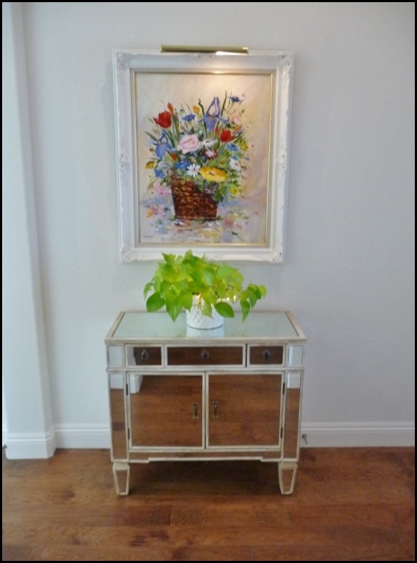
Our
entrance hall is a small area. You will notice that the front door will
swing into the wall on the right of the table so that area had to stay
open.
There
are a couple of things that I would like you to notice. I left the area
on the left of the table open instead of pushing the table closer to
the wall that divides the rest of the hallway that opens up into the
kitchen.
This is called giving it some visual air space. When you do that it can make the area look just a wee bit larger.
If
I had pushed the table further to the left, it would have looked
crammed, making the person viewing it, think. “ Oh she barely had enough
room for that table! This is a really small entry!” Not the thought
process I want to take place.
I
have a few options of tables that could have worked in this space,
however I chose the mirrored table for it’s reflective qualities, also
creating a bit more visual space.
The
other reason is I wanted to reflect more light. Even though we have a
window in the door, (still so happy about that one!) the entry appears
darker than I like. I love light and lots of it!!
So
what should we hang over this mirrored table? A mirror? That would give
more light reflection, but with the glass in the door, and the mirrored
table I felt we had enough reflective surface.
I
wanted something that was happy, something that introduced a little
color. I had the perfect piece. It was large so it would fill in the
area nicely, it has a portrait light which will add more light to the area.
We tried it and it worked beautifully. It is an original oil painted by artist Dorothy Spangler.
It
was a gift from a very dear friend, so when I look at it, I smile for
two reasons, one because of HER and the other because of the subject
matter. One of my other favorite things in life, FLOWERS!!
Ideally
the table could be about 4in. longer on each side, but for now this is
working out just fine! Isn’t she a cheerful greeting?
In
the future I will probably be getting a runner, or a rug. Nothing has
spoken to me yet so I will wait until I find the perfect rug for there. I
also have some really great plans for the walls and the ceiling, but
that will have to wait for later.
I
am not sure you can see it or not, but I have the little tiny LED
lights in the plant, more sparkle, more reflection = more visual space!!
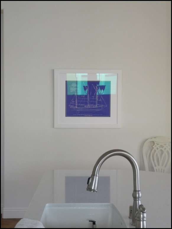
As you walk down my entry hall it opens up into the kitchen/great room, and to your left is a big wall.
I have plans for a, “someday piece of artwork,” for this wall, but until then I have a really nice piece to use there.
This
piece was chosen for two reasons. It can be seen from the entry piece,
and it introduces some of the same color found in the floral as well as
it introduces the color scheme that is in the great room.
I purchased this vintage sailboat blue print and had it professionally framed with a very simple white frame.
The print is bordered by a thin black mat, and then a white mat. Simple, just how I like it.
I love the way the buffalo check fabric ties in with the blue print.
The
print itself is fairly large, however I visualize a huge colorful art
piece, eventually. I will be on the hunt until I find the perfect piece
that speaks to me.
Once
I get that print I also visualize a long bench upholstered in cobalt
fabric with Lucite legs so it will have a see-through quality, and not
visually take up too much space.
Something like this….
I can just see a huge piece of art with this on that wall. This wall is actually straight across from my kitchen counter…..
So
when I look for another piece of art I will keep in mind the scale for
the large wall, and also a good combination of colors for our home, and
most importantly the subject matter that speaks to me. Art should speak
to you, draw you in.
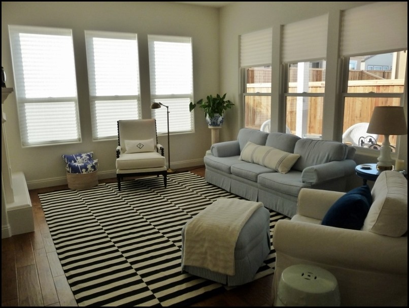
As you walk forward you enter into our great room……
As
you can see two of the walls are all window, but the wall to your left
is the focal point of the room and that houses our TV and fireplace.
I have some big plans for this wall in our future and I wrote about it HERE, if you would like to read about my plans. However for now we have to put something up above the fireplace.
We
found that nothing but a mirror would work behind the antique black
clock and a mirror would be a bit redundant with the TV because of its
shape and refective quality, like the screen of the TV.
The
clock was moved to a better spot, and we hung an oil painting of the
ocean, and sail boats. Again it looks a bit small for the wall, but once
we do the molding treatment on this wall it will be the perfect size
flanked by sconces!
When sitting in this room this piece takes me away to my favorite place, the ocean. It makes me feel peaceful and at home.
We
have quite a few more pieces, but as I have been with these, I will be
strategic in where I hang them I will take you all on for the ride in my
new home and in my thought processes!!! I am a teacher at heart!

I hope you,"enjoy the process," of following along with our journey in our new home, and come back as we continue to make it our HOME!!


10 comments:
Would you ever reconsider TV placement? Would you reconsider bookshelf/cabinetry idea? I know that's a lot to deal with, but that is valuable wall space for furniture placement. Sectional, maybe, there. As "light" as possible. Might be interesting with fireplace. Choose great coffee table. Group light comfortable chairs. Hard to tell Exclude most other furniture. Who knows, maybe minimal in this space would be smashing. Just thinking.
I love that gorgeous painting that your friend gifted to you!....having a great time seeing "your process" and taking many notes!....Happy Monday!!
Looks like you are coming along nicely with your decorating. The entryway looks great and cheerful like you wanted. I agree the picure above the fireplace offers a peaceful feeling. Where I live I'd have to have a washable entryway rug immediately. If it's not the bits of sand that can follow us in it's weather related like snow. I hope you are both enjoying your new home as you begin settling in.
I don't usually comment as I am not a designer/decorator but I have to tell you how much I am enjoying watching your process. My husband and I are looking for a similar home and I love learning from you. No detail is too small to share so please, continue! It looks beautiful!
You would make a great teacher! I'm learning so much from you...love how you take us through the thought process. Just what I need since decorating my home has always been a challenge for me. Thanks so much for sharing. Love your blog!
Thank you so much for sharing your thought process with us. I admire your taste and ideas. Your new home is lovely and I eagerly await for your next post! Please keep sharing with us!
I love seeing your things as they find a place in your new home...perfect as always! Hugs...Debbie
Everything is fitting so beautifully in your new home! I love following you in this process!
My husband & I just got back from a road trip to California. I was thinking of you & realizing why you love the ocean so much. After finally seeing it...I get it!
I admire your bravery to hang pictures on newly painted walls. But it's a step forward in making your new house feel like a home.
Art is certainly the thing I struggle with most of all so I love that you have shared your thought process, thank you Kathy-Sue. Your house is beautiful!!!
Post a Comment