For those
of you who have been following along with me on my blog you know I am a
gal that likes order, neatness, symmetry, and an uncluttered atmosphere
in my home.
When we chose the floor plan for our new home there was one element that gave me angst, and I mean big time angst.
I won’t even admit to you how many hours I spent thinking about, planning, and sourcing ways to deal with this one problem.
THE PROBLEM CHILD!
In
my great room we have one wall that is the focal wall of the room. On
this wall is a slight niche for the TV and a fireplace, side by side.

In my world the fireplace should be in the center of the room flanked by two bookcases, and one will hold the TV.
Since
I was not the architect on the job, nor did they ask me to be, this is what we have to work with.
You can see for a gal that loves symmetry this can be a big problem.
Well,
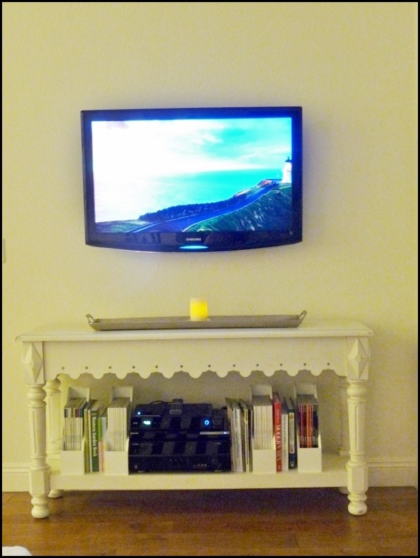
this week we moved into our new home. I already had a nice console
table that would work under the TV that I thought would look nice, and
it does.
I
might want a larger piece down the road since we also plan on getting a
larger TV, but luckily I don’t feel the need to make a change right out
of the gate.

Once
my hubby placed the TV on the console table I immediately noticed how
it pulled the room together because it was black, and black & white
are at the base of my home.
It
also balanced the fireplace opening. Now I don’t have a problem
admitting when I am wrong and boy was I wrong about the TV wall.

The TV has been installed on the brackets on the wall and it works great there.
We
are both very happy with the results and for the fact that we don’t
have to address this wall immediately like I had originally thought. In
fact I made my hubby promise me that would be the first project he would
do for me right after we signed the papers.( I am a planner)
I do have plans for molding to make the entire wall look and feel like one large composition.
It
is going to take a lot of planning, measuring and blue tape to get it
right, and when the time comes we will be up for the challenge.
Sometimes, even in design, things have a way of working themselves out so relax, and don’t over think it until you see how it turns out.
Two black boxes side by side will add balance to a room, who knew?
The TV is my friend, not my enemy.
FUTURE PLANS:
The TV/Fireplace wall will have a paneled molding treatment on the entire wall, floor to ceiling.
Here are a few images that I have pinned for inspiration…….

This
first image is the closest to what I have envisioned for my wall. On
the left you will have to visualize a console table with the TV on the
wall and panels behind it.
The over mantel treatment is almost exactly what I want except for how low the sconces are hung.
I see sconces hung this low all the time so I am sure there is a reason for it, however for me they just look too low.
How do you feel about the height of the sconces? Maybe I should do a blog post on this subject? HMMMMM?

Very similar to the other one. It has clean lines with just a touch of elegance and that is the look I am going for in our new home.

This treatment does not go all the way to the ceiling like I want, but what I do like is the treatment behind the TV.

None
of the above images are exactly what I want, however by pulling an
element from one image and then the others, I can come up with what will
work best in my environment.
1. When looking for ideas for your home always think of the images you are looking at as inspiration only. Gather lots of images. ( I pin mine to a pinboard on Pinterest)
2. Try not to take the details literally, or you will overlook some good inspiration, and feel paralyzed.
3. Choose rooms that make you feel good, and then analyze what it is about the room that you can apply to your own.
4. When looking at your images for inspiration try to save some that you don’t like as well, and keep those separated from your likes. It is just as important that you are very firm on what you don’t like.
5. Often times likes and dislikes can look very similar, but there will be one detail that will make you, personally not like it.
6. You need to be very aware of what you dislike so you don’t fall into the pitfall of adding it unconsciously to your room. That is why it is so important to examine images and all the details, big and small.
Using myself as an example:
For
instance in my looking I discovered I do not like large entertainment
walls with shelving and doors. I prefer a simple console type piece.
I also discovered I do not like sconces place low on the wall above fireplaces.
7. Start
applying your idea to your area on paper first, and start with the area
that is the most important to you, or at least the area that will
dictate the outcome of the design.
In my case it will be the over mantel first, because it will set the lines that will go over to the TV area.
I am starting with the fireplace because I have a much smaller area to work with than I do on the TV wall.
The
measurements and lines I create above the fireplace will flow over to
the TV wall where I can actually add more if need be. There needs to be a
consistent flow of lines so it will not start looking like a puzzle.
I love design! I am always on the learning curve and it is inspiring and a challenge all at the same time!!
Moving and making plans for the future sure is fun and we intend to.........

