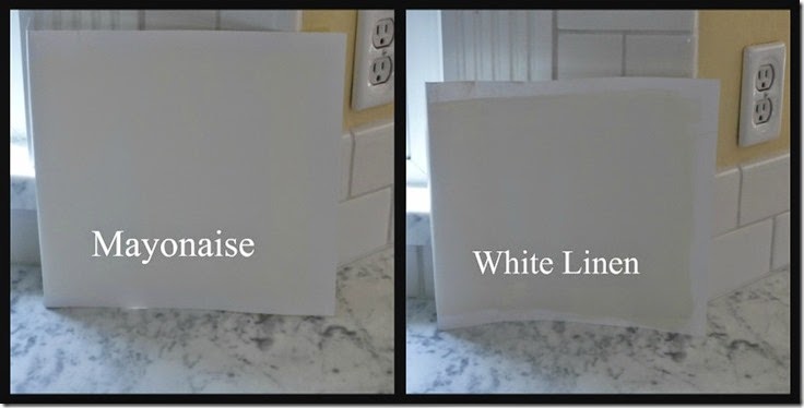
Some people can grab a paint color, and go for it, and live with the consequences.
These
are probably the same people that can go to the hairdresser, and make
major changes because they know it is only hair and it will grow back.
Personally I am NOT that girl! When I get my hair cut differently, even slightly different I feel as if I am in the dentist chair.
When
it comes to paint on the walls the paint sets the mood, or feeling in
the room. It is what wraps around me every single day. It is NOT just paint in a can to me.
I want it to have all the qualities I have grown to love in my home for the last 37 years….
Warm, inviting, fresh, clean, and it needs to give a glow, and life to the room.
Whenever
I choose a new paint color I will try to narrow it down to the top two
colors that I think will work. I will live with it for an entire day
before taking the plunge. I need to see it in all of the different
qualities of lighting that changes in a room throughout the day.
This time I started with four different samplings of warm whites. I narrowed it down to three.
Then I narrowed it down to two, and not one of those was the perfect color.
Oh my, what is a girl to do?…..
....Study Why They Did Not Work
What I will look for:
1. Undertones that showed up that I don’t like………… I saw a pink undertone coming through first thing in themorning.
2. How the color reflects or absorbs light…… both colors absorbed light making my room look dead and flat, instead of the nice warm glow it has always had.
3. Do I need to go lighter, darker, or even brighter…….all of the colors I tried were in the right value. They all were on the lighter side.
4.
What was the feeling the color made me have……. none of the colors made
me smile or feel like I could take a deep breath with a sigh of
calmness. They did not have enough life to them. They just went flat in my room.
5. How the color marries to its surrounding
colors……..every color I sampled married well to all
of my surrounding colors.
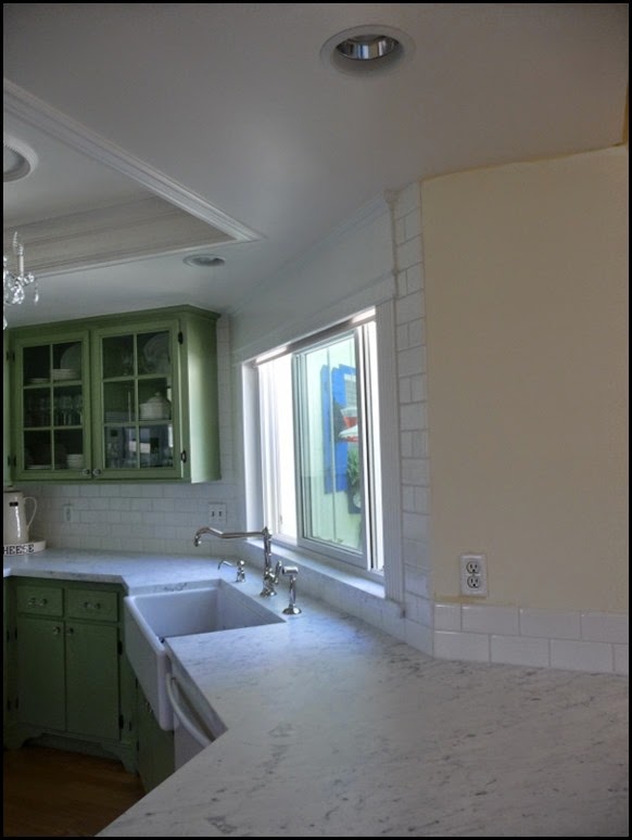
After going through this process I realized the color I needed was right under my nose. It was my living room color.
It is like French Vanilla icecream.
Simple? Not so much!!
WHY?
As with most of the colors in my home I tweak, or make my own formulas by adding a touch of this, and a drop of that.
I work with the tinter’s at the paint stores, and they help me concoct my formulas.
The
color in my living room, and hallway are a special brew that was made
over 12 years ago. Since that time the actual paint bases have changed.
If
the base is different, and they will vary from paint company to paint
company, the color will be different if you try to use the same formula
in a different base.
This
is where modern day technology has been very helpful with the onset of
computer matching. It is not an exact science, but it at least gets you
in the right ball park.
Keep
in mind a good tinter is worth their weight in gold. Once you find a
good tinter that really knows paint and pigments, and how they work, be
sure to maintain a good relationship with them, they are invaluable.
Most
computers will pull up 4 different formulas, and it will tell the
tinter which one is the closest match. It is up to the tinter to make a
decision based on their knowledge of how pigments will mix together.
Since
I am an active participant I looked at the formulas, and made the
decision which one I felt would work based on my experience with color
in my home. The tinter concurred so we moved forward.
Let me bring up another point here…..
If
you are using a flat paint it will tint up more quickly and could
possibly tint darker if you are using an old formula of an eggshell,
satin, or semi-gloss, so keep that in mind and adjust the formula
accordingly.
My
original formula was an eggshell finish so we adjusted and made the
formula slightly lighter. After the first try the hue was correct but
the shade was too light so we added more pigment, and Voila it was
almost spot-on!!
Close enough for even me, and I know I am way beyond picky.
So that my friends is the paint saga, and how you should analyze, and have your paint formula’s mixed up.
Kathysue now has a new paint formula on file for any upcoming touch-ups that might be needed.
I have named my color: VANILLA!!
Let the painting games commence!!!


5 comments:
I hope you love it! I was going to say I'd go with a white with a hint of gray because of the color in the countertops. I put up White Chocolate in my office and I'm quite happpy with it. At times I detect a hint of green but most of the time I don't so I'm ok with it. My living room ended up being Lady Finger and I couldn't be happier. It lightened things up but gave me the tone I needed to still work with my furnishings. I wasn't so smart to paint it on poster board...we did samples on the wall around the room. It was messy but it got me there. I can't wait to see the reveal!
I trust that you will get it right.....nobody does their homework like you do:)
This is exciting. I like to test a paint and leave it up a couple days. I miss my old painter, Rick who was patient with me…you are so right about tinters.
We think out of the same paint bucket!! franki
Once again, thank you for sharing your wisdom and extensive knowledge, Kathysue. What I learned working with paint is to be patient, do tests and study it over a few days. Great points!
Post a Comment