When I am working on a design I like to pull together lots of combinations and possibilities. You just never know what puzzle pieces will complete the picture.
Sometimes it is fun to try something that you really don’t think will work, and it might surprise you, and be the perfect piece for the room.
Always keep an open mind during the planning stages. It will take awhile to get down to brass tacks.
Often times there will be one piece that will tell you exactly what direction to go in.
I am in the planning stages of redoing my kitchen so I am having fun pulling different elements together to see what direction the room wants to take me.
The last time I spoke about my kitchen we were debating on whether or not to put tile on the wall at the end of our breakfast bar.
After a lot of thinking, talking and asking my friends opinions, we decided to NOT do the tile, it just felt too heavy for the room.
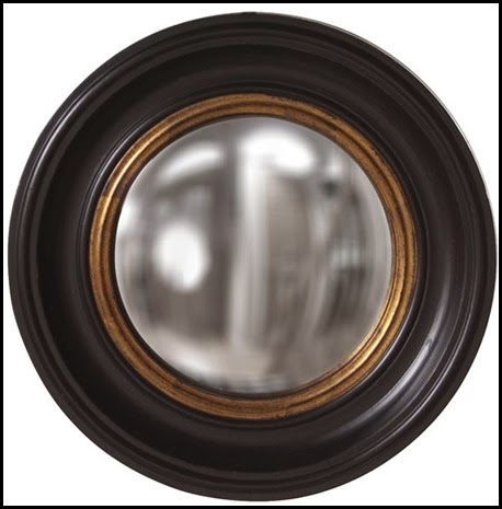
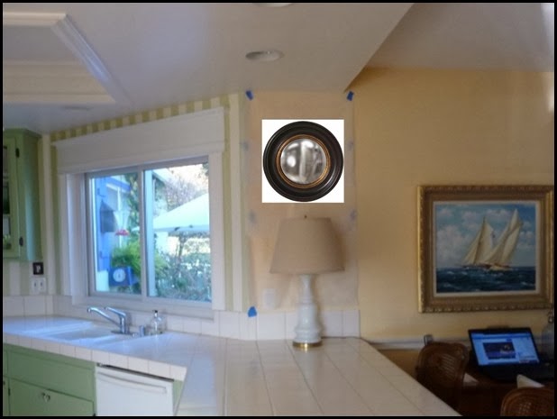
Of course I can not let that wall go so I have looked at some different elements that could go there.
It is fun to play with the different elements. Let me show you some of the mirrors I am considering….

I am trying to bring a little bit of black and gold/brass into the kitchen since I have some already in my family room that you see from the kitchen.
You can see the black and brass combination in my sconces and my firescreen.


I like the touch of black with the gold.
I already have a Queen Anne mirror that I could paint out in a gold leaf. It is a really good quality mirror, but it is cherry and it is in a closet, just waiting for me to use it again.

This star mirror is probably the most fun of them all. I do love a touch of whimsy and I think this gives me a classic touch of whimsy….


Speaking of whimsy….. I love letters, and numbers so when I can add them in a room I will. I found these blue enamels letters and thought I should at least try them. They are vintage, Love that…….

This might be a tad too fanciful, but it is still fun!!
So there you have it. This is what I have been thinking about plus quite a few more details, but more on that later.
UPDATE: Marble slabs are paid for, they are mine!! The contractor is coming tomorrow to discuss details of the job.
It looks like this is really going to happen!!


10 comments:
the letters would be soooooo cool. i can imagine a vertical row of plates hung there too.
smiles.
michele
It must be "in the air"...I am so "feeling" the black and brass...and love that you're putting a little "glimmer" in the kitchen..one step removed from "glamour." I'm leaning towards "smoked glass"...the kind with a little brass attitude...franki
Love the star mirror too!..elegant and fun!…looking forward to your progress..have a great weekend!
I'm so glad to hear you've decided against the tile and have decided instead to go with an objet d'art.
Is the photoshopped pix of the queen anne mirror true to size? I like that mirror but wonder about the proportion.
Also like the letters. Would you leave them blue or paint them black?
I think the wall definitely needs at least a touch of black.
What about the lamp that is already in the picture, but with a black lampshade?
What about the round mirror, but hung much lower to the countertop? In the lower 1/3?
Also like the starburst mirror, but with black rather than brass.
Jeesh, why don't I get my thoughts together before I start commenting?
I am looking forward to your decision! I know you will choose just the right piece!
What about the black and gold mirror with a sconce above and take away the lamp. Or the plates would look good too with light shining down on them. Then maybe place a tray or basket on the counter underneath with something alive in it:)
I like the star mirror. I have a thing about putting the word EAT up in a kitchen/dining room as it sounds bossy to me. I would prefer YUM. Am I nuts?
The letters get my vote. I like whimsey, and that blue is perfect for your house.
Post a Comment