In my
last post you all got to see my mantels new look. This change opened up
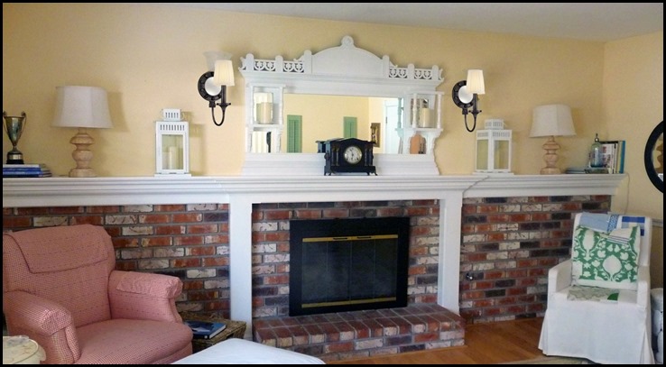
more opportunities and choices for lighting sconces……

You will notice there is not sconce on the left side!
This was done on purpose because we had to try out three different sconces.
Number One
This is actually a mock-up because this very bad blogger forgot to take a picture of this sconce in the room…..
Here is the actual sconce that we tried out. It is from Lamps Plus
and I must say I was quite impressed with it’s design and quality. I
love the round shape and the fact that it has a mirror to further
reflect the lighting.
I think this sconce would work equally as well in a traditional, or a more contemporary setting.
It comes in the antque nickel or antique brass finishes………
I know this is going to sound a bit off the subject, but do you ever watch, “What Not To Wear!”? Stay with me now.....

See the sconce on the wall? Isn’t it a handsome piece?
Choice Number 2
This is designed by none other than Johnathan Adler, now I know you have all heard of him. I had no idea he had lighting designs at Lamps Plus.
Jonathan Adler Ventana Nickel
Plug-In Wall
Lamp
When I opened up the box and saw this little beauty, I fell in love with its sleek, handsome style.
It had just the right amount of black and brass for my room.
The round backing is wood and so is the base of the sconce.
(all sconces were temporarily hung for visualizing purposes)
The
oval lampshade in natural linen offered just the right amount of
softness the room needs. Again, I was very impressed with the quality
and the design itself.
I have one more sconce to show you……..
Choice Number Three
This sconce is designed by one of my favorite designers, Mary McDonald.
She
always does such an amazing job with her interiors, and bold choice of
colors and patterns, yet still has a classic traditional bend, which is
exactly what I love.
Her lighting designs for Lamps Plus did not disappoint. She has a whole collection that is amazing. Go Here to see the whole collection.
This is another beauty from Lamps Plus! Who knew they had so many designer’s lighting?
This offered me more black in the room. It’s square design had clean lines, and was very sophisticated and handsome.
( plugged in with an extension cord, you can see it laying on the mantel)
Wow! with each sconce the choice got harder and harder, they all worked, and were of excellent quality and design.
Decisions, Decisions!!
The
decision has been made, and we are going to place the order, so you
will just have to wait a little bit longer to see which one worked out
the best in our room.
With
each sconce there will have to be some re-wiring, and the light box
will have to be hung a bit lower. Still more projects to do, but we are
making some good progress!!
Which sconces do you think I chose, or should have chosen?


12 comments:
OH YOU TEASE!
Now I have to wait!
Oh we have to wait - and you didn't even have us try and guess which one you chose. I'm going to go ahead and guess anyway. I think you selected #2 - because I prefer #1 and #2 and you said you loved the second one. Time will tell.
Can't wait to see...hopefully tomorrow!
They are all nice:) I think you picked the first one..maybe #2..
xxleslie
Like the other ladies, I think you probably went with #2, but I happen to like the look of #3. Can't wait to see what you selected.
My pick is number one because I think its shape and style suit the room and your style of decorating better than the other two. They are a bit more contemporary and geometric whereas the first is a softer more traditional, classic shape. In my opinion the mirror kind of dictates because it is so decorative and ornate with its profile and details.
love number 3, the square look compliments the square shapes in the mantle
what a fun exercise!
xo
debra
That was quite a tease! How fun to have that decision to make though. ;)
Oh you are a terrible tease!! I really want to know! I THINK number 3 because it is my favorite and we think alike, but i could see #2 as well....
Stacy
I'm going for #1 since the shade hangs below the top of the trim but perhaps the other 2 would hang lower when installed. I think 2 and 3 are too large for the space. Can't wait to see the installation and hear how you decided. Jo @ Let's Face the Music
I think you picked #3
Am I right?
I love # 3, but it's a toss up between 2 and 3. Looking good in there!
xo nancy
powellbrowerhome.com
Post a Comment