home about me our home

Wednesday, September 29, 2010

Blog Hopping

I love finding new blogs to look at don’t you? I have found so many wonderful blogs by blog hopping. Some have been recommended by others and I even  have a little method that I use to find  other blogs. Here is my method:

On Saturday or Sunday I make a point to visit my favorite blogs and I look at the comments.  If I don’t know  the commenter I hop over to their blog and peruse for awhile.

The other method is pretty obvious. I look at their side bar and go to some of the blogs I have never visited before.

You all should try one of these methods if you have not done so before. It is amazing how many design blogs are out there. There are so many young and talented people out in blog land.

I love learning from others, and even at my age I am always learning.

How about you guys? How do you Blog Hop?

If you leave a comment give me a name of a new blog you have recently found and enjoyed. I would love to go and visit!!
bunny (240x238)
What an adorable little blog hopper!

“ Enjoy The Process” Of:
Blog Hopping and finding new and interesting blogs!
Kathysue

Monday, September 27, 2010

Another Trend I am not sure I like!

I already admitted to the fact that I do not like the new look of painting moldings and the walls the same color and finish.

I am a little more hesitant to admit I do not like this trend because I do not want to offend any of you who love it. I hope you all realize I have been in this business for such a long time and I know that design is subjective. I do not take it personally if my opinion differs from yours.  I do not mean to offend any one by saying I do not like something. So here it goes!!!

3 (400x266)
Dark Steel Windows!!
I know this might be a surprise to some of you that know how much I love, love black and white. It would be a natural assumption that I would love this look.

Dark steel windows look cold to me. I love a beautifully separated window pane by wood not steel. I remember when people were putting in the dark steel framed windows several years back and they just stood out too much and gave a cold feel to me.

2 (305x400)
5 (400x400)
Dark steel windows have a more commercial look to them, IMHO.
4 (342x484)
untitled (500x375)
Although I do love each of the design and decor in these images, I am just not a fan of the dark steel framed windows.

As I have said before, design is totally subjective and I never expect anyone to totally agree with me. I personally feel that dark steel framed windows have such a distinctive look that they will  become dated as do most trends.

 I say, stay with the classics on permanent fixtures such as a window.  So, how do you feel about the dark steel framed windows?

“Enjoy the Process” Of:
 Discovering why you like or dislike-like a design element!
Kathysue

Friday, September 24, 2010

Does Lime Green go with Gold?

I am starting to look at some different color combinations for my Thanksgiving table. I know, I know it is sooooo early, but I like to think about these things in advance and ponder on what I might do.
One of the combinations of colors I like is Lime green and Gold. Here are a few inspirational images that made me think of this as a possibility.
4 (400x300)
5 (400x313)
untitled (715x648) (715x648)
2 (750x800)
3 (537x546)
untitled (715x648) (715x648)
So what do you think of this combination of Lime Green and Gold?
I wonder if this will be the combination I use for my Thanksgiving Table? Hmmmm??!!!!
“Enjoy the Process” Of:
Thinking about different color combinations for your Holiday table.
Kathysue

Thursday, September 23, 2010

I Miss Silver Sage!!

I eluded in my last post that I had been to the new Restoration Hardware’s New gallery store in Berkley California a few weeks back. I also mentioned that the interior changes and look of their store left me cold and feeling somewhat down.

I don’t know about you, but I am not sure that is what they are trying to achieve. I have mentioned before that I like color, light and airy so it is a given I will not be comfortable in a dark cave- like room.

Where I feel Restoration Hardware might be shooting themselves in the foot, is the look that they now have does not appear to be very versatile to the masses. The look is so distinctive that you might just have to do your entire room over in order to make their pieces fit.

I read this statement on their website, they started with a quote from Picasso:

Every act of creation is first of all
an act of destruction

During the collapse of the global economy, we drew inspiration from Picasso’s words and chose not to listen to the conventional wisdom encouraging us to follow the pack and lower quality to reduce prices. Instead, we saw an opportunity to be liberated, abandoning our past to embrace the future, one that has redefined the essence of who we are. No longer mere “retailers” of home furnishings, we are now “curators” of the best historical design the world has to offer
We’ve destroyed the previous iteration of ourselves, clearing the way to express our brand in a never-before-seen fashion.

I would say that they have definitely done some destruction. There is no resemblance of the old Restoration Hardware, which I personally loved .  I always felt so comfortable and serene in their stores. I really do miss Silver Sage walls with wonderful white trim and architecture. I felt they had a variety of colors and looks that would fit into just about any decor.

They did say they were not going to do what is popular or follow the masses and yet, they have done just that. The style they are projecting has been around for quite some time and I think they have dived in head first with no wiggle room.

Here are some room vignettes from the new look of Restoration Hardware. I must say I do love some of the individual pieces and I will point those out. I am just not convinced it is a smart move to go this deep into such a specific look that has been around for awhile.

2 (800x413)
I must tell you that in the store the walls are a darker shade of gray not this soft light color you see in their catalog which is much more appealing to me. As individual pieces I like most of what I see, but to have an entire room done in this is just too much of a good thing.

The city map is amazing and could be used in other rooms. I also believe a linen sofa is a classic, but give me some colored pillows please!!!

3 (800x413)
Neutrals, Texture ? Yes, but enough already.

8 (800x413)
More of the same with the addition of a chesterfield style sofa.

5 (800x413)
Look familiar. Antler chandelier? This has been done forever!(That was said in my California Valley girl accent)

4 (800x413)
I rest my case!!

I know many of you in blog land have truly loved this look for a long time and have it in your home. You have become a collector of Swedish, French and Belgian antiques and also have added a few of the industrial pieces. For you this is a look that you love and can relate to, before, during and after Restoration Hardware has moved on.

My whole point is, Why oh Why dive head first into one particular look that has been around for such a long time?! I am just not sure it is the wisest choice. I am not an expert- only a consumer and all of this is IMHO.

How do you all feel about this look? Are you going to jump on the band-wagon?

Enjoy the Process Of:

Really looking at trends realistically and staying true to who you are and what you truly love.

Kathysue

Tuesday, September 21, 2010

WHAT IS THE POINT OF USING MOLDINGS IN A ROOM???

I love the architecture and interest that moldings can bring to a room
I have been noticing a trend in moldings lately. Have you all noticed that there are some that are painting the walls and the molding the same color?  Sometimes they are even done in the same finish!

I recently went to a Restoration Hardware store and they are completely re-vamping their look and their store. I could do a whole post on just their look, but today I want to talk about their walls and their moldings.

We all know that gray is the new “IT” color and I guess they thought so too.  All the walls and the moldings are painted in a medium value gray and dimly lit by halogen lighting.

I have to say it was depressing. There was no life, no color. The variations in the rooms came in the form of textural differences, but the colors lacked luster at best. I know that this is a particular style trend, but I for one am not impressed with a whole room or house done in this look. The word that comes to mind is “Boring!” IMHO.

I digress, back to moldings and walls painted the same color.  Here are a few examples where the walls and the moldings are painted in the same color.
entry (360x460)
dark (320x400)
dining room (375x500)
untitled (500x375)
kitchen (434x553)
game room (375x500)
Next I am going to show you some rooms with a subtle contrast in the colors used for the walls and the moldings.
contrast (500x375)
subtle 4 (540x429)
subtle (394x448)
subtle 2 (437x600)
subtle 3 (384x576)
Now let’s look at high contrast between the colors used on the walls and molding.
high contrast 2 (466x582)
What would this room look like with the moldings painted the same color and finish as the walls?
high contrast (470x469)
blue green (500x330)
dark gray (375x500)
navy (353x395)
This is what I have concluded from thinking about this new trend. I personally do not like the moldings and the walls painted in the same color and finish. I prefer contrast, whether it is subtle or a high contrast.

I think when the walls and the moldings are painted the same it makes the room look dull and as if it was a spray and go paint job. I know we have all seen those before. I actually saw a job where the painter sprayed all the walls in a home and when it came to the kitchen he sprayed down a wooden spoon in the kitchen drawer. Unbelievable!!

I am a detail girl and I love nothing better than a beautiful simple molding treatment that stands out subtly or in a high contrast way. I for one hope this new trend does not stick around  too long.

So after seeing all the above images, have you noticed the rooms that are being featured with no contrast in the moldings? How do you feel about this look????
“Enjoy the Process” Of:
Studying the new trends and deciding if you would like them in your home.
Kathysue

Monday, September 20, 2010

Mind Your “P’s” and “Q’s”

We have all heard the saying mind your P’s and Q’s! Well, I like minding my P’s.
This past weekend my granddaughter decided to make a chart listing all of the letter P’s in my home. I thought it would be fun to show you all the P’s we discovered.
P's 002 (800x600)
This is in our guest room. The walls are a soft French vanilla, bedding all white with soft blue sheets, moldings are all white with a very, very soft blue ceiling. I liked the way this almost took on a shell effect.
P's 003 (800x600)
Master bath vanity with glass vessel sink and iridescent tile back splash.
P's 004 (600x800)
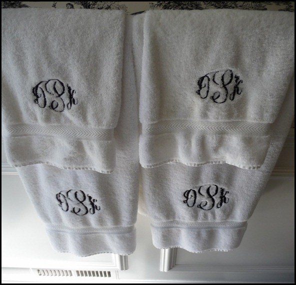
Guest bathroom towels done with black and white checked floors and white woodwork and toile wallpaper. All my towels are monogrammed but we did not count all the towels, way too many.
P's 005 (600x800)
Letter P on family room wall. It is from Ballard and it was gold so I brushed it with black paint.
P's 008 (800x600)
A tiny distressed framed P that is on the letter holder that is on my childhood desk.
P's 009 (800x600)
Paper weight on my desk.
P's 010 (800x600)
John Derian cream tray that is in my kitchen.
P's 012 (800x600)
Pottery Barn chalk board pitcher in the corner of my kitchen.
P's 013 (800x600)
Small cheese knife in my spooner.
P's 014 (800x600)
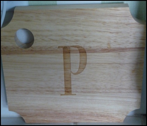
Cutting board to go with small cheese knife.
P's 015 (600x800)
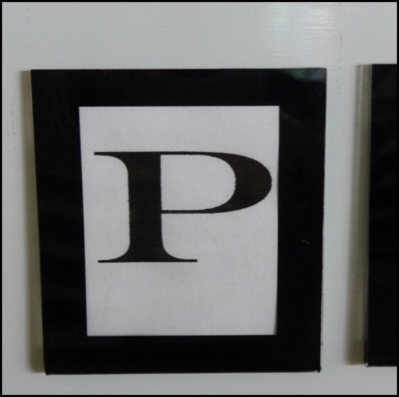
Framed P that I made and put in a black frame that is part of a grouping of my grandchildren’s pictures in varying size of the same black frame. I am not one that can have unorganized things on the front of my fridge. I love looking at my grand kids at different ages, they are my JOY!!!
P's 016 (600x800)
Ceramic P plaque inside kitchen dish cupboard with a mirrored back.

So there you have all the letter P’s in my home. If you would like to see my Kitchen go here. Master bathroom here. Guest bathroom here!!

This was fun for me, I did not realize I had so many. Funny how you start a collection because you love something and before you know it , it is a full blown collection.

Do you have letters in your home? What do you have in your home that has become a collection before you realized it?

“Enjoy the Process” Of:
Discovering that you have a collection of something that you love!!
Kathysue

Saturday, September 18, 2010

Playing Dress-Ups!!


As we become older I think we sometimes forget to play. Play can come in all different forms to different people. I love being a girl, so playing for me usually will involve something to do with fashion, make-up, hair or, what I like to call, “Playing House.”  I wrote about in my other post.

I am very fortunate to have wonderful friends around me that I can play with. The other day a very close friend of mine and I did a day that I liked to call playing dress-up.

We went to a store called Ulta. It is a make-up and hair care product store. We went up and down the aisle trying different colors of make-up and finger nail polish. What we were really looking for was some hair care products.
 Both of us are going to be taking a little trip to where we will be in the sun and we like to protect our hair.
I volunteered to go on-line and investigate some products. We opened several bottles to smell the fragrance of each and there was one that stood out more than the others!!
Oscar Blandi Sun Shield. The fragrance in this product reminds you of being in Hawaii. It reminded me of the Plumeria flower. We are both going back to get this on a special sale event!!
oscar blandi (250x250)
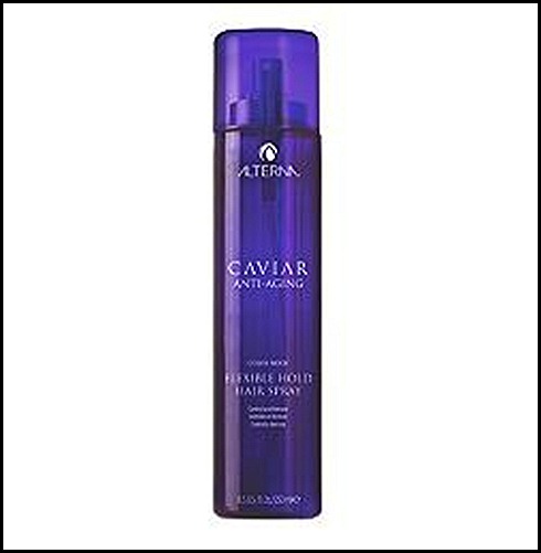
The other product that we fell in love with the feel and the fragrance that it left on our hair was Alterna’s anti-aging hair spray. It is a bit of a luxury as far as hair spray goes but Oh my!!! does is smell amazing. I am waiting until it is on a special to make a purchase. Alterna products are what Jennifer Anniston uses on her hair. I figure if it is good enough for Jen it is good enough for Kathysue.
Alterna anti aging flexible hold (250x250)
I was surprised after a day in a make-up store that I did not buy a new lipstick or lip-gloss. I actually think this is a first!
I love being a girl and playing dress-up with my friends!!
What do you do when you play dress-up?!
“Enjoy the Process” Of:
Being a grown-up girl and still playing dress-up with your friends!
Kathysue

Thursday, September 16, 2010

A Fall Green I Love!!

Today I am going to talk about the Fall color Artichoke Green.
Paint, Artichoke, SW6179 by Sherwin-Williams
Sherwin Williams SW6179
It is no secret I am a lover of green, as you can see from my kitchen.

fall dining 2
Greens come in so many varieties, however, since I am talking about Fall and ideas for Fall decor I thought I would talk about Artichoke Green.
Artichokes can be used in so many different ways in your Fall decor. I have collected some images that I hope will inspire you to add this wonderful color to your Fall palette.
CLEAR (227x253)
Simple? Yes, but this could be very striking in your kitchen or on your dining room table with candle light.
NO BOW (300x400) 
Speaking of candlelight. We not only have artichokes, but we have green beans and asparagus all in great shades of green I also like that they did not tie a bow to hold them, just a simple knot with ribbon.( I am not big on bows and I prefer something a little more simple)
ASPARAGUS (650x433)
Speaking of bows, I do love the purple with the artichoke and asparagus green, but, and I do mean but, think how much more sophisticated it would have looked without the bow, just a simple knot would look so much better, IMHO. This is really a simple, but fun idea.
CANDLE (338x450)
I love the dark brown of the pinecone with the green of the artichoke. That is really a great fall color combination.
COLORED WATER (383x383)
Oh! Why Not?!!
CENTERPIECE (400x265)
PILLAR CANDLE, IN STYLE MAG (400x400)
In Style Magazine
PITCHER (800x800)
This is perfection to me. A simple white pitcher filled to over flowing with artichokes and surrounded by herbs and wood. Love this!!
PURPLE (250x368) - Copy
PURPLE (250x368)
Purple really looks pretty with artichoke green.
WHEAT (275x360)
How about a wreath of wheat and artichokes?!
VASE (137x206)
Artichoke used as a vase for mums and lavender. A very pretty color combination.
untitled (360x460)
More lavender and artichokes pretty with white.
Simple yet very pretty!!

PITCHER (800x800)
ROSES (400x300) 
These last two pictures are my favorites!! 


This is what I learned about myself while doing this post. I love artichoke green when it is mixed with simple white and dark brown/black. I told you, I am always on a learning curve.

Did you discover anything about your like or dis-like for the color of artichoke green? Which color combination did you like the best?

Before I let you go I have to share a few rooms that are decorated with the color artichoke green, Enjoy!!
chairs (400x267)
bathroom (500x750)
bedding (589x442)
gray (466x582)
bedroom (600x450)
room (360x460)
brown and white (580x481)
“Enjoy the Process” Of:
Decorating for Fall with Artichoke Green!!
Kathysue
BTW: I don’t normally talk about cooking on this blog, but if you love to eat artichokes this is the best recipe ever!! This is from a restaurant in Carmel, California called the Rio Grill , that I also highly recommend!
Artichoke%20recipe[1]