home about me our home

Thursday, July 30, 2015

A Look Inside Our New House


This past Monday we got to go into our house for our pre-drywall walk-thru to make sure we got all of the electrical changes or add-on etc, that we wanted.
Doug listened intently while I flitted around taking pictures and important measurements! I had my own agenda!!

It was so fun!!!
One of the features we THOUGHT our home was coming with we found out it won’t have and I did a happy dance inside.


9157394649_1d80e1594d_b
See the arches!

I don’t mind the one big one leading from the kitchen, but the others were causing me angst! 

It was also going to be an extra cost to us to make the wall flush for our TV area, since I have some plans on adding some architecture to that wall. 

Needless to say when I got the email verifying NO arches, we were both very happy.


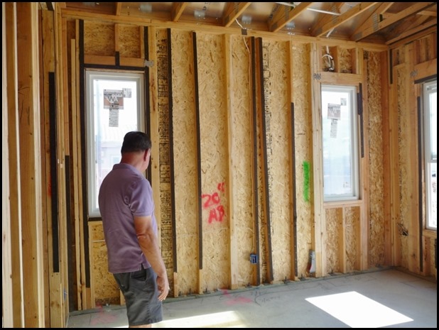
P1150403 (800x600)

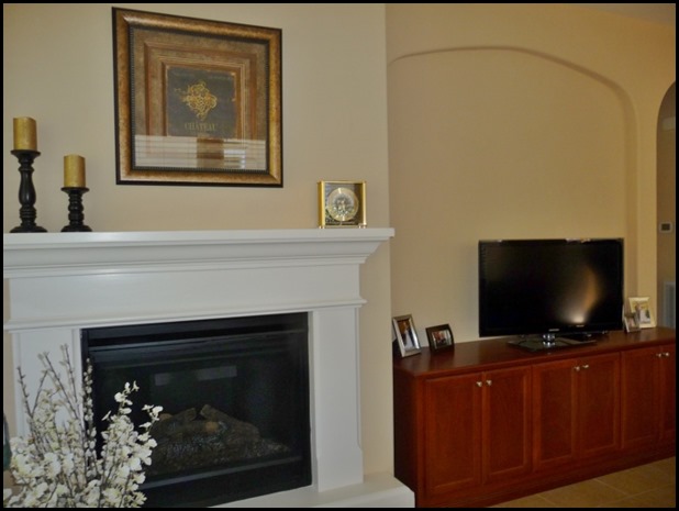
Here is the picture of that wall! We have a fireplace on the right and where you see my hubby standing is a 92in. wall where a console table and TV will be hung on the wall.We thought we were going to have an arch like pictured below…….


P1150116 (800x600)

Worked for this homeowner, but just  not our style so NO ARCHES for us.

I was noticing as we walked around that all the door frames were squared so I mentioned if they were going to be arches wouldn’t they already be framed as an arch and he said yes, but I still asked if  would  double check the master plans to make sure for me. 

Whew!!


P1150314 (600x800)

This is our entry with a temporary door. Small but big enough for one of my small console tables. I have plans for this area!!


P1150315

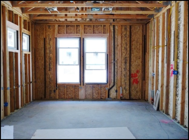
Our Great room, however I am referring to it as our family room. After all it is not GREAT, kind of more medium. 

Love all of the windows since I am all about light, and fresh air. We have 10 ft. ceilings throughout the house.

P1150316 (800x600)

The two windows at the end of this room is our dinette.


P1150399 (600x800)

This is the dinette wall that has the funny little windows that did not make any sense, I am happy to report they are not as bad in person as I anticipated, so that was another good discovery.


P1150402 (800x600)

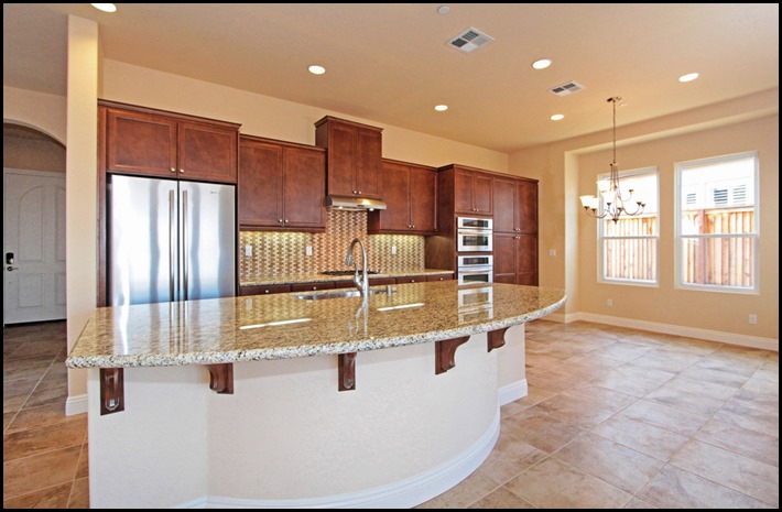
Our galley kitchen, the pipes coming up in the floor is where the sink will be and the 9 ft. island!! 

Where the ladder is standing will be all the kitchen cupboards. Here is a picture of the model so you can have a better reference..

9159619008_93645e3848_b

AND

9157394649_1d80e1594d_b

Next, onto the master bedroom……


P1150317 (800x600)

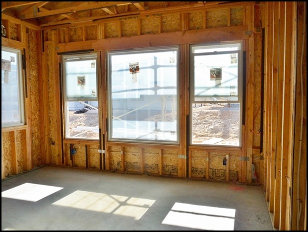
The three windows that you see are the back wall facing the backyard. We added the large window in the center for a view.

I am so glad that we did.


P1150318 (800x600)
The side wall in our master is where our night stands will go under each window, and the bed in the middle.
It couldn’t be more perfect for us.

That’s about it except for one more thing!!! You are about to see something you will probably never see again!

Me wearing orange!!!


P1150410It did say VIP on it, I guess that was suppose to make us feel important!!


Sunday, July 26, 2015

The Process Of Selecting A Piece Of Furniture!


I love the design process, and trust me it IS a process. One that you need to take time, and do some deep thinking, and careful planning.

It has been so fun for me to treat myself like a client, and delve into what I really want my new home to look, and feel like.

PLANNING IS IMPORTANT!

Luckily I am pretty solid in what I like in my home, and the style I like. However, once you start looking around even I find more than one look, or direction my home could go towards. 

This is why it is so important to plan it out carefully and really try to stick to the overall style and design you want. If you just start purchasing elements without a plan you just might end up with a room you never wanted.

 STUDY AND DO YOUR RESEARCH


In studying rooms, and analyzing what  elements I love I have realized I can go a more traditional, elegant coastal look, or I can go a more traditional, relaxed coastal look. I have to admit I probably will have a touch of understated elegance in my home, I just seem to gravitate towards that look.

THROUGH THE EYES OF A CHILD

Even my granddaughter at a very early age when asked by her Mom if they could do something to their home to make it be like Grammy’s home, she replied, “NO!” in a  very matter of fact manner.  

When asked what she liked about Grammy’s home so much she said, “ It’s just fancy!” Of course you have to realize at that time we were reading the, ‘Fancy Nancy,’ books, but we were both amazed at her observations at such an early age.

So I WILL have a touch of fancy here and there, but overall I wish to achieve a more casual look and feeling. 

 I Did My Research


I came to this conclusion after looking at several of the elements that I want to incorporate in my home eventually. 

This will be a process over time for us, it won’t all be done at once. Time or budget will not allow for that.

That is another reason that it is important to have an overall, flexible plan.

I already have my base furniture pieces, and will actually only have to purchase, maybe two items. I will know better once we move in, and have everything in its proper place.

One item I know for sure that we have to purchase is a console cabinet for the wall that our TV will be going on. 

We have one wall in the family room where the TV and our fireplace will be placed.

This particular wall is going to be my greatest design challenge, and I am sure I will learn some important lessons along the way. I will delve into this subject more at a later date. I think that will be a post in of itself.

The reason I am bringing up the TV console is it is going to play a very integral part in setting the look and feel of our main living area.

I Did My Homework

The first thing I had to consider is the size and then the style, or feel of the console, and also it needs to have a white finish.. I did copious amounts of sourcing and studying of images of rooms.

I did discover something about myself, I don’t particularly care for the big entertainment units which would actually be a natural choice for this wall. In my looking I found I like a buffet, or console cabinet the best for my design aesthetics.

Scale Is Important

Most TV media tables are a bit lower than will work in our room, we have 10 ft ceilings, and our TV will be placed on the wall so something low would look out of place in my minds eye.

Now back to some of the choices I am looking at. You have to keep in mind two things, I tend to like a more simple look for my home, and I will need a  cabinet that our remote will be able to see the signal. 

I decided that something with a grille, or glass would work, and that way you would not see the inner workings as readily as when they sit on a shelf. 

The glass doors would have a bit of a reflective glare that would camouflage them, or a grille would hide them almost completely.

The looking began with the size in mind first, and then the style, and one more thing, the finish needs to be white.
CHOICE #1
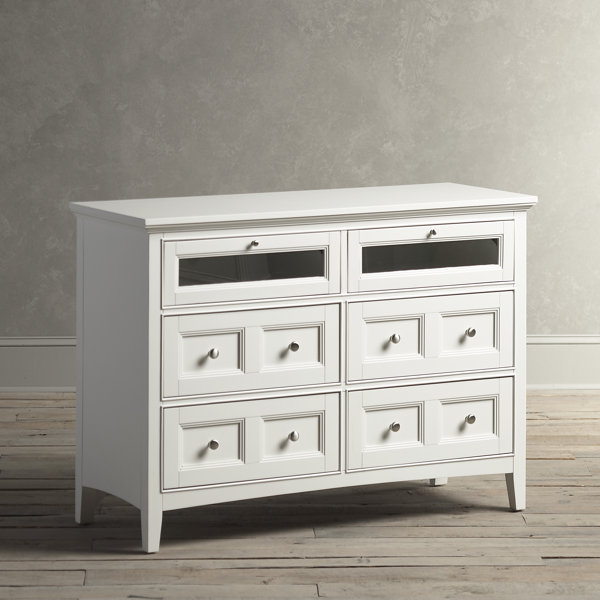
Birch Lane Tilton Media Chest

Simple, clean and fresh, has good storage, and a place for the components and a very good price point.

This cabinet is tall enough and the depth is good, but it is only 50in. wide which will work, but I think I might need a bit wider. 

To be honest I won’t really know until all the other pieces are in the room.

CHOICE #2
Belgard Media Console

Right size, right style, but this will have to be painted so we have to consider adding an extra cost factor to this one. 

I am also very enamored with the X motif, and have plans on this design element in another area of my home so this would make a nice visual flow by repeating the X motif element.

It also comes in a style that has some more storage and is a bit higher by 4 in. I just might need the height because of the 10 ft. ceilings……

CHOICE #3
Belgard Cabinet
I think this has a lot of character and it would also work nicely in our home.

CHOICE #4

I found this very interesting, but I would have to contact this company to find out just how big each drawer is to see if it would work with the components. 

It is already white, and has hardware that will fit in the overall design aesthetics of the room. It is all about the details.

CHOICE #5
Larger
This is just the right size, but we would have to pop out the panels, and add glass, and without seeing this in person, I can not judge if this would be possible.

This is a bit more traditional with more going on with the details, but I like it’s details.

CHOICE #6
French Casement 80" Glass Media Console

This is just the right style, white and has glass, the only problem with this one, is it goes from the smallest width of 50in. which I think will be too small all the way to an 80in. width which I fear will be too large and overstated for the size of our room.

As I said before, I will know more once we move into our new home, and see how all of my furniture looks once placed in the room.  I did make up three possible furniture placement plans to try.

Plan A
 
furniture floor plan New House
I have a room plan and it all fits on paper, but any designer will tell you what looks good on paper does not always translate in the room.

Plan B
Furniture floor plan New House 2

However, we still need to do a floor plan so we do not make unnecessary purchases. Design is not an exact science, but one of creativity, and individuals interpretation. 

Plan C
new house furniture floor plan

That is why there are so many different styles to choose from. What is pleasing to one homeowner might be distasteful to another.

So there you have it!! Which console is your favorite, and which room plan do you like?

I have been asked what is the program I used for the room plans, here is the link if you are interested click
HERE!


Thursday, July 23, 2015

Our New House Has It's Front Facade!!!

   
 CHARM IS BEING ADDED TO OUR HOME!!

P1150324 (800x600)

Things are moving right along with our new build home. 

We made our weekly visit to the job site and we were greeted by our sweet little cottage’s front facade being worked on.

This is one of the things I was so looking forward to seeing done because this is what is giving my home it’s cottagey feel.

P1150325 (800x600)

We now hove siding, shakes, corbels and board and batten, plus a charming little square vent cover in the front. 
Our porches support column now has its top and bottom finishing touches. 

It is all coming together nicely. Can’t wait to see it when the paint gets applied, that will be the finishing touch.

P1150328 (800x600)

This is all very exciting to us!


P1150330 (800x600)

The front window will have black shutters, which is exactly what I would have added if they weren’t already there. 

There just might be a window box in our future, if the HOA allows one. 

We will have to get use to living with the constraints of an HOA, but I remind myself the rules that might bother us are also the rules that protect us from others that might not keep there homes up to the standards of the community.

It  has been even more fun than I anticipated, watching our house being built.

More To Come!!


Monday, July 20, 2015

In Search For The Perfect Element For Our New Home

 
Do you ever get a picture in your minds eye of what you want something to look like, or maybe it is just one particular element in a room, and then you can’t find it!!?

Well that is what has happened to me.

I love to be inspired, and when I look at images it will sometimes make me start visualizing what I want in a room. That is exactly what happened when I saw this image…..


New house office

I was looking at rooms with navy walls because that is what I would like to do in my hubby’s den/office. 

See that fantastic round window on the left? 

I don’t have a round window in my home, however that window inspired me to do a round mirror on the window wall, one on each side of the bank of two windows on the back wall in the office/den.

Surely this will be a slam dunk to find a simple, nicely white framed round mirror at a reasonable price!

Apparently NOT! I pinned several mirrors that were round, some would have to be painted, and none were what I had pictured in my minds eye.

I needed it to be 22in.-24in. in diameter, a nice white frame, and a reasonable price point.

Gray Round Camden Mirror | World Market
Nice mirror, simple frame,  good price at $99, but I would have to paint it white.

acacia wood 24" mirror

More of the same and this has to be painted as well, it is the right size at 24in., however this cost more for basically the same look. This one is $129.


Bassett Locklyn 24" Round White Wall Mirror
Getting closer, it is white, has simple grooves around the frame giving it a bit of character. 

This one is also 24in., looks pretty good to me, a real possibility at What? $152, a good deal, but when I have seen two others for less, it makes me hesitate pulling the trigger. Are you like that too?


Ortley Gold Porthole 24 1/2" Round Convex Wall Mirror
I  saw this one which definitely has a nod to a Nautical feel, but that was also a problem, I don’t want to get to kitchy in his office/den even though I am leaning towards a Nautical feel for this room.
It is a wonderful mirror with the convex glass mirror, that is what caught my eye, but it is just a touch too thematic for a base piece in the room. 

When doing a nautical or coastal  look, one has to be very careful to not go overboard with kitchy, thematic elements.
Because of the convex glass, and the nice detailed wide frame this one came at a heftier price of $199. 

I could see one of these in a room, or a hallway, but not two like I want to do in my room. Just one step too far for my liking.

So what is a girl to do? Well, this girl is a very patient girl, and has learned that things usually work out for the best in the end, and by waiting I will be sure to find the perfect mirror.

My Waiting Paid OFF!!! 
This past week I took a trip into Homegoods actually looking for someone else, not even thinking about the round mirrors,  and Lo and Behold there it was!!

I heard the angels sing there was a glow of light spotlighting the MIRROR!!!! Not just one Mirror but there were three to choose from.

Did I buy them?
You bet I did!!!

Perfect size, frame, color and price…..

P1150322 (800x785)

Simple frame with some detail to make it interesting, 22 inches, and the best part, no painting, Okay that is kind of the second best part. 

The really, really best part was these mirrors were only, are you ready? $39.99 ! I feel as if the decorating fairy was with me!!!

My first purchase of a decorating item for our new home!!!

I am so glad I did not pull the trigger on the other mirrors and waited until the right one showed up. 
Again it shows how planning and patience can pay off!!!