home about me our home

Thursday, May 30, 2013

When Snips From nature and French Perfume Join


What do you get when you add bits and pieces

 of Nature and French perfume together?


 READ ON!!


Having flowers in my home use to feel like an impossible luxury. The problem was my approach!!

I thought I had to have a plethora of beautiful, expensive blooms to have flowers in my home.


I have since learned that even a sprig of greenery in a small vase can add life to a room.

We all have access to small bits, and pieces of greenery in our lives so we can all add touches here and there throughout our homes.

Look around your home and see what fun little containers you might already have around the house.

Recently I purchased 3 fun pieces from France….
(Fleaing France website, HERE.) to use as containers for small bits and pieces of flowers/greenery.


French Perfume Lab Findings - Octagonal Bases

 
Image of French Perfume Lab Findings - Octagonal Bases


Vintage findings from an old French perfume laboratory.

Vintage footed beakers France stamped in raised glass on the octagonal bases.

Here are the reasons these little French pieces spoke to me:

1. My love of fragrances.

2. As a little girl my Dad brought home some beakers and  vials from his job and I use to mix up lotions and potions and pretend I was making French perfume.

3. My love of Paris and the amazing trip I had with my husband, where he bought me some French perfume from Guerlain that I love!

P1110922

This is how I chose to use them in my kitchen. I just added three simple little daisies. Every time I look at these I smile.

I hope this changes your approach to adding some life to your home with greenery or flowers! 

It is so simple and to be honest I love the simplicity of simple little arrangements in a room vs. large overly done arrangements.

Let me leave you with one  more idea for inspiration……

bottles 010
Three simple sprigs of fern in some vintage medicine bottles on my kitchen window sill.

SOMETHING TO DO:


Now go, and look around your house for some spots you can place some small containers, and get outside and snip away!!

“Enjoy The Process!” Of:

Adding bits and pieces of nature to your home.

BTW: If you like gardens and French perfume, check out this blog post on The Buzz. She will introduce you to a new find in Paris!!

Tuesday, May 28, 2013

Special Touches To Take Your Room Up A Notch!


I love to study the details in a room. When I look at a magazine I will skim over the page quickly, then I will go back and study all the little details that I might have missed.

It is the details that will make a space special.
I actually have a pinboard on Pinterest specifically for DETAILS!!

Today I am going to share a few details that I think can add that extra special touch to a room.


SKIFFERS

Skiffers in Satin Nickel detail by Stairrods UK1

I have never seen these before, but I love this little practical embellishment. What a great way to prevent scuffs from the vacuum cleaner.
They come in different metal finishes too!! Silver, brass and antique brass. Fun little detail!! 

MIRRORS


The reason I pinned this little night stand is I think adding an antique mirror to a drawer front would be a great idea to beef up the style of a simple piece. Adding a embellished pull also adds to the appeal of this piece.

Simple to do too! Just make a template or take your drawer into a glass cutter and have it cut and use silicone to apply to drawer and Voila! A whole new look.
CRISS-CROSS
 
Bathroom designed by Robert Young image via

I love this criss-cross transom above the door. It duplicates the criss-cross element on the vanity. Simple detail but gives a lot of W-O-W factor!!

If you are desinging a den/office, or a room for a man this next idea is so handsome!!

 BELTS AND PLEATING
I love this detail, notice the pleating at the bottom. It is made to look as if the belt is drawing the fabric in, just like a belt would on a kilt. Great detail and nothing was missed on the execution of this idea.

 PLANKING

Planking the walls is a detail we are seeing a lot of, but what I want you to take notice of in this bathroom is how they went up a bit higher for the faucet placement. 

This is so much more interesting than if they had made it go straight across, don’t you think?

Remember when executing a design in your room make sure to add some special details to take it up a notch!!

“Enjoy the Process!” Of:
Adding special touches to a well designed room!

Thursday, May 23, 2013

How To Use Color Spots In Your Rooms


Color Spots!?
What do I mean by color spots?  A color spot is one of the accent colors in your room used in an accessory. The color spot should be  strategically placed in your room in order to make the eye flow effortlessly around the room.

It sounds easy enough, doesn’t it? However if the color spots are not in the right areas in the room the eye will have a jolting affect, and will not be a pleasing  view.

Let’s look at some rooms today, and see if we can pick out the color spots together……….

gray-yellow-and-blue-office-horchow
This room has a color spot of yellow throughout the room. Notice how easily the eye flows from the book shelf, to the pillow, back to the book on the desk top, then down on the floor with the art piece, then we finish our travels on the art piece on the wall. A nice easy flow.


eed1afc080bf601eefa80a89c8dc69f8
I wanted to show you this next image because it is not quite as obvious where the color spots are.

Notice the yellow/gold in the pillows, tulips, lemons? Now look to your far upper right…….. Notice the wall color in the other room continues carrying the eye into another space.

This is a good lesson for all of us. We should step back, and view our spaces in their entirety, not just little corners, or single vignettes. One area needs to be joined by a common element, or color to another area in a room, or in this case, rooms. 

5bf24911eece33cededee1a1f909b652
I love this bedroom and it is one of my all time favorites. Notice the soft turquoise  used as a color spot. The eye moves from the lampshades, to the bolster, to the book on the night stand, and then the eye travels down to the floor, seamlessly.

When choosing your accent colors, try to use them in three strategic spots to make the eye travel easily around the room.

f03490b98d74b5b9a6d776fbf9c22673
This room actually has used two color accents in the room, brown and green. I would like to point out the green today.

The reason I chose green is because I want you to notice that the view outside becomes part of the interior of this room because of the large windows. It is almost like two large pieces of art.

It is important to look at all aspects of your view, inside and out when placing color spots. That is why it is important to step back and look at the room in it's entirety.

Personally my eye starts with the art above the fireplace. I view the windows next, then down to the green ferns in the urns, and  center to the flowers on the silver tray. An easy path for my eye to travel.

Color spots can be brought in by using so many different objects.

Go and take a look at your own room, and see if you have color spots placed around the room for a nice visual flow.

What colors do you use for color accents and what objects did you use for your color spots?

Important to Remember:
You want your eye to visually flow throughout your room. Make sure there is no jolting affect in you rooms.

Now go, and have some fun playing with your accessories, and create your very own color spots throughout the room, always keeping in mind the visual flow!


Sunday, May 19, 2013

PPL! The Cheapest Design Elements For Your Home!


 Now what do those letters stand for? Paint, Plants and Light. "PPL" Remember those three letters as the cheapest decorating tools in your design arsenal.
I have found that those three items can change a look of a room more quickly, and less expensively than almost any other element.


Paint is always an obvious change in any room but lighting, and plants were a surprise to me.
This is how I discovered what a difference a plant could make in a room...........

 One day I took out two plants that I had in my living room to water them at the kitchen sink. As the plants were draining in the sink I walked by the living room and I actually gasped! 
The room that had looked warm and inviting now looked cold, and empty. What??!! How can two $10 plants make such a difference? Well trust me they did. 
I discovered that plants would then become one of the elements I could always afford  in my decorating arsenal.


Now for lighting, this is a vast subject so I will touch on the high points. Do you know how many light sources an average room should have?
 I read a little formula a long time ago that said  find your square footage (example 12ftx16ft = 192sq.ft) then multiply your square footage by 1.5 (192 x 1.5 =288) so that means your room will need 288 watts of lighting sources.An average room should have approx. 4-5 lamps.

 In my own family room that measures 17 x 20 I have 6 lamps,2 sconces and 2 uplights in the corners. 
Do you have enough lighting sources in your room? Most people don't so don't feel badly about that, just become a little more aware and it will help you see your rooms differently. I am going to show you a few rooms that have a good use of "PPL".


 The first picture is done by Brown Design Inc, now imagine this room painted in the wrong color, no plant, and maybe only the bedside lamps. Boring!
 Look at how many lights just in this one section of the room and the color of the paint keeps the room simple and fresh. 
Without that one plant and the bouquet of roses on the nightstand  the room might actually look bland. This is a great example of using "PPL"


In this next room the lighting is amazing. The over sized chandelier and the use of the strip lighting above the cornice molding absolutely breathtaking. Take away one of those lighting sources and the room is not nearly as spectacular.

 Notice the use of the plants, if those were not in the room the room would not have as much life to it. The subtle color keeps this room soft and inviting. I love the "PPL" in this room.


In this next room  we have an all white kitchen with some great old school lighting fixtures, perfect choice for the look of this room. 

The plants in this room come in the form of a beautiful floral bouquet and a bowl of crisp green apples on the counter top.

You see, bringing life to a room with plants doesn't always have to be the potted variety.


This is a bright and cheerful room with a lot of good natural light, but that did not stop them from putting two lamps on the console table, and a great overscaled lantern above the black table.

 The plant life here is of the potted variety but they are placed in just the right areas to make your eye travel around the room to the pops of the fresh green.
So remember PPL, Paint: is it time to make a change? 
Plants: Do you have any in your room? Lights: Do you have enough in your room?


Thursday, May 16, 2013

The Family Room Reveal and A Story


Where do I begin? I guess at the beginning……..

There was once a family room, a very nice family room. “ It is just not ME!” said the magical girl that saw pictures of rooms in her head……

Family room summer look May 2011 026 (800x600)_thumb[6]

You see this girl had a plan, an ongoing plan for many years. She was just waiting for the right time to start the ball rolling.

She only had a few obstacles, time, money, and an unwilling in-house handyman to make her vision come to fruition.

She would drop hints of her desired plan along the way for several years, until one day the in-house handyman was willing to go forward with her plan.

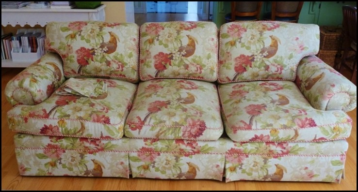
First this sofa had to be changed out from this……..

mantel for Linda 003 (800x600)


To This………
new sofa in room 008 (800x600)
She had waited a verrrry long time to get her blue and white ticking sofa. She had her ottoman rebuilt to her design specifications, and recovered to use as an ottoman, or a coffee table.

Of course a new rug had to be chosen, and this girl just knew a black and white striped rug would be perfect for her. 

Many did not agree in the house, but she realized they did not understand her vision.

You see this girl has magical powers, she has visions, visions of entire rooms beautifully decorated.

Next there just had to be changes made to the mantel………

mantel for Linda 002
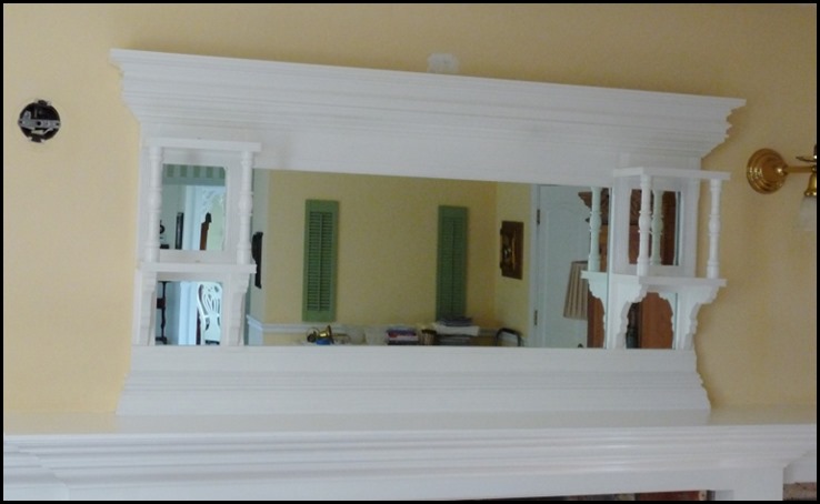
The antique Victorian over-mantel was no longer going to work with the new clean lines, and fresh look of the future family room so……..

The Dismantling of the Mantel began……….

mantel collage
Up the ladder her in-house handyman went ,and then the mantels fancy top came down.

After a lot of planning, and stacking of moldings the girl and the handyman agreed, this was a cleaner, fresher look for the new family room…

Mantel dismantel 004 (800x490)
Now the Victorian lighting is all wrong so we have to come up with a solution. Since the girl has a vision she  knows the look she wants, but has to do a trial, and error on three lights…..

three choices
There was a clear winner in her mind, and yet she still had some in the house that did not agree.

She stuck to her vision and the lights went up………

black sconces 001 (784x800)
By now the new white chairs had been added along with a re-do of an existing small arm chair in a darling buffalo check…..
new sofa in room 012 (600x800)
The girl’s smile was getting bigger and bigger with each new piece.

Next there had to be some changes made to the brick on the fireplace wall.

Now this is where we had a bit of a pause in the story. 

You see the live-in handyman had a deep spiritual tie to the brick. The girl found out it was against his religion in the handyman world to paint brick!

Oh dear this is a big problem for the girl so she comes up with an alternative plan.

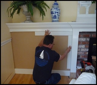
He is willing to move forward with this plan. The side panels of brick will be covered with a wainscoting treatment……

wainscoting and mirror 007 (800x600)wainscoting and mirror 008 (800x600)

There were new accessories arriving……

MIRRORS

new mirrors 004 (800x600)
Uh-Oh! Too much going on with the existing floor lamps. Something has to change.

Meanwhile the live-in handyman is busy working on making the mantel look just like the girl wants, except for one detail…

The brick around the fireplace opening….

 He decides to sit a spell and ponder what to do next?

Pillows are arriving, a new lamp to go in front of the new bright white mirrors arrives, and it is perfect in the girls eyes…..

family room, blue jay and flowers 007

apothecary lamp 002 (600x800)
The live-in handyman even painted an existing side table navy blue for the girl, trying to make her happy…...

Blue end table 001


Blue end table 017 (800x600)

Everything is looking just like the picture the girl had in her head except the last bit of brick!!

THEN……….
A design miracle occurs!!

The ever so handy live-in handyman finally sees the girls vision…..

969705_10152227402650288_52026776_n
247751_10152227402845288_1840378804_n


apothecary lamp 004

So my dear friends we have gone from this.…
Family room summer look May 2011 026 (800x600)_thumb[6]pod pillows 005 (800x594)

And from this to this……..
mantel for Linda 002 (600x800)_thumb[9]
pod pillows 003 (800x600)_thumb[2]

To finally arrive to a much awaited destination to the picture of the room in the girls magical head……

969705_10152227402650288_52026776_n


Now to most this story would be over, but there is still more to come.

For some reason the magical girl that sees pictures in her head has a few more ideas to be added!!
As always …………..


A special thank you to all of you who have followed along with this long journey. I so appreciate your reading, your in-put and your compliments. You all made this journey a lot more fun for this magical girl who sees pictures in her head, and for her live-in handyman.