home about me our home

Tuesday, May 31, 2011

A Fun And Colorful Combination!!

Sometimes I come up with an idea that  I really love!!Recently while doing the playroom I had such an idea.
I love light!! Natural light and ambient light!! Even in the playroom I wanted some ambient light. It had to be fun and colorful, after all it is a playroom.
So I took this…………
ledberg-light-strip-white__0118366_PE273980_S4 14.99 for three (500x500)
Ikea’s ledberg-light strip, sold in a package of three for $14.99

I added it to the top of two of these………………..
billy-bookcase-white__80158_PE194633_S4 59.99 (500x500)
Ikea’s Billy bookcase $59.99 each
So far not too exciting until I found these……….

superfin-vase-assorted-colors__0114590_PE267139_S4 2.99 (500x500)
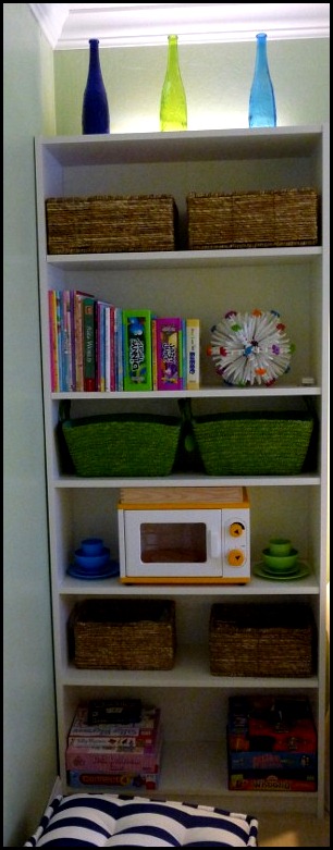
Superfin vase for $2.99 each. I purchased six of these fun and colorful vases in the cobalt, turquoise and lime green. I then placed them on top of the bookcase in front of the strip light and created this………

playroom progress 007 (600x800)
The above picture was taken during the day.

I love them the most at nighttime!!playroom progress 012 (800x600) (2)
Come by tomorrow and I will be showing the rest of the playroom!!!

“Enjoy the Process” Of:

Adding a fun element to create some ambiance!!

Kathysue

I am linking up to Kim's Party at Savvy Southern Style
Wow Us Wednesdays
Click here to join the party 

Sunday, May 29, 2011

Why I Write About My Thinking Process!!

I would imagine some of you might think I over think my design work from reading the post that take you through my thinking process.

The reason I do posts like these is that you, my readers, can possibly think of your own process in a new way.

Throughout my years of being a design consultant for over thirty years I became somewhat of a teacher to my clients.

I was always gratified the most when I could teach them a new way to look at their own home more objectively. I wanted to leave them with the tools that they could use in making future decisions for their home.

I knew that I would not always be there when they are shopping for their home, and I wanted them to use the tools I had given them to help them through the process.

Throughout the  years I have had many clients and several of them I call, “Friend!” One friend/client in particular always fascinated me with her questions and her confidence in me.

She would always ask me, “ How do you do that?” She was referring to  how I would know where to put items in a vignette or how I knew to purchase a certain item for her home. Often times I would say, “I don’t know, I just seem to know!”
This particular client is a professor of psychology at a major University. It is her job to understand how people think. She brought to my attention how others might need to know the process of how I think and why.

This is the reason I write about my process at such length……….

By making your thinking visible (that is, by explaining how you go about the design process) you provide scaffolding and appropriate support that allows others to think about  similar work.
Your comment about there being no right or wrong in the design world then allows people at all levels of expertise to buy-in to the process, and begin thinking about how they will approach their own project.  
Not sure you realize what an incredible gift that is, but in the world of cognition, teaching and learning, what you do, and how you think is EXEMPLARY!
AMAZING!

Needless to say I was blown away by her wonderful comment to me on a blog post I had written. That being said, it also made me realize I need to keep doing post on my thinking process.

I know not all of my readers will enjoy these types of post, but for those of you that do, I truly hope I am giving you some food for thought that will help you in making decisions for the process of making your house a home. 

Sometimes I wonder if I am hitting a cord with my readers.  The only way I can tell is by the comments that are left. I so enjoy reading each and everyone of them, and I want to thank you for taking the time to leave a little piece of yourself with me!!! Without all of YOU this blog would not even be worth doing. 

I hope you will continue to allow me to do what I love doing………

Enjoying the Process of:
Helping you make your house a home!!

Sincerely,
Kathysue

PS...... Thank you to those of you who are leaving a comment on this post, it will be really helpful in letting me know if I am on the right track. XO KS
 
BTW: If any of you are having a problem leaving a comment would you mind emailing me and letting me know. Apparently some bloggers  are having problems and I was notified that they had a problem on my blog. Just email me at Goodlifeofdesign@yahoo.com
Thank you so much, KS 

Saturday, May 28, 2011

A Tisket a Tasket I found a Basket !!

I made a trip to Homegoods and I found a basket just like the pottery barn basket for $59.00 instead of the $129.00. After seeing it in person it looked huge so I had to re-evaluate my plan.

Next I saw a basket that was a little shorter, but the color shape and width were perfect. The texture was much smoother, but I liked that aspect. It was definitely worth a try at home so into my basket it went. At $29.99 it was more than worth it.

magazine basket 001 (689x800) (689x800)
This basket was  handmade by the women of Lombok Island, a small island East of Bali in Indonesia. It is beautifully and skillfully made so, even if I were  to find another basket ,I would keep this one and use it in my master bedroom to hold books.


magazine basket 004 (800x600)

Next I went to the clearance aisle. They had two varying sizes of square baskets with lids. The large one was on clearance for $12 and the smaller one was only $9. They are not skillfully made like the other basket but I like that they have lids to hide what is inside.

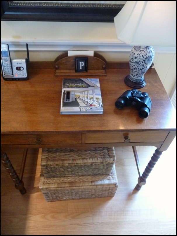
I have a desk in my home that was mine as a little girl. In fact underneath the desk I have the name of my childhood heart-throb written.

magazine basket 014 (600x800)

magazine basket 026 (394x800)
Under this desk you could see the cords to the phone lamp etc. and it annoys me. Do you all hate cords as much as I do? Well, these baskets stacked on top of each other hide the cords and hold magazines and the extra decor books I have that won’t fit on the shelves. Score!! into the basket they went!!! I just  solved two decorating issues with one trip to Homegoods. I love when that happens, don’t you?
In January I wrote a post where I said that I wanted to add more baskets to my home this year. I think I am on my way…….
“Enjoy the Process” Of:

Adding texture and storage to your room with baskets 
.
Kathysue

Friday, May 27, 2011

Making Choices!!

Making choices is not always easy when it comes to our homes. Have you ever noticed that when you don’t have the money  you find all kinds of things you think you would like to buy? Then  when you have the resources, time and money to get what you want you can not make up your mind?
Why is that? I think it has to do with dreams vs. realities. When we face reality  we will choose the elements based on three things:
  • Availability
  • Affordability
  • Practicality
Those three words will throw us into reality in short order. I personally think these should always be in the formula of what will work in my home.
I am an advocate for planning. Without an over-all plan for the design of a room in our home we cannot make compromises that might possibly have to be made due to, availability, affordability, practicality!! By having an over-all plan for the look and feel we want a room to have, we can make good decisions based on the above criteria.
If you find something you love, but there is no way you can afford what you want how could you possibly make a compromise if you do not have a plan, direction and feel you want  for your room to have?
After you decide on the direction and feel you want for your room to have, you must then think of what the element you want to purchase will add to your room.  What is your objective for wanting this in your room?
For instance:
I am on the hunt for a basket to sit by my reading chair. My objective is :
  • storage for design magazines and books
  • something to fill an empty space
  • needed warmth and texture
  • round or oval shape to soften the hard edges of the brick
  • size can be as high as 21” by 20 in diameter
  • light in color to brighten the area in keeping with my summer look.
You can see from my objectives that a basket will fit the bill perfectly!!
family room baskets 001 (600x800)
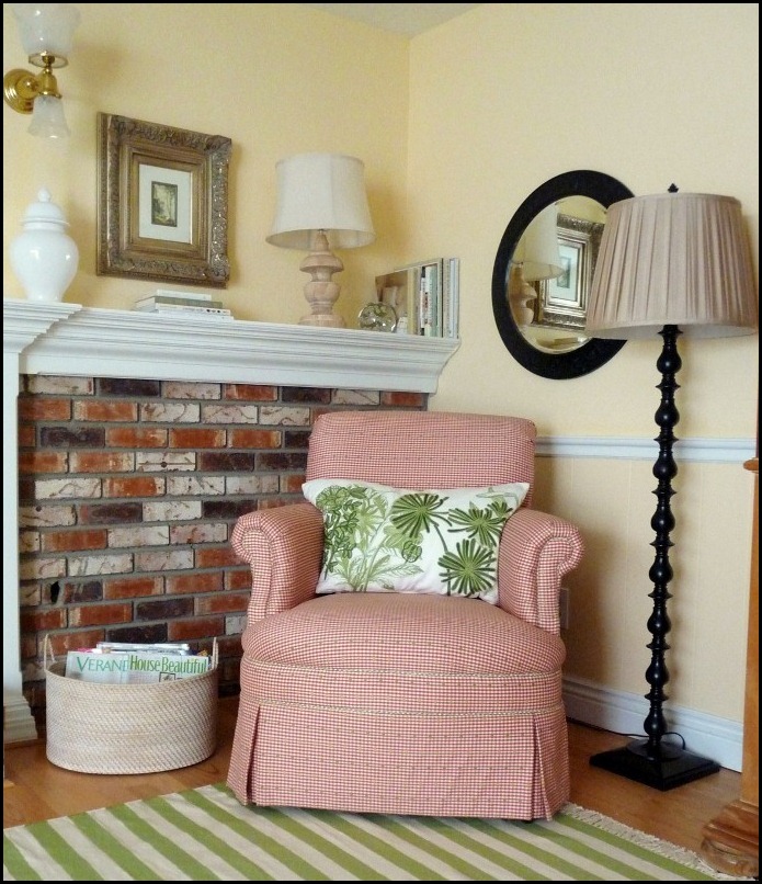
(On the left side of the chair is the area where I would like to place the basket.)
family room baskets 003 (600x800)
I tried this basket, but it looks a bit small and I think I want a bit lighter color.
family room baskets 004 (600x800)
I used my laundry basket as a model for what size would possibly work. You should have seen my hubby’s face when I sat this basket in the family room!! He said, “We have spent thousand’s on this room and you are going to use that?!!” I of course cracked-up, and  I re-assured him this was just a prototype of what possible size would work. The basket measures  19in. high X 22in. wide. Now I have the size I need!!

Now for the reality formula!! What is available, affordable and practical.
This is what I have in mind:
Pottery Barn
$129
img61l (800x720)
Extra large basket 21”diameter X 23.25 high.
It is textural, warm and will hold books and magazines. It meets all the criteria except for one, Affordability. This is from Pottery barn and is $129. Not a huge amount of money, but for a basket to hold my items I would like something for less and so would my Hubby!!

I have my objective so now I need to shop around with my plan in mind!!
I know I can get a basket at Homegoods that will probably look very much like the one above, but that will take time and patience. Aah-Hah!!
Another piece to the puzzle in our plan: Patience!! Now, that is a tough one for most of us. I read a post over at Karen’s blog,”Strictly Simple Style,” that made me think about writing this post. She addressed the issue of, “Making Do!” Be sure to visit her blog and read this post!!

Now back to the basket!!! Availability and  Affordability!!!!! Let’s shop around to see what is available and a bit more affordable……..
Ballard
$39.00
ballard $39 Overall 19 34H  19 14W 18 12D
It is light in color, oval in shape and the size is a bit smaller at:
18 1/2” deep by 19 1/4” wide, but it would still work. (Sherry sent a picture of this to me. Thank you, Sherry!!)
The price is definitely less, so will the compromise in the overall style be worth it to me?? I think I will look around a bit more…..

ballard 3 for $119
Ballard has  a set of three for $119!! Let’s see... divide that by three and it is approximately $36 per basket. The only problem is, I don’t need three and these are rectangular. I think the shape is too harsh with the hard lines of the brick.
Onward we go………

Crate and Barrel
$59.00
basay basket crate and barrel $59.95asket. 20.75 dia.  23.25H
Shape is perfect!! Color is light!! Price is better!!
The size is a little over 23.in high X 21in. in diameter. A bit higher but it includes the handles.
Things are looking better to me!!!!

Wisteria
$59.00
w5457-large wisteria $59Dimensions 22w x 21.5dia. 22
Color? Check. Shape? Check. Size 22in wide and 22 in high.
This does appear to be a bit more roughly textured than the one at Crate and Barrel. It is also more like the Pottery Barn basket. Notice the top rim and the handles are the same as the Pottery Barn basket. It is probably because Wisteria is a sister store for Pottery Barn.

I think $59 is reasonable and each of the above baskets meet all of my criteria. So which one will I choose, or will I wait until I can find one at Homegoods?  You know they will have one for around $29.99 or less. That would be a savings of $30, hmmmmm???? What will I do??????
To be continued…………
I need to go shopping!!!!

“Enjoy the Process!” Of:

Making an overall plan of attack to achieve a look and feel for a room or an element in your room!!
Kathysue

Wednesday, May 25, 2011

Look What Sherry Did For ME!!!!


With every room design, or re-do there has to be a plan. I am a big planner!!! I have to know what direction I am headed before I venture out. I know there are those who just go for it, and often times it works for them, but in my life I have to have a general over-all plan of where I will possibly end up.

I have talked about how important it is to stay true to who you are when it comes to designing or choosing elements for your home. I personally have a very fine line with what will be pleasing to my eye.

Not too many people get me!! Recently through some fun email conversations with the ever-humorous, talented Sherry Hart from Design Indulgence blog,  I told her of my plans for my family room that was going to change due to the fact of my recent purchase of a new green and off-white striped rug from Wisteria. In just a few conversations, Sherry got me.

She actually took it upon herself to put together a poly-vore board for me. That alone impressed the heck out of me. To think that someone would do that for me. I am the one that is usually helping someone with their room design. I have never been on the receiving end. Let me tell you it almost overwhelmed me that someone would be so generous, but that is Sherry!!!! Generous to a fault.
Let me show you what she put together for me……

untitled (500x500)
I could not believe my eyes!!!She nailed it!!! I loved each and every element she applied to the room. She added the white chairs because I mentioned the possibility of maybe some in my future.
A couple of the elements I had considered already, such as the wooden turned lamp and the rustic basket. I already had some blue and white porcelain, but not mixed with the white.

 What I had not seen was the amazing green embroidered pillow. I also loved the black sconces and the wood octagon mirror. I had thought of using a basket for a coffee table but not a rough metal and wood table.


I know that she has been such a wonderful, and faithful reader of my blog. She is a true designer, she obviously listens and observes. I imagine she had a clue from seeing what I liked and what was already in my home, and she came up with a wonderful combination of elements that she titled: Nantucket Family room!! I love that!!

If I had to describe my style it would be Casual-Elegance. I require light and bright with a fresh crisp color pallet. I love symmetry and I lean more towards a traditional feel.


Sherry did tell me this:

"I just tried to keep in mind the pictures of your home by looking at your home tour. A little casual, not country, not beachy but more sophisticated and classic, timeless."

I feel that Sherry truly gets me!!! I admire her design aesthetic and I would not be afraid to ask her opinion because I know this blogging friend truly gets me!! Thank you Sherry for diving in and doing the poly-vore inspiration board for me!

Now I need to get that basket from Pottery Barn and a couple of mirrors and I am set!!!
“Enjoy The Process” Of:

Getting wonderful design advice from a generous fellow blogging friend!!

Kathysue

Monday, May 23, 2011

My Summer Family Room Reveal!!

Now that summer is right around the corner I have made some changes to my family room. My objective was to lighten and brighten my spring look, and make it look a little softer and lighter for the upcoming summer months.

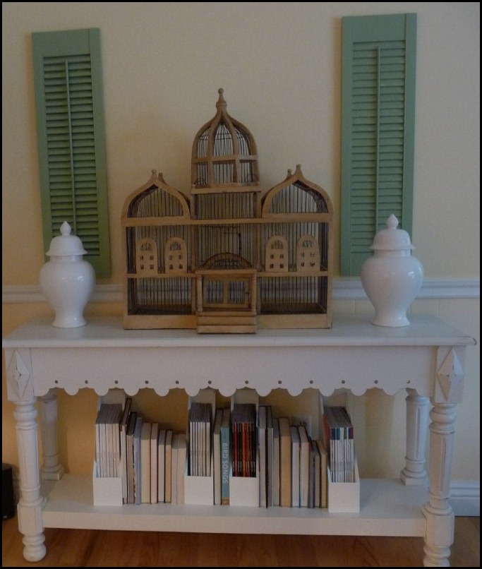
As you enter my family room if you look to your right  will see a console table. I have some of my precious design magazines. and design books on the bottom shelf. You will notice that I have the book’s page side turned outward. I did this in order to keep a lighter, softer look in this area.

The shutters are vintage. I found them at a salvage yard and painted them the same color as my kitchen cabinets in the adjoining room.
The bird cage was purchased many years ago. and I still love what it adds to the room.
Family room summer look May 2011 028 (677x800)

In this next image you will see the same area. I have switched out the white urns for some clay pots filled with flowers.
Family room summer look May 2011 019 (677x800)


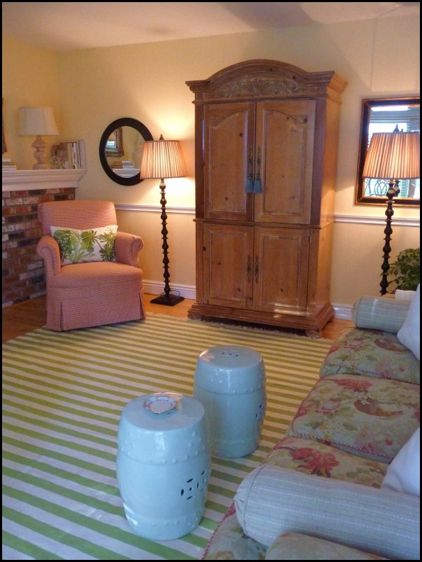
As you continue into the room on your right is the door to our garage. The natural pine armoire holds our TV. The black floor lamps I have had for several years and I was using them in another room. I placed linen shades on the lamps in order to tie in with the sofa fabric which is also linen.

You will also see my new green striped rug that I purchased from Wisteria. I am in love with this rug, and I am enjoying how  cheerful it is making the room.

(Future plan for this wall is to get two matching mirrors with the floor lamps placed in front of each mirror just like the lamp is on the right of the armoire.)
Family room summer look May 2011 010 (800x600) 
In the next image facing the fireplace if you look towards the right corner you will see a small reading chair. I love this chair for its comfort. The higher than normal arms makes for a great reading chair. You will notice the fabric on this chair was also used on the sofa as cord welting. This chair has a contrasting welt in a small green check. The embroidered pillow was purchased from Pottery Barn on clearance. It is 16X26 in. I used a standard size down pillow which is 26in. in length and it fit nicely. 

Family room summer look May 2011 033 (600x800)

Family room summer look May 2011 023 (600x800)
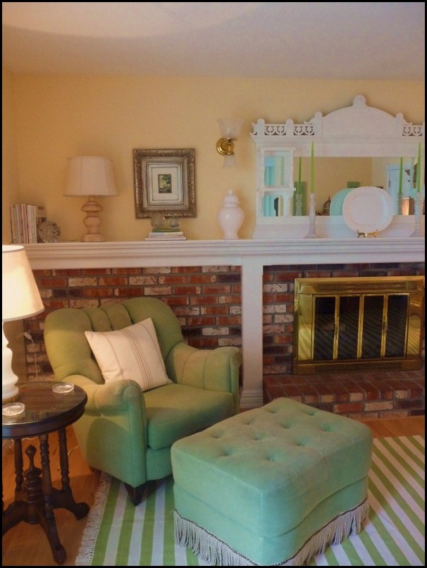
To the left of the fireplace in the other corner is the most comfortable chair we have in our home. We all love to sit in this chair. I added a light linen colored pillow with a stripe that is a soft simple look. I purchased this pillow at Home goods. It is a Ralph Lauren pillow. You can catch a glimpse of a vintage 1940’s milk glass lamp that I added a linen shade too tie in with the other lamps in the room.
Family room summer look May 2011 023 (800x600)
You can see my dining room green striped wallpaper in this image. It is amazing how much it looks like  my new rug. This shows my sofa with two white pillows and a white throw. I am still working on a pillow combination for the sofa. I have some samples of fabrics coming in the mail this week. I will also be adding a white linen pillow from Pottery Barn with a brown wood button closure as seen
below………
ivory (383x344)
I think it will be just enough texture and interest to add to the look of the sofa and still keep it light and airy.
Family room summer look May 2011 021 (600x800)
.
Family room summer look May 2011 005 (600x800)
This is the left side of the 17ft. long mantel. I purchased two new wood lamps and topped them off with linen shades. All the shades in the room are linen. The artwork I have had for a long time. It was given to me by my DIL. It is so perfect, both pictures have water scenes and are slightly different. I like the gilver(silver/gold) picture frame. I think it picks up the color of the linen sofa nicely. I also love that it is so formal next to a very casual lamp. I think it makes for a much more interesting vignette.
Family room summer look May 2011 004 (600x800) (600x800)
The picture on the right of the mantel.
Family room summer look May 2011 003 (528x800) 

Family room summer look May 2011 006 (800x596)

Mantel #1
Family room summer look May 2011 015 (800x600)
The entire 17ft!!! I have added the rough clay pots which add some texture to the composition.


Mantel #2

Family room summer look May 2011 018 (800x600)
A little more white is added by adding the white urns.
Which composition do you like better, the clay pots or the urns?

Family room summer look May 2011 026 (800x600)
Future projects for the family room to the dismay of my poor hubby are:
  • Add white picture framed wainscoting below existing chair rail.
  • Cover used brick with white wainscoting.
  • Remove brass fire screen and add a black wrought iron screen.
  • Change brass sconces out to traditional black iron sconces.
  • Cover opening of fireplace with Carrera marble.
  • Cover the hearth with Carrera marble.
  • Add crown molding.
  • Reupholster sofa in small cornflower blue ticking stripe with green corn welting.
I told you I am a planner!!!!

I hope you enjoyed my little tour of my family room!!!

Kathysue is:

Enjoying the Process of playing house!!!

 BTW:
I am linking to  Sherry Open House Party  #9 at:
No Minimalist Here blog!! 

and

Home May'd Spring/Summer Link Party At:
Layla's blog:
The Lettered Cottage

and
Courtney's
 

Saturday, May 21, 2011

What Does All This Equal===

If you put this………

Family room summer look May 2011 042 


With a lot of this……….

Family room hints 016 (800x600)


Add a couple of these……….

Family room hints 011 (800x600)


With just a touch of this………..

Family room hints 002 (800x528)


and only one of these………….

Family room hints 005 (800x576)

and one of these……….

Family room summer look May 2011 043


With just a couple of these…………

Family room hints 013 (800x600)


All on top of this………….

Family room summer look May 2011 007 (800x600)


Making sure to add a bit of texture with a couple of these……..

Family room hints 010 (600x800)


Grounding it with a touch of this………..

Family room hints 015 (800x600) 


and making sure you add a touch of black………..

Family room hints 003 (652x800)

What do you think you will get????

“Enjoy the Process of:
 Putting together puzzle pieces!”

Kathysue

Friday, May 20, 2011

I WON!!!

The lovely Emily Clark had a giveaway on her blog and I won!!!
What did you win? You ask!!!!

First I have to tell how wonderful this is for me……….. Several years ago I passed up some lovely fern prints at Homegoods. I wanted to use them in my family room for a summer look.
 I always think of cool and shady spots dripping with moisture when I think of ferns, so it is only natural to have them for a cooling effect for summer(or at least that is how my mind works.)

Emily’s Giveaway was from a lovely Etsy shop called, Saturated Color.
This Esty shop featured antique book plates!!! Are you starting to get the picture?

I won not one, not two, but three antique fern bookplates from this lovely shop. I can hardly wait to get them and frame them. I know exactly where I am going to put them!!!

Here is a small sampling of some of the loveliness you will find at:
2 (570x448)

1 (570x784)
3 (570x716)
untitled (512x800)
She has sooooo many more to choose from, so be sure and visit her shop


Enjoy the Process: Of

Browsing through a lovely shop on Etsy

Kathysue


http://www.etsy.com/shop/SaturatedColor?ref=ss_profile
Tuesday, May 17, 2011

My Colorful Window box and Shutters


My window box is in my backyard. I only have one and I love it!!
The image below is a picture from last year’s window box.  Although the front of my home is  painted yellow the back is painted in a  cooler color scheme. We live in a hot area during the summer months and I wanted it to appear cooler so I chose a soft sage green with bright cobalt shutters! Are you surprised!!!

It is funny how most visitors don’t even notice the transition so I guess that means it works!!!

The cobalt has allowed me to display many fun color combinations. Below is a display of cool blues and greens. Another year I had all white hydrangeas. This year I am still working on the display. I will give you a hint, the base color is bright pink!!! With all the helpful hints that Debra Phillips gave in her post, "Container Design in Three Steps!" I think I will have a lovely display when all the plant material fills in.(Click HERE to read article)

Backyard bubbler 010 (598x800) 


Backyard bubbler 008 (600x800)
The left of the window box.


Backyard bubbler 007 (800x600)


Backyard bubbler 012 (600x800) 

The right of the window box.


Backyard bubbler 017 (678x800)
The water feature right under the window box. You can’t tell in this image but in the center of the rocks is bubbling water that makes a wonderful sound.


Backyard bubbler 016 (800x600)


Backyard bubbler 010 (598x800) 

So there you have it!!! My brightly painted shutters and window box.

I will have to admit I don’t think I would be brave enough to have used this color combination in the front of my home, but it sure is fun for the backyard!! Could you use a bright colored window box somewhere on your home?

Kathysue