home about me our home

Sunday, October 31, 2010

I Was Brought to Tears

Since today is Sunday I thought I would share a picture of a statue that touched my heart while visiting Saint Paul’s Basilica in Rome.

I entered and looked to my right and there it was!! As a mother I immediately felt  emotion.
 As I looked at her face she looked so serene for she knew this was how it was suppose to be.
 There she was holding her son Jesus as he lay lifeless after being removed from the cross. To know that when this child was born this would be his destiny. My heart ached for her. It was truly moving. I could not stop the tears, they just rolled down my cheek.

This statue was carved out of one slab of marble by Michaelangelo when he was only twenty-five years old. What a gift from God. His hands had to be guided by something higher to create such beauty that would be so moving and make all who view it feel such emotion.

Holy Land 2010 268 (600x800)
Holy Land 2010 265 (800x600)
Notice her bowed head and her left hand lifting upward as if to give him back to God. This is just so moving to me as a person. What a blessed savior.

Kathysue

Friday, October 29, 2010

One of those “DAYS!”

untitled (400x265)

Do you ever have one of those days when you look around your home and everywhere you look there is something to re-do or clean-up?!

I usually get in this mood with the change of the seasons. Since it is now officially Fall in California, I am in a mood.

I guess I should just re-group prioritize and dive in!!
What do you do when this kind of mood hits you?

“Enjoy the Process” (If you can) Of:

Getting it all pulled together around the house!

Kathysue

Thursday, October 28, 2010

Being Centered!

We have all heard of Being Centered in reference to ourselves. Being centered is important in going through life. Today I am not talking about our personal beings. Today I am talking about our homes actually our entry halls.

I have always been attracted to center hall tables. I have not found too many examples of center hall tables. It is probably because our homes are not as grand as they once were or as spacious.

I for one would love to have a center hall table but alas my home is not large enough. Instead of having a center hall table I will just dream and look at images of center hall tables like the following…………..
1007p095_len_2[1] (383x510)
branches (568x450)
flowers (499x499)
This is gorgeous!
Max and Col. (468x537)
simple (470x540)
untitled (460x360)
I don’t know about you all, but I feel sooooo centered now!!!
“Enjoy the Process” Of:
Enjoying images of something you love!
Kathysue

Tuesday, October 26, 2010

Celebrating “60” In Egypt!!

As some of you know I have been on a three week vacation to Rome and on a Mediterranean cruise.

 Hubby and I went with two other couples that are long time family friends. While we were on this trip I celebrated my 60th Birthday. Here are just a few pictures of what I did on my 60th.

It all started the night before where Hubby surprised me with a Birthday dinner in the beautiful Murano restaurant on board ship. The dinner was amazing and the company was the best!
Holy Land 2010 744 (800x595)
I am the Birthday girl sitting at the table with the love of my life.

Holy Land 2010 746 (800x600)
A special Birthday cake. Yum chocolate, my favorite!!

Holy Land 2010 745 (747x800)
The waiters singing Happy Birthday with all kinds of accents and notes!!!

The next day off to Egypt to see the pyramids!! My son wrote this Happy Birthday note to me……..
I wanted to wish Mom a Happy Birthday! Not sure I'm comfortable with the symmetry of being born on Friday the 13th and visiting the Pyramids, a place renowned for ancient curses and all other manner of spooky stuff on the same day, but to each his...her own. ;) Hope you enjoyed your day and I'll see you guys when you get back. Love you!

That is right I was born on Friday the 13th 60 years ago!!! Love his sense of humor.

Holy Land 2010 823 (800x475)
It was a bit windy but warm and lots of dust in the air. The little numbers on our shirt are our bus numbers. Trust me there were a LOT of buses there!!!

Holy Land 2010 840 (800x312)
This picture not only shows the line-up of buses but the two largest pyramids and the Sphinx. It was truly amazing to be there in person.

Holy Land 2010 834 (800x600)
A close-up of the largest pyramid. Our tour guide told us the pyramid weighs over 11,000 tons. Amazing!

Holy Land 2010 830 (800x600)
This is a great shot of the individual stones and how they stair step upward.

Holy Land 2010 836 (800x315)
Full length of the Sphinx.

Holy Land 2010 842 (800x598) 

I had to take a picture of this image.  Yes, even in Egypt they have one of these……….
Holy Land 2010 788 (800x600)


Then we sailed off into the sunset……….
Holy Land 2010 855 (800x596)
………Tired and full of awe. This is a Birthday that this girl will never forget!!
Kathysue

Sunday, October 24, 2010

A Pumpkin for A Princess!!

Every Little Princess or big Princess for that matter needs a pumpkin like these……….
pumpkin carriage[1]

ss_100090394[1]
I found these last year and had them in my Fall Inspiration file. I think these are adorable and totally doable. So fun and unusual.
I hope this inspires your own imagination to run wild!
“ Enjoy the Process” Of:
Decorating your pumpkins in fun an unusual ways!
Kathysue

Saturday, October 23, 2010

H-O-P-E !!!

Hope! We can all use a little hope, can’t we? I just read a new definition of HOPE that I really like and wanted to share it with you.
H-O-P-E
Holding On Praying Expectantly
It makes you think doesn’t it?
Do you pray expecting an answer?

Friday, October 22, 2010

What is "PPL"???

"PPL" Remember those three letters as the cheapest decorating tools in your design arsenal. Now what do those letters stand for? Paint, Plants and Light.  I have found that those three items can change a look of a room more quickly and less expensively than almost any other element.

Paint is always an obvious change in any room but lighting and plants were a surprise to me. It is kind of funny how I discovered what a difference a plant could make in a room.

 One day I took out two plants that I had in my living room to water them at the kitchen sink. As the plants were draining in the sink I walked by the living room and I actually gasped! The room that had looked warm and inviting now looked cold and empty. What??!! How can two $10 plants make such a difference? Well trust me they did. So that is how I discovered that plants would then become one of the elements I could always afford  in my decorating arsenal.

Now for lighting, this is a vast subject so I will touch on the high points. Do you know how many light sources an average room should have?
 I read a little formula a long time ago that said  find your square footage (example 12ftx16ft = 192sq.ft) then multiply your square footage by 1.5 (192 x 1.5 =288) so that means your room will need 288 watts of lighting sources.An average room should have approx. 4-5 lamps.

 In my own family room that measures 17 x 20 I have 6 lamps,2 sconces and 2 uplights in the corners. Do you have enough lighting sources in your room? Most people don't so don't feel badly about that, just become a little more aware and it will help you see your rooms differently. I am going to show you a few rooms that have a good use of "PPL".


 The first picture is done by Brown Design Inc, now imagine this room painted in the wrong color, no plant and maybe only the bedside lamps. Boring!
 Look at how many lights just in this one section of the room and the color of the paint keeps the room simple and fresh. Without that one plant and the bouquet of roses on the nightstand  the room might actually look bland. This is a great example of using "PPL"


In this next room the lighting is amazing. The oversized chandelier and the use of the strip lighting above the cornice moulding absolutely breathtaking. Take away one of those lighting sources and the room is not nearly as spectacular.

 Notice the use of the plants, if those were not in the room the room would not have as much life to it. The subtle color keeps this room soft and inviting. I love the "PPL" in this room.


Now here we have an all white kitchen with some great old school lighting fixtures, perfect choice for the look of this room. The plants in this room come in the form of a beautiful floral bouquet and a bowl of crisp green apples on the counter top.
You see, bringing life to a room with plants doesn't always have to be the potted variety.

This is a bright and cheerful room with a lot of good natural light but that did not stop them from putting two lamps on the console table and a great overscaled lantern above the black table.
 The plant life here is of the potted variety but they are placed in just the right areas to make your eye travel around the room to the pops of the fresh green
 So remember PPL, Paint: is it time to make a change? Plants: Do you have any in your room? Lights: Do you have enough in your room?

                             "Enjoy The Process" of:

 Adding "PPL" to your rooms
Kathysue
                                                               

Tuesday, October 19, 2010

I AM BAAAAACK!!!!!


Hi bloggy friends! I have been gone for the last three weeks. I hope you have not minded me using some of my archived post to feel in the gaps. Hubby and I have been on a wonderful trip to Rome and a Mediterranean cruise.

 I got to experience my 60th birthday at the pyramids in Egypt.  We saw and experienced so many wonderful things. Good to be back home!! Feeling very tired but blessed to live in our wonderful country.

 I will get back into the swing of things in the next few days. Thank you to all of you for continuing to visit my blog, you are the BEST!!!

Monday, October 18, 2010

Whose Personality Does Your Home Have?

Do you think your home reflects your personality?  We all know that it should but does it?   When you look at a room that you love can you describe it with adjectives?  Throughout blogland we all view beautiful rooms that we find appealing for different reasons and there are certain adjectives  that we use to describe these rooms. Below is a room that I love I will try to use three  adjectives to describe it.

First I have to say, I love everything about this bedroom. Here are the adjectives that I would use to describe it:
Fresh, inviting, elegant

Next I am going to show you a room which I love the paint color. This room was designed by Suzanne Kasler and the walls are a lovely butter cream.  Here are the adjectives that I would use to describe the dominant color in this room :
  Soothing, relaxing, elegant


Now don't fall out of your chair, No! I do not like this at all. The adjectives I would use to describe this are:
Busy, Cluttered, Confusing,

I bet you are wondering why am I telling you all of this and what does it mean to you. Now here comes the participation part. I would like each of you to go to your favorite room in your home and I want you to write down the three adjectives that describe it.

Next I want you to describe the dominant color in your house with three adjectives.
Are you writing all of this down? Good!

Lastly I would like you to go to the part of your house that you would least like people to see, Yikes!  I know this can be painful because you don't like this spot. ( Mine would be my garage for sure, that is a whole other show).  As painful as it may be, write down three adjectives that describe this area.

Here we go:
First, I asked you to write down three adjectives that describe your favorite room in your home.
 You just described your favorite things about yourself !

Second, I asked you to write down adjectives that describe the dominant colors in your home
You just described the personality of the person who chose that color!

Third I asked you to describe the area in your home you would least like people to see.
You have just described aspects of yourself that you are ashamed of and things you try to hide from others.

This is a little test that I have saved for six years that I found in an article in O At Home Fall 2004. I saved this test because frankly it made me think and it revealed something about myself in relation to my home.
So, after all this reading and writing did the adjectives that you used describe YOU and your home?
Something to think about isn't it?


"Enjoy the Process" of:
Discovering the personality of your home.
Kathysue


Saturday, October 16, 2010

Black and White for Halloween

I like to use Black and white for Halloween without the addition of orange!! No surprise there! I have some fun black and white ideas in my files that I have collected that I thought you might enjoy seeing.
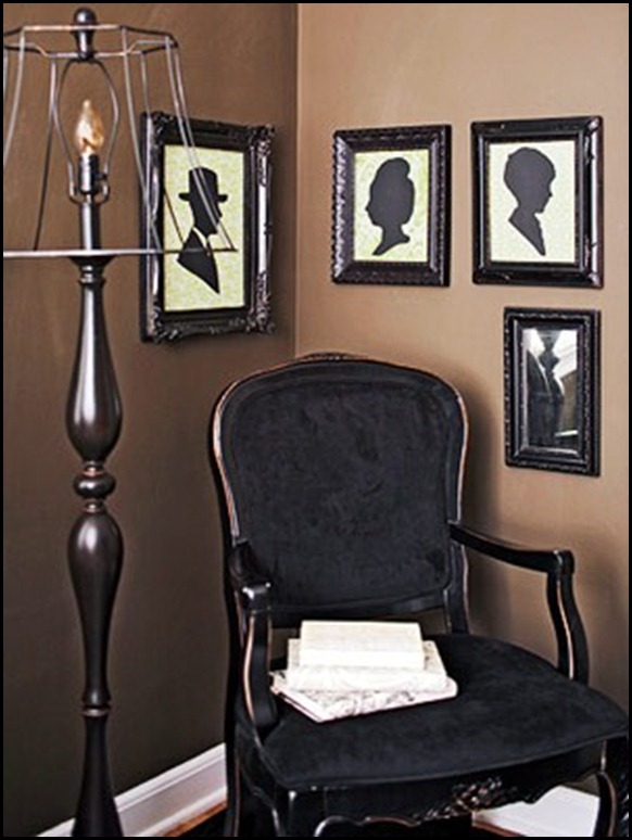
NO FABRIC SHADE (300x400)
What a fun idea!! No fabric on the lampshade and an addition of the silhouettes makes it perfect for Halloween.
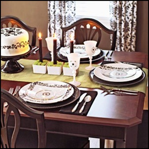
CANDLES IN MOSS (300x300) (300x300)
Black candles in simple green moss.
BATS (300x333)
These would be fun going up your walk-way to greet guest!
CHANDELIER NAPKIN TIES (300x400)
Cute napkin holders.
FAMILY TREE (300x400) (300x400)
The Family tree out of felt or construction paper.
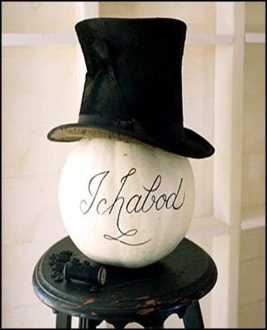
HAT (300x300) (300x300)
This would be great at the front door. Did you notice the thread and buttons on the chippy stool?
MOUSE AND CAT SILHOUETTE (300x400) (300x400)
A little addition of black trip and silhouettes of a cat and mouse chase and you have an instant decoration for Halloween.
OUTDOOR STEPS (300x300) (300x300)
Notice that this is a temporary addition to the steps so after Halloween is over you can take them off. How about a sign that says, “Enter if You DARE!!!”
PARTY (300x400) (300x400)
PILLOW (300x300) (300x300)
PUMPKIN (300x300) (300x300)
SCONCE (300x400) (300x400)
SCRAP BOOK PAPER BACKING (300x250) (300x250)
SILHOUETTE (300x400) (300x400)
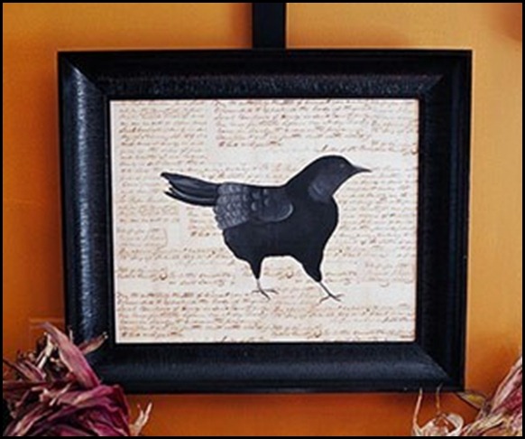
untitled (300x250) (2) (300x250)
Get some Thrift store vases and paint flat black add a crow and Voila! It is a Halloween decoration!!
I lean more towards the fun or cute side of Halloween instead of the scary side. I even think some of these ideas can fall into the category of sophisticated. I thought it would be really cool to have a huge over-sized silhouette of a chandelier in the front window.
I hope this gives you all some fun and inspiring ideas for the up-coming Halloween celebrations.
“Enjoy the Process” Of:
Making your own personal statement with your Halloween Decorations
Kathysue

Thursday, October 14, 2010

"I See Dead Corners!"

Remember the movie where the little boy says, "I see dead people"? Well when I walk into a room sometimes I see Dead Corners.

Have you ever walked into a room and it just feels sort of dead and drab? Do you think to yourself this room needs some life? Look in the corners! Is there a lonely chair or table, does it look a little dead? Corners need life.

 If you are limited on windows in your room the corners can recieve life by LIGHT and PLANTS or both. In dead corners I try to put somethng with life in it a light or a plant.
 I like to use up lights in corners not just behind my plants, which by the way make wonderful shadows on the wall and ceiling, but I will even put them behind the chair that is sitting in the corner,or a large armoire.

 We all know that a floor lamp works great or a hanging light but don't forget the power of a simple little uplight. A reader of mine, Jeanette, has up lights in her home and she has forgotten to turn them on from time to time so she is going to put them on timers, great suggestion, Jeanette. So in your corners add Plants and Light and pair them together.

 Uplights can be purchased at places like Lamps Plus  for $14.99. Although they are not decorative or very pretty to look at keep in mind the lamp itself will be hiding behind a piece of furniture or a plant but the light that will be coming from them will illuminate and cast lovely shadows in the drab, dead corner.


First I must say, I am not a fan of the design in this room, personally way to much going on for my taste. But look at the use of the uplights. I am showing you this picture so you can see the wonderful shadows that are cast on the wall and ceiling by placing uplights behind the plants.


This room is decorated simply and notice the plants in each corner. But, I see Dead Corners! Just imagine how this room and its corners would come to life if there were uplights behind the two plants.


Here are two lonely plants in a very dark room but they come alive with light and shadows from the simple use of uplights


Here is a  beautiful room with black walls which could appear dark and drab but with the use of lighting it is bright and cheerful and inviting. The one corner to the left the owner put an up light on the book shelf behind the wing chair and it yet agains brings life to a dead corner.

Are you starting to see the light? So go and look at the corners of your rooms could they use a plant or an uplight to give your room more light?

"Enjoy The Process" Of:

  Adding life to the corners of your rooms with Uplights
Kathysue
                                                                       

Monday, October 11, 2010

Fun With Food For Halloween

Halloween can be a fun holiday to do something different for your family and friends. If you have small children or even grandchildren there are some really cute ideas that you can do with food.
I have a few to show you that you might enjoy for dinner on Halloween night or even for a party. I hope this gives you some inspiration.
STRAWBERRIES (425x308)
How about some Boo-berries!!
cake (300x300)
A Yummy Graveyard Cake
DESSERT (400x291)
Monster dessert cups
MEAL (475x356)
Boo-ghetti
Mummy-Meatloaf-Living-Locurto[1]
Mummy-Meatloaf
untitled (300x300)
Skeletons and Eggs
I just thought all of these were cute and easy ideas to make your Halloween dinner or breakfast a treat!!!
“Enjoy the Process” Of:
Being clever with food.
Kathysue