home about me our home

Friday, July 30, 2010

What do you think about this wall treatment?

In a previous post I talked about one of the changes I was thinking about making was changing my existing entry hall wallpaper. I have had this paper up for at least 15 yrs. I think it is a vintage classic and the colors are perfect for my  home. It is an English wallpaper with sage, cream and watermelon pink.
My favorite things 005 (800x600)
When I did the post mentioning that I was thinking about changing the wallpaper some of my readers wanted to know what I had in mind.

I have to be honest I really did not have anything in mind. I just knew I wanted to make a change. Do you ever do that? Now be honest, I know we creative types are always thinking of changes we can make!

Since several asked, it made me think more seriously about the idea of change. About 10 years ago I thought about changing the wallpaper and I even ordered two samples of what I had in mind. I did not go forward with the idea and I don’t even remember why.

I remembered looking in a Classic Thibaut wallpaper book and loving two possibilities for my entry. I just knew they would not still be in print, but maybe Thibaut had something similar.

To my surprise they actually still make the two possibilities. They are classic so I guess that is why they are still making them.

I talked to my good friend Sally J. at Divine Distractions blog about what I had in mind and she offered to order me two samples. Sally is a talented designer in the Dallas, Texas area with her own design business. Her blog is full of inspiration and her wonderful sense of humor and design. Be sure to go and visit. Her blog is one of my daily reads.
I know, I know you want to see what I have in mind. Well, here you go!!

Magnolia Hill beige
Magnolia Hill

memory lane
Memory Lane

I would like to use a wall mural in my entry. What do you think?
I love the classic look of both of these murals and they are the perfect size for above the wainscoting in my entry.
entry hall (733x587)
So what do you think? Which one do you like? I am open for any other suggestions if any of you know of another mural that would work in my space. Let me know what you think???
“Enjoy the Process” Of :
Making a small change that will make a big impact!
Kathysue

Thursday, July 29, 2010

They Arrived and They are Fantastic!!!

They arrived and my DIL says they are amazing and loves,loves them!! I am so glad that these X benches worked out. To think they only were $149 and no tax or shipping it is truly amazing. It is hard to believe that WS Home charges $1500 for the same type of bench. I have not done a side by side comparison. I do not feel the need to do that since my DIL is more than happy with her purchase. She has impeccable taste so that is enough for me. To refresh everyone’s memory here is the X bench from WS Home……………
william sonoma home
This is in brown leather and we were looking for white. At one time WS Home had the white leather. This bench is priced at $1550.
Here is the bench that came today from this company. It took all of ten minutes to put together with a screw driver and an allen wrench, and that was for both of them!!
Bedroom8[1] 

Bedroom7[1]

Bedroom3[1]
This is just a sneak peek of the room. We are still waiting for the furniture to arrive but I will post what they have done so far. It really is turning out just like they wanted it too and all for a friendly budget. We like that!!
“Enjoy the Process” Of:
Planning a design and seeing it all come to fruition!!!
Kathysue

Wednesday, July 28, 2010

What Color Combination Shall I use???

Now that I have my "Someday"floor plan for my, “Someday Family-room re-do, it is time to think about color.
Choosing colors for me is easy because I have always liked the same colors and used them throughout my home. Green, white, soft yellow, blue,watermelon pink and touches of black and white. With that being said I must look at the adjoining room, the kitchen, for a color cue.
Most of you have seen my kitchen, but for those of you who have not here is the colors I will be working with......

IMG_0201 (800x600)
Photo_Video_aa276a2f-b71c-418e-b00c-3a6d3d12c059_medium_thumb[2][1]
In both of these pictures you can see I am working with a green and white. I also must consider the white oak floors in a natural finish, which has golden undertones.
The other thing I need to consider is I love a light filled room with medium value colors and accents in pops of white or black.
Let me show you some pictures of rooms that I love the color combinations......
traditional-meets-modern-living-room-xlg-73360243[1]
soaring-living-room-xlg-74528413[1]
3cd15ec5bb21[1]
85d51339646c[1]
cobalt blue
f82125066e82[1]
bookcase
rug
untitled
johnathon adler
Johnathan Adler
black and white accents
I think you can tell by all of the above images I am going for a cobalt blue and white with green and touches of black and white as my main color scheme.

So what about the walls? What color will they be, will they have any architecture applied to them? That question will be answered in my next post!!
“Enjoy the Process” Of:
Collecting images for color combinations that you love.
Kathysue

Monday, July 26, 2010

“Someday Family Room” Floor plan!!

In my last post I talked about the possibility of a floor plan for my,”Someday Room.” I love the idea of the two sofa’s facing each other so I drew up a floor plan to show you  how the furniture will fit in the room………
family room floor plan 001 (582x800)
You can do this for yourself if you would like just go to Better Homes and Gardens web-site to Arrange-a-room. It is really fun and it helps so much to visualize the actual room and whether or not the furniture will fit.

I allowed for two 7ft. sofas. A 3ft square coffee table. Two small club chairs with a table between them. Two end tables, one round, one square with a lamp on the square table. The circles are two floor lamps.
In making plans on changing any room it is important to also take inventory of the existing pieces that will stay in the room.

I have two pieces in the existing room that I will most likely keep. One is a natural pine armoire that houses the TV. That will go on the back wall. The TV is on a pull out and can be swiveled for viewing.

Here is a picture of the armoire……….
Family Room 052 

The other is a console table that could possibly be used behind one of the sofas against the wall. I do not have that in my room plan, but it is a possibility. Here is the console table…………
lights for fall
This is actually the wall where the armoire will be sitting. Since you can see the wall color pretty well in this picture this is the wall color I will be using again. It is a formula that I had made, I have had this color on the walls for over twenty years. Since it is a formula that I made up I will refer to it as Maize. I love this color and I am kind of married to it!! It gives me the light and freshness I love in a room.

Many of my clients in the past have asked me where do I start in planning out a room. All rooms and homeowners are different so it will vary. For me, I needed to see where the furniture pieces would go first in order to know what I should look for that is why on this project I started with the floor plan.

I have my floor plan so the next step for me is the color scheme. I need to know what colors I will be using in order to choose the wall color and also the fabrics for furniture. I will show you my inspiration for that in the next post!!
So now you have my room plan. What do you think? Would love your feedback!!

“Enjoy the Process” Of:
Figuring out what furniture will fit in your room by using a floor plan.
Kathysue

Saturday, July 24, 2010

A little Change Here and There!!

As you have read in previous post I make little changes in my home for the seasons. I thought it might be fun to show you all side by side pictures of the small changes that anyone can make in their home. I change out pictures and lamps as you will see in the following.
summer changes 006 (600x800)
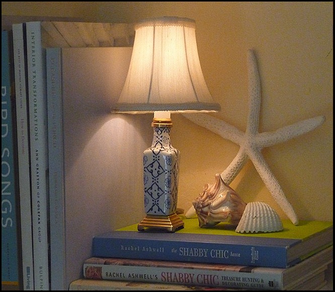
In the fall and winter months I have this little accent lamp out,but for the summer months I bring out a touch of blue and white in this little lamp.
Summer changes 031 (800x573)
A simple and easy change that anyone can make.
My favorite things 001 (800x600)
This picture hangs above my desk in the family room for all the year except for the summer and then it is changed out to this:
Summer changes 013 (800x600)
A touch of blue and watermelon pink!!
 Mexico Cruise 092
This accent lamps resides at the end of my counter and for the summer months I change it to this lamp…….
summer changes 002 (465x800) (465x800)
Another easy change!!
fall picture change (800x600)
This sweet little bunny picture is up for the fall months and it gets changed out to a couple of different pictures………..
Summer changes 033 (800x747)
Cool blues!
Summer mantle in white 020 (800x769)
Watermelon pink coral.
As you can see, they are only small changes, but they make a completely different look in the area that they are placed! I hope you have enjoyed some of my changes that I like to make in my home!
“Enjoy the Process” Of:
Making small changes in your home!
Kathysue

Friday, July 23, 2010

Looking for Inspiration for A "Someday Room"

From time to time I decide I want to make changes in my home. I am sure you can all relate to that, can’t you? I usually start with a dream plan and go from there. I might go forward with the plan or it might have to wait for awhile. I still hold onto the dream and enjoy the process of the planning and the hunting until it can come to fruition.

I recently did this with my family room. This is the room where we as a family all hang out and watch TV and relax. I joke about how the sofa should be a bed because someone is always laying on it.

I thought it might be fun to share some of my inspiration photos with you. These are images I have in a file that I add too whenever I find something that might work in my, “Someday Room.”

My family room is not overly large but it is just the right size for our home. When we had the home built we added three ft. to its width to accommodate three growing boys that like to lie on the floor to watch TV.

The room measures 17ft.wide by 20ft deep. The end wall has a brick wall half way up with a large white mantle at the end of the room. On the left side of the room is a French slider measuring 8ft. On the right there is one door leading out to the garage. Opposite the fireplace is the opening to the kitchen which has a breakfast bar on the left. On the right is a wall.

family room floor plan 001 (2) (582x800)
First I am starting with the layout of the room in order to figure out what type and how many pieces of furniture I will need.

My idea is to have two sofa’s facing each other as pictured in the following images………
image_thumb31[1]EK13[1]I love the idea of a day bed to separate the room with the two sofas facing each other. What do you all think about that idea vs. two chairs?
eric roth living room white slipcovered sofas tufted leather ottoman casters turned wood legs fireplace mantel glass french doors[1]   This is how I would love my sofas to sit in the room. I think of all the pictures in my inspiration file this is my favorite. I know the ottoman used as a coffee table has been done forever,but I do love this oversized rectangle ottoman.

001_interior-design-styles-ED1009-MARKS31-040[1] 
ADliving[1]
I like the idea of two chairs facing the fireplace I would want these to be able to swivel for easy conversations.

helen Green 3[1]
Another day bed I just really like this idea and the look in the room.

sarah1[1] 
All of these pictures have sofas facing each other and a daybed or two chairs at the end of the configuration. I love this look. Do any of you have two sofas facing each other in a room? Does it work well for your family?

In the next couple of post I am going to go into the details of the room and the ideas for:
room arrangement
architectural elements
colors
sofa
rug
chairs
tables
lighting

I hope you come back for more of my plans for my,"Someday Family room!"


“Enjoy the Process” Of :
Making plans and exploring your dreams!
Kathysue

Wednesday, July 21, 2010

SUMMER MANTLE IN WHITE

This summer when I went to change my mantle I did something a little differently. In the past I have always added blue and white to add coolness for the summer months, as seen in the picture below:

Summer changes 028 

Summer changes 010 

Summer changes 031
For the other looks my mantle takes on throughout the year you can go here if you would like to see more.

This summer I decided to do something a little different by adding some watermelon pink to the mantle.

summer mantle change 004 (800x227)
First I took away all the accessories to have a blank surface. This mantle is 17ft long with only 3ft 9in. of wall space above it. It is a bit hard to decorate. I have found for my own personal taste I like fewer but larger items on the mantle.

I gathered together the items I thought I wanted to use to create a color story.
summer mantle change 008 (800x534)
 I thought I would add a bit of the watermelon pink since that color is also in the room. It all looked as if it would work when I gathered the pieces together.

 This is just a picture of the pieces gathered this is not how I placed them!!
After trying and trying to live with the pink for one day, It was just too much going on for my eye. I felt that my eye jolted from one piece to the other and that is NOT the look I was going for.
I proceeded to take all the pink away and then it finally started looking like the peaceful serene mantle I was trying to decorate.

Summer mantle in white 002
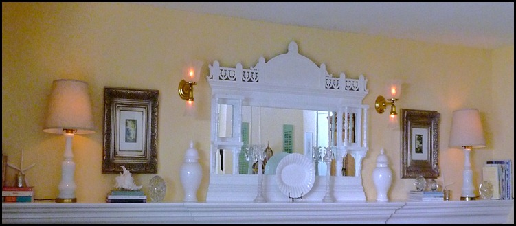
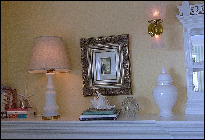
My all white mantle! Simple, Yes, Calming Yes!! Just what I wanted. It is a light and airy feel and it works well in the room. Here are some close-ups of the pieces I used on the mantle.

Summer mantle in white 010
I love the bubble balls, they remind me of the bubbles in the ocean surf. The picture on the wall is of a small sailboat in the distance. I only wish I could be on that little sail boat. You can catch a glimpse of a star fish and a mercury glass votive that glows so pretty in the evening and it also picks up the finish on the picture frame.
Summer mantle in white 011
This is a close-up of the picture.
Summer mantle in white 012
This is the picture on the left side of the mantle.
Summer mantle in white 008
The left side of the mantle.
Summer mantle in white 014
Summer mantle in white 015
This is my antique overmantle. It is from the late 1890’s and it is mahogany. We added moulding at the base to make it look as if it is integral with the mantle piece. I had to have white so we painted it to match the white of all the woodwork throughout the house. It is Kelly Moore's Swiss Coffee, a warm white.
Summer mantle in white 018
So there you have it, my summer mantle in white!!
“Enjoy the Process” Of:
Making fresh,new changes for the summer months!
Kathysue