If you
live in a home you probably have a kitchen but as varied as
personalities can be so can the differences in kitchens, and how they
function.
When I think of a kitchen I think of all the details that go into making a pretty, and functional kitchen…
Design
Decoration
Function
The Design
The
design/layout of this small kitchen is one of the reasons we purchased
this home over 34 years ago. There were three things I wanted in my
kitchen….
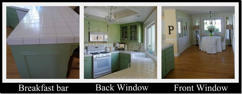
…..A breakfast bar large enough(3ft.X6ft.), to seat three little boys.
A back window to watch my three son’s swim in the pool.
A front window to watch my three son’s play ball in the court .
I
also loved the fact that the kitchen sink was at an angle making the
design a little more interesting than a typical U-shaped kitchen.

Times
have changed since we had three little boys sitting at the kitchen bar,
or playing ball out front, but this is the little kitchen that still
keeps on giving.
The boys are all grown up and the kitchen still remains giving to my family and friends.
1978
Gone
are the days of the wood stained cabinets, linoleum flooring, recessed
fluorescent lighting. The cupboard that once hung over the breakfast bar
is no longer there either.
DECORATION
When we decided to make some cosmetic changes to our 1978 kitchen we thought painting would make a huge difference.
Since
there were no existing moldings on the cupboards we decided before we
painted it would be a good idea to add some character.
We started by adding a small crown to the top. At the bottom edge of all the cupboards we added a skirt molding.
We also added a molding square on the end of the bar area where it was just flat and plain.
Let me tell you this made such a huge difference in the appearance of our kitchen.
Next
came the feet! I wanted feet like you see on furniture pieces. After
looking on line I found them to be very expensive. I put on my thinking
cap and decided that the look I wanted looked like brackets.
We purchased $2.00 shelf brackets and placed them under the skirt molding on the bottom edge of the cupboards.
I discovered it made a difference how much the detail would show up once it was shadowed by the cupboard.
It is important to keep that in mind when choosing any detail. Shadowing can make or break the detail.
Next came the jewelry of the room, the knobs and pulls. I wanted a little sparkle so I went with glass.
Restoration Hardware
had the perfect knobs, and pulls. I chose these particular ones because
of the oil rubbed bronze backing that tied in with the hinges and the
touches of black I like to add to my décor.
We also decided to change out two of the cupboard doors next to the kitchen window with glass paned doors.
Inside the cupboards we placed strip lighting. I chose this type of lighting because of the warm glow it gives at night.
There
are mirrored backs on the inside of the cupboards to reflect more light
and it also gives a window effect to that part of the kitchen.
The
other addition in this part of the kitchen was adding the vintage
crystal chandelier where there use to be plastic panels hiding the
fluorescent lighting.
You all remember that beautiful lighting we all had in the 70’s, don’t you?
Instead
of fighting with the open box I decided to make it a feature by adding
stacked moldings and a frame around the opening to finish off the edge.
We
placed a medallion in the center and hung our small vintage crystal
chandelier. You will also notice the molding treatment we used to frame
the kitchen window above the sink. It just finishes it off nicely.
We had more than enough cupboard space, but we added a very large pantry in the dining room. It is hiding behind the mirrored doors……
![dining mirrored doors ribbit (478x640)_thumb[2] dining mirrored doors ribbit (478x640)_thumb[2]](https://blogger.googleusercontent.com/img/b/R29vZ2xl/AVvXsEgGmCfvb9oSdoq5qKDLH8vAleOg6mvGzGkfvd5qfUQyWjPRwmeHkmfBvlt_kL3n79NGeyPhyphenhyphenvbM0F60XDcuByRT2Jv-0DbSeApgU7UbYI3yQEmUXLxZOllkXuoNA7BMDLiTkAxZbXd1nIM/?imgmax=800)
I
had a pantry in my first home so when this home was being built we
extended a wall in our dining room to accommodate a large pantry.
This is where Design and Decoration meets up with Function!
As you can see it is a multifunction pantry, it holds food, dishes and appliances it is big enough to hold it all and I love it!!
Here is a close up of the shelves.
FUNCTION
I recently read a quote from the designer Barbara Barry that
articulated perfectly how I feel about my home as a whole, but
especially my kitchen!!
In a passage called "Inner Beauty", Barbara writes,
"As
much as I love the part of my work that is all about what is seen when
we walk into a room, I also love the part of my work that is about what
is not seen. Or at least not by everyone- the inside of the cabinets,
the full refrigerator, the silver drawer, and the well-stocked pantry;
they too can be things of beauty, artfully arranged to inspire when
given a cursory glance."
I could not agree more!!
I love to see pretty bottles, and produce inside my refrigerator so I do what I like to call, “FRIDGESCAPING!”
There
is nothing I love more than fresh produce in pretty bowls in my
refrigerator. I will always have several choices for my family and
guest. I also love to have a good variety of cold drinks on hand.
Inside
the door you will find what you might need for a cup of coffee, hot
chocolate or tea. The cute little bottle with the stopper holds simple
syrup for your drinks.
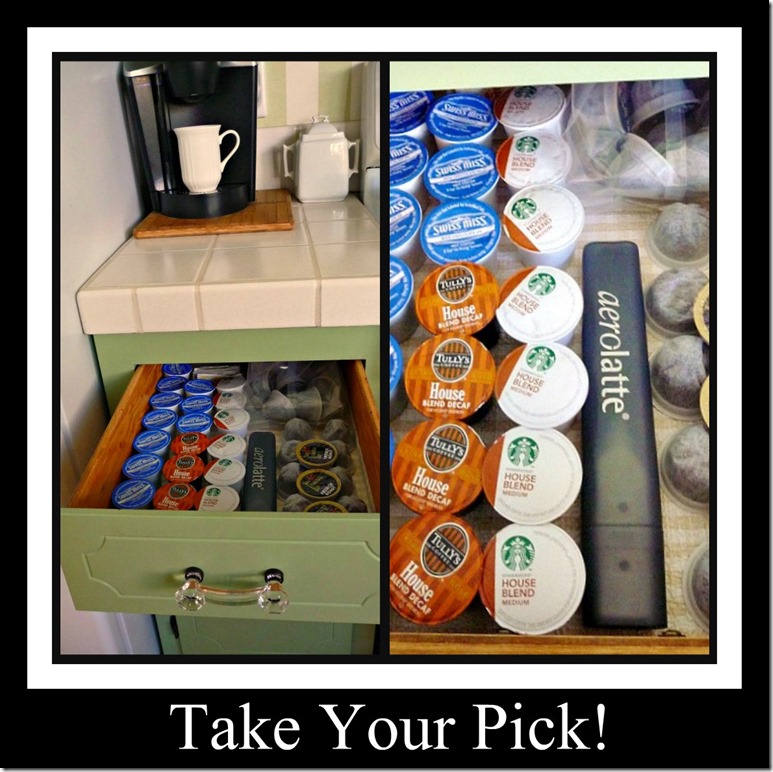
Speaking of drinks let’s take a look at my coffee bar that I use daily……
Now it is time to pick out your choice of hot drinks……
When
I have company I put out a tray next to the coffee maker on my stove
for easy access to anything they might need to add to their hot drink of
choice……..
The next very functional feature in my kitchen is the spice rack……
My sweet little kitchen is pretty in my eyes and it has functioned beautifully throughout the past 34 years for my family and friends.
This concludes the tour of all the In’s and Outs of my little kitchen!

Thursday, August 22
Friday, August 23
And now for the giveaway!

There
will be two winners for this giveaway! Pfister generously donated a
prize for this giveaway, so one winner will receive a free faucet worth
up to $300, and a second winner will receive a $250 Visa gift card!
To enter for your chance to win, just follow the steps below, and good luck! (drawing for US residents only)
Step 1:
Follow one or all of them on Pinterest in order to get more entries in the giveaway!

Enter the giveaway using the Rafflecopter link below! Follow one or all of them in order to get more entries in the giveaway!
click here: a Rafflecopter giveaway
Good Luck Eveybody!!
Winners will be announced on:
August 30th
SHELBY PATTERSON BALTZLEY
IS THE WINNER Of:
The $300 Pfister faucet
MICHELE UNDERWOOD
IS THE WINNER OF:
The $250 Visa Card
CONGRATULATIONS LADIES
Winners will be announced on:
August 30th
SHELBY PATTERSON BALTZLEY
IS THE WINNER Of:
The $300 Pfister faucet
MICHELE UNDERWOOD
IS THE WINNER OF:
The $250 Visa Card
CONGRATULATIONS LADIES
and
THANK YOU FOR JOINING IN ON THE FUN!!


![pantry closet ribbit049_thumb[20] pantry closet ribbit049_thumb[20]](https://blogger.googleusercontent.com/img/b/R29vZ2xl/AVvXsEjUQmv3zNe5GlqoYYMvPnAEldczSqirk0UJjE1gIX3xZJudjesk8vxC_U0p2rN6GodYda5O-gN2DSBHGtiErMgcUkH7US3Fuch7xBt_F3-Wu9Llz3u0-dd5o92zej8XJzNzcLfF1rJrFGw/?imgmax=800)


33 comments:
Your kitchen is absolutely wonderful. I love the cabinet color! Every detail is fabulous.
Thanks so much for the shelf bracket feet idea. J is going to come by later for a look. Would love to do this in our bathroom. Brilliant idea!
I love your pretty kitchen, Kathysue! It is so warm and welcoming...a perfect reflection of you and your love for your sweet family! Now I am wanting some feet on my cabinets! Loved your fridgescape! :-) Hugs...Debbie
Your kitchen is so full of inspiring details! I love love love the green cabinets too! I've been secretly hoping that one day I might have the guts to go with green cabinets. :) Thanks for the tour!
Everything is so pretty AND functional! Love the fridgescaping :) Thank you for sharing!
I have enjoyed seeing your kitchen in many past posts, but this closeup is inspiring. Your attention to detail has transformed your 1970s kitchen into a timeless one. It shows how much thought you must have given to every decision and your decisions were spot on. It also enforces the old adage, "A place for everything, and everything in its place." Thanks for the tour, Kathysue, and for sharing your great ideas.
XO, Victoria
OMG!! Your kitchen is...wonderful! I can't thank you enough for ALL THESE CLUES! My husband is so handy (as is yours, I've read) so "we can do this!" It's the best, KathySue!! Kudos!franki
Looking good...and you are right its all in the details! I am totally jealous of your super orderly pantry...wow and that coffee bar, great looking!
Kathysue, I enjoyed the tour of your kitchen. I love black and white, with green; and your pantry is wonderful!
Kathysue, your kitchen is one of my all time favorites. I love it. So much character and I love, love, love the chandy. Hugs, Marty
It's so sweet and I LOVE the color!
Oh I am loving those stripes- loving them!! Your kitchen is so charming~ love all the details!!
Kathysue your kitchen is AMAZING!
Some of my favorite elements are what you did with your ceiling lighting and the feet for the lower cabinets! FABULOUS KITCHEN!
The way you started your tour brought tears to my eyes. I just sent my daughter off to kindergarten and the beginning of your post reminded me of how quickly things change. Your kitchen has gracefully changed over the years. You added so many lovely updates, the chandelier is AMAZING. The feet on the cabinet are such a neat detail. You have a gorgeous space filled with happy memories.
So love your kitchen and your blog. I haven't been here before, but will be back again soon. Can't wait to show my mother what you did with that old overhead light! She has the same problem and this will look so good in her little cottage.
oh that i could be an artful arranger behind closed doors like you and barbara barry. i am a big ol mess in that particular area. love love love those mirrored doors on your pantry. would never have guessed what lies behind them, and they add such great reflection in the room.
smiles.
michele
I love all the beautiful touches you've added! Thanks for sharing!
Beautiful! I love your kitchen area so cheerful and homey!
The molding makes a huge difference - love it! And your knobs and pulls are gorgeous!
Kathysue, what a beautiful kitchen. LOVE the green! It's so bright and cheery and happy! You have done a wonderful and creative job updating your kitchen.
I am very impressed with how organized you are and how you bring beauty into the non-public areas of your kitchen too! So much like Alexandra Stoddard!
I love this post!
Beautiful kitchen. I also have been updating my kitchen. I love your ideas and hope you don't mind if I copy some of your great ideas. I will be back soon.
Betty @ My Cozy Corner
Ooh. I am loving those green cabinets and that pantry is to die for!!!
I love what you said about seeing your boys. I think that was the most important part of purchasing a home:) Your kitchen turned out pretty. You incorporated a lot of good ideas and the text on the photos was helpful. Very nice and cozy kitchen!
Kathy Sue, you already know how much I admire your design sense and talents, but once again I'm in awe of your attention to detail. The extra molding on the cabinets makes a huge difference, and love the idea of "feet" for your cabinets. Beautiful space bot functional and pretty. Thanks for the tour!
All I can say is, there is no place like home...unless you get to spend a few days at Perdue Inn. :) I fell in love with your kitchen before I fell in love with you. Your kitchen brought us together and we have become lifelong friends. I don't have to tell you how comforting and welcoming your kitchen is, as I have had the pleasure of sitting at that bar, using that great coffee bar, and sitting at your table, partaking of your generous hospitality. I would be there tomorrow if I could. :) Thanks for joining in this tour. You know I love you to pieces! xxoo
Hi!
I'm a new follower on fb and your blog. I love your kitchen!!!!
Christine
Hi!
I'm a new follower on fb and your blog because I love, love,love your style!
Really enjoyed your kitchen tour, love the color of your cabinets and the old fluorescent light box turned beautiful chandelier is gorgeous!
Hi Kathysue. Your kitchen is just lovely! Every single touch that you've added is just perfect and ready did make a huge difference. All of your memories of time spent there went your sons make it even more special, I'm sure. Thank you for sharing such a wonderful tour.
Man, you are organized, Kathysue!!! I love that striped wallpaper.
You are so smart! Love the idea with the bracket...very clever! I'm off to see the rest of the kitchens...
I love your kitchen! So charming and functional!
Love the spice rack clips....
I have always loved your kitchen...it is just beautiful!
Such a lovely kitchen tour! Great details and love those handles!
Hugs,
Jamie @ somuchbetterwithage.com
Post a Comment