home about me our home

Tuesday, June 30, 2015

WINDOWS! Inside and Out


P1150295 (800x658)

This past Friday as we turned the corner we saw that we had windows!!!

Very exciting to see, to say the least. We also have a temporary door, and sheet rock was being delivered.

It looks like they are getting ready to do the plumbing, and electrical wiring inside. Of course all of this is quite exciting to us.

P1150296 (800x600)

With the windows being installed my mind naturally goes to window coverings. I already did a post on what I was thinking about using on my windows here.
 
Today I thought it would be fun to see some of the ideas that have inspired the look that I am leaning towards.

Since the Great room is the main focus of our home let’s start there.

We have two banks of windows with three windows side by side as seen in the image of the model below….

9157395119_b7bcf99822_b
Keep in mind that the overall look I am going for is a somewhat traditional Nantucket look.

Here is a picture of my existing furniture that will be going in this room you can see I use a mix of black and white with blue and white  with blue and white porcelain and baskets…

12

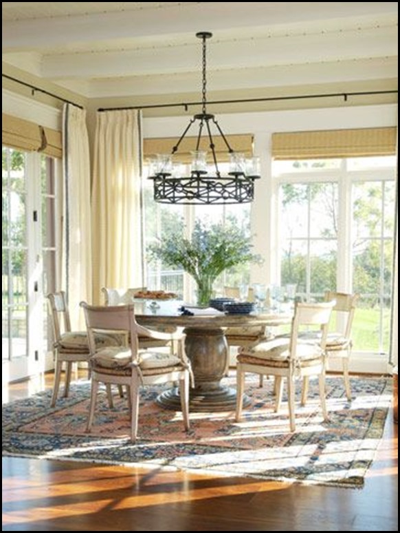
I will continue with this color scheme and I also add more baskets for texture. With all of this in mind I think that the look of bamboo or matchstick blinds will be perfect for this look…


New House window treatments 3
I like the use of the black iron rod(another tie-in with my black and white) close to the ceiling, and the inside mount of the blinds in this image so you can see the nice window moldings.


New house window treatment 6
The drapery softens the treatment at the corners. In my new home I will have a small space of wall on each side of the windows and I think adding the side drapery panels at each corner will soften the room.

I will make sure that the drapery panel will just barely come to the edge of the molding in order to not to cover any of the window. There will only be panels at each corner, nothing in the middle. I want as much window to show as possible.


New House window treatments1
I also like the idea of simple white cotton or linen draperies having a black leading edge trim. The black will be a nice tie in with the black and white base of my rooms décor.

You will notice in this next picture that the blinds are hung as an outside mount and closer to the ceiling…


Ashley Whittaker Design
I discovered something about myself in my sourcing. I prefer an inside mount over an outside mount for this particular look. 

I know that many designers would recommend to go high or go home, but for me I prefer the moldings of a window to show, when possible.


I think I like it better with some wall showing above the blind

This is such a beautiful room and yet I still prefer a bit of the wall showing above the blinds.

It is important to look at all the details, and to come to grips with what works for you and is pleasing to your eye. Sometimes it will be such a small detail, but in your eyes it can make all the difference in the world.

Make sure what you know that you dislike as well as like when making your design decisions.


I would like to turn the sliding glass doors in our den into a window area like this one.
Notice how the drapes in the corner soften the whole look of these windows.

I also might decide once we are in there, that the drapes are just too much for me, since I am not that big on window treatments, but for right now they feel like they will look very nice in my minds eye.

Since you can see the dining area, and the great room when looking into this area of the house, it is important that the window treatments have something that ties them together.


9159616712_976603a103_b
(image of model)

I could do matching bamboo, or matchstick roman shades, or I could do something a bit different that will still tie in the look if I do decide to use the drapery with the black trim on the leading edge of the Great rooms draperies.

New House window treatment 5
I would keep it simple, and do an inside mount so there would not be the flap valance, but I think using the same banded trim as on the drapery will be a nice tie-in, bring the black and white into the kitchen area, and break things up a bit


white living room design  Love those black trimmed Roman shades.
Simple, clean, fresh and very sharp looking. I love the high contrast between black and white.


living rooms - gray black white roman shades gray silk drapes bay window gray white striped striped pillow built-in window seat gray cushions
So there you have it, my plan, so far!!!

Of course you know all of this could change once we get in there, and live in our new environment for awhile, but so far this seems pleasing to my eye and is doable.


Thursday, June 25, 2015

It Is Never Just ONE Decision!


When choosing elements for a new home, or a re-do it is never just one single decision that you have to make.

 All of your decisions will be connected in one way, or another. You must stay aware of this in your design making process. There will also be compromises that will have to be made along the way, as well.


Compromises are part of the design process. We all have to make them at one time or another.

They are usually based on, availability, practicality and affordability. What one person will compromise on another would not even think of making that compromise.


First I have to say that when I use the word compromise in referring to any of my design choices, it really is not a complaint at all because, let’s face it, it is unbelievable to me that I get to buy a brand new home at our age.

When I speak of a compromise it is based on what I wished I could have had over what I chose due to the criteria of availability, practicality or affordability. 

Today's post is all about making choices/decisions where compromises were made, and what I based my choices on.
In our newly built home we will have two full baths. One in the guest bedroom area, and one in our master bedroom.

 This is an image of a standard guest bathroom. You can see the color of the  standard countertop. 

I opted for a shower in the guest area because no one in our family takes baths, and if my Mom gets to visit I did not want her to have to get in, and out of a bathtub. 


Of course that was an upgrade, but worth it to me for future safety purposes. That choice was based on practicality.

The standard option for counter tops, and shower walls in both bathrooms was a solid surface product called Piedrafina. It is ground up marble with resin added to it to bind it together.

The builder offered one standard option in a beige tone, which I am referring to as sand, or linen in order to help me see it differently in my brain since I am not much of a beige gal. (it is all in attitude)


piedrafina arena counter top

It is very neutral, and light enough that I am going to make it work in my design pallet.

This is a girl that wanted white, or Carrera marble, neither were offered, without a horribly expensive upgrade, and marble was not even offered. 

I personally could not justify the expense (affordability), so this will be on the counters and on the shower walls. I did upgrade the counters edge to a thicker profile.

This one decision (the slab counter top), dictated the tile flooring choices, and also the carpet that will butt up to the tile in the master bedroom area. Sigh!

They had standard choices that ranged in color from beige, to beiger, to beigest. This is where I had to decide on standard, or upgrade. 

If I had chosen the standard choice in the tile, then I would have had to choose a color of carpet that would not go with anything in my master bedroom, or home.


 Sooooooo I had to do an upgraded tile.

Now you would think since I was upgrading there would be lots of choices, and for some their would have been, but from the non-loving-beige girl I was very, very limited.

This is when I had to quickly put on my designers hat and think rapidly of possible design choices in the future. Luckily my cabinetry was all white so that was my starting point. I had …..

White cabinets

P1150179 (453x800) new house kitchen - Copy

Neutral/Sand Colored counter top
 and shower walls……

piedrafina arena counter top
I can make this work if I keep my master bathroom sand ,and white because my bedroom furniture is linen and creams.

Ribbet collage MASTER BEDROOM

This won’t be so hard after all, until I took other elements into consideration.

Now we have to choose the floor tile. This is where it became a bit harder for me because I had to choose something that would work with the shower walls that would butt right up next to the Piedrafina  in the shower.

I chose a 2X2 matte white tile for the shower flooring since I want to keep the white, and cream color scheme going in both bathrooms.

I kept in mind, light, soft and sand. The only tile that would work that was offered that I remotely liked was a porcelain Travertine tile, but it was CREAM!!

Okay, I can make this work!!! To make it look a bit more up to date, and current I chose a 12 X 24in. tile that will be installed in a brick pattern .


The grout I chose is very close to the overall background color so it will be a soft look. Notice I keep using the same buzz words, light, soft, cream, sand and white?


It does have some colors in there that I am not that fond of, but I am going to try, and neutralize those by keeping the surrounding elements neutral, and soft.

This tile will also be in the laundry room, and the guest bathroom which will butt up to the hardwood flooring in the guest area hallway.

Something else to think about!!  
So now I have to keep in mind not just the carpet in the master bedroom, but the hardwood flooring. 

Remember when choosing elements always, always, keep in mind how they will relate to the elements that they will be in direct contact with, and also how you can make them work into the look, and feel of your home. 

All of these thought processes were going on in my mind at one time, and Oh! one more thing, the grout color also had to blend with the carpet and the tile.

Counter top, tile flooring, grout, carpet, hardwood, all needed to look good with each other. Yikes!!

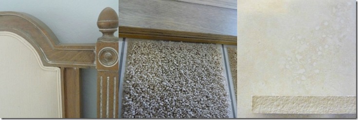
Next was the carpet, AGAIN, I had to upgrade in order to get a soft sand color that would blend with the travertine, and work with my existing bedroom furniture.

Here are the three elements lined up next to each other. I know everyone’s monitor will read the colors differently, so you will have to trust me that they all work well together.


Ribbet collage New house bed, carpet and tile

I know that most people think it is always a slam dunk for designers, but you can see we have the same struggles as our clients.

We can not get whatever we want, and what we want is not always attainable.

 However, as long as you have an over all plan, and feel for  your home you will be able to adjust accordingly, and come up with a  look, and feel for your home that you will be comfortable with in the end.

The Important Take-Away:

  • Make an overall design plan before ever making any purchases.
  •  
  • Always make sure that  all of your elements marry well together.
  •  
  • Never choose one element without thinking of what other elements in the room it will be next too or seen with.
  •  
Remember these three take-aways whenever you make changes in your home. 

It is all in the details, and you need to think them through before jumping in with both feet, and possibly make an expensive mistake.

I don't have a complete decorating plan as far as accents for my bathrooms, but we will be exploring some ideas together in some of my upcoming post.

Stay tuned for my continued journey!
I plan on continuing to:

"Enjoy the Process!"


Tuesday, June 23, 2015

I Might Be Going To The Dark Side!


 Don't worry today I am talking about the dark side of color, not the Baaaad dark side! ;)

Dark walls are often associated with making a room look smaller. Yes, they can do that, but they can also make a room look cozy, and inviting, or crisp and sharp when accented with white. 

If you pay close attention you will notice that dark walls are being seen in  the design world these days especially in dark charcoals, and blacks.

One of the most stunning, small, tiny powder rooms I ever saw was all painted in black with gold accents. It literally had room for a toilet and a very small sink. I saw this years ago and have never forgotten it.

Personally I tend to go for rooms that are in a fairly light to medium hues, however there is one color I have learned I can live with that is dark, and that is NAVY BLUE!!

Van Deusen blue for New House office
Benjamin Moore’s Van Deusen blue

When my oldest son was celebrating his 9th birthday we did his room in all navy and white, his Dad made him his furniture for the room which was all white with navy drawers and navy tops. 

It is still one of my favorite rooms that I decorated in our home of 37 years. I wish I had a picture to show you.

With the purchase of a new home I have started thinking about each room as it will relate to the other rooms in the house. 

In an open concept home you need to look at the whole picture  not just each room as a separate entity.

Today I am going to talk about the office/den in our new home. Let me show you the floor plan once again so you can see how it relates to the kitchen and great room….

mallorca_5fqw

Our office is where they show a dining room. It can be an office, or dining room. You will notice that our office doors are French doors. 

I am very excited about these gorgeous 8 ft, glass doors, but since they are glass the office will be in plain view even when doors are closed. 

The doors can have a covering on them, but why have French doors if you are going to leave them covered up all the time.

Remember I am a girl that requires light so I might have a covering that can be closed if my hubby wants privacy, but most of the time this door will be open for viewing.

With that in mind, you can tell from the floor plan that you will be able to see inside the office from the kitchen and great room. 

It is important that there is a visual flow, from room to room, and since my color scheme is navy/cobalt, black and white in this part of the home it seemed to me that the office would be the perfect spot to do navy.

I still have some convincing to do as far as my hubby is concerned, but I think I can convince him if I keep it fresh and crisp.

The two navy paint colors I am considering at this point are:

Van Deusen blue for New House officeNormandy Navy New House office
           Van Deusen Blue         Normandy Blue             


Both of these colors are from Benjamin Moore paints. The first one is the color I love, the second color is still in the Navy but just might make a good compromise for my hubby, if I need to compromise to convince him.

Let me show you some of the rooms that have inspired me….

New house office

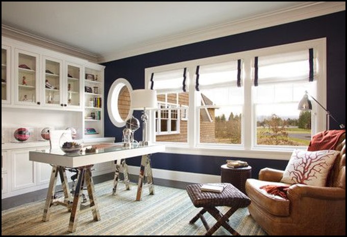
This one wall is so striking, it does not make the room close in or look dark and heavy. 

We have two nice sized windows on the back wall that could take this treatment beautifully. 

I am not a fan of the brown recliner, or the russet throw, but all the navy and white is so appealing to me.

Notice the round window? I don’t have a window, but I can use a nice white round mirror to give me this look.

New house office 3

This navy is quite a bit darker, and yet it still feels crisp with all of the white surrounding it. I also like the window treatments in this room, they add a touch of texture and warmth.


Good Life of Design: Designer Tricks of The Trade Some good advice on choosing paint colors

The rug and the gold accents really bring this room to life.


Favorite “PINS” Friday! | Beneath My Heart
The more white the better.


Nautical Inspired Office or Study Space

The white furniture and storage cabinets, keep this room looking fresh and crisp. Love the sail ship and I think the office is a perfect place to display a ship like this! I think this might also be another element that just might convince hubby he NEEDS a navy office.

Blue & White Hallway - Cornwall Cottage - Holiday Cottages (houseandgarden.co.uk)

This room has a lot more white than navy  by making the navy in panels outlined in white moldings, and yet it still gives you the feeling that you are in a navy room. I really like this.


For example, a navy pillow punches up a white slipcover in the living room, while navy walls create a rich envelope in the master bedroom.

Navy with a touch of black is so handsome and it is a combination that I do love and use in my home. I even have a pinterest board named, Black, White and blue all over.

I even found a piece I would like to hang on the navy wall in the office/den from Dot & Bo


White World Map

As you can see my wheels are turning in my design brain. I am having so much fun. Design is such a passion of mine that this just feeds my creative side to be able to make plans for our new home.

We have a lot to think about and trust me I am……

“Enjoying The Process!”

House Progress:


It is starting to look like a real house now, not just a box in the dirt!

BTW: To see more of my inspiration images go  to