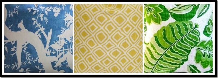
“Choosing the Star fabric for your room!”
Sometimes decorating can be like casting actors in a play.
After all aren’t we setting a stage, so to speak.
Today I am going to take you through one of the final processes in the coordination of fabrics for a room.
Once you have all of your swatches in hand it is time to start mixing and matching.
The first step is to decide on the STAR!!!
In playing with swatches for my Spring pillows for my family room I tried, and tried to make the addition of yellow the star.
I was considering this fabric by Schumacher…….
Since this was a standout pattern it was a natural for the role as the star.
So why did it not work?
As
much as I tried different combinations of coordinates in supporting
roles, this one particular fabric was just not strong enough to take on
the role of, The Star!
When one star player does not work start looking in your stack of swatches for a new star……
What makes a fabric a star?
Boldness of color
Scale of design
A Pattern standout.
At
a glance I could see several possibilities, but for my particular
design aesthetics the blue with white patterns felt like they could be
the star.
So I began with my star possibilities…….
(Samples are on their way!)
With one of these in mind, I began to play with lining up some supporting actors.
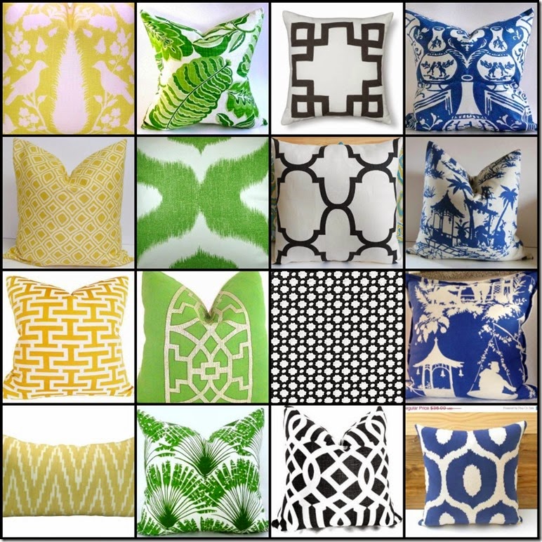
I knew that I wanted a blue, green, yellow and black and white combination so now I just needed to narrow it down.
I started with my next most important color to add to the room….
YELLOW
With
the blue fabrics scale, and design I knew it needed to be a very easy
on the eye, non-committal fabric, you know a pattern that could mix
with just about anything.
For me, that would be a smallish sized geometric pattern.
The
other thing I needed to keep in mind was the value of the yellow, not
too light, and not too bright because that is what my room requires.
The
next fabric choice almost as important as the yellow was finding the
right green. It needed to be fresh and crisp in order to elevate these
two patterns to a Spring look.
I had three good options to work with….
Option #1
A
larger scale pattern that both the blue, and yellow would work with. It
is a good idea to vary patterns scale when mixing patterns. A general
guideline is small, medium and larger scaled patterns will make a good
mix.
Option #2
This is a very large scale pattern so this is also a possibility.
Option #3
This
pattern is a bit more of an all over pattern in a med-large scale, but
what is attracting me to this particular pattern more than the other
two, so far, is it’s vibrancy and freshness.
You see, you need to take all things into consideration when choosing fabrics for your room…….
.
Scale
Color
Design
What pleases your own personal eye.
The
last but not least color option is the black and white. I have a black
and white striped rug in my room so I only need a touch of black and
white to add to the mix.
Again I have a few options, so lets see how they pan out.
Option #1
The Greek key pattern has always been a favorite of mine and I think it
mixes nicely when used with a Chinoiserie pattern as in the blue
fabric.
Option #2
The
black and white trellis pattern is also very nice, but it might be
shouting too loudly with the other fabrics, in this scenario. Of course
all of these opinions are subjective based on my own taste.
Option #3
This
is another trellis pattern but a bit larger scale and the white is more
dominant in this pattern, which is a good thing since I am creating a
brighter, more cheerful combination for a Spring look.
The
next step is to mix, what you think might be your final choices with
the other permanent elements in your room as far as patterns and colors.
My last collage………
At
this point in the decision making I am leaning more towards this
combination. I will only make my final decision, once I have all samples
in hand. It takes time and planning to get things right, but once it is
done I know I will be happy with my final decision.
I have learned if something feels a bit off, or when in doubt, don’t.
Remember doubt is always there for a reason.
You
might not see it right off the bat, but if you wait it out, it will
reveal itself to you as you let some time pass before jumping in with
both feet.
This is actually a rule I try to apply to my life in general, not just design decisions.
I
am in hopes that following along with me in this little exercise will
possibly help you out in your next project where you have to mix
patterns and/or elements in your room.


3 comments:
I find your process interesting and will help me to expand the way I coordinate fabric. In the past I've always picked a multi-color fabric for my star. I need to remember this for next time I'm pulling fabrics.
Hi Kathysue,
My process has always been the same as Cathy's. I'm not as brave or as confident as you to have so many different colors. Three is usually my max.
Love your selection and the colors....they are definitely some of my fav colors together!....
Post a Comment