I have talked about lighting in previous post as being somewhat like jewelry in an outfit.
When you think about it, it adds sparkle, texture and sets the mood for the room, somewhat like jewelry does for an outfit.
When choosing lighting you need to keep in mind the overall style and/or mood of the room.
A way to tie lighting together is by its style as well as it’s finishes.
There
are instances where one fixture such as a chandelier over a dining
table that is off by itself can be an over-the-top fixture that is
completely different than the overall setting.
This
method of juxtaposition has to be done very carefully, and not everyone
has the ability to do it well, so move in with caution.
Sometimes, “Different,” is just different,
and it does not marry well to other pieces in a room, so I always
caution non-professionals when trying to make this move.
I
have been playing with lighting for my new home over the last week, or
so. I have come up with fixtures that I truly like and now I have to
marry them to each other.
Personally
I find it very helpful to do a collage of sorts, and then put them with
some of the base pieces that will be in the room to see if there is a
gentle flow.
I don’t want anything to be jarring on the eye, or to not make sense. I use a saying, " It visually flows!" all the time.
Let me set up the scenario for you…
Our new home will be a traditional/coastal look, hopefully somewhat like a Nantucket home.
Of course I live in an area surrounded by vineyards, and not the ocean, but the ocean is where my heart always wanders.
It is a small cottage home of 1590 sq. ft. this is our retirement home, and we have downsized a bit.
My furnishings will be the same as in my previous home…


You
can see I have a base of black and white, and blue and white. My sofa
is a traditional style blue and white ticking, and I add pillows to
change things up seasonally. Green is a constant accent color in my
home.


![winter look_thumb[5]ribbit winter look_thumb[5]ribbit](https://blogger.googleusercontent.com/img/b/R29vZ2xl/AVvXsEimEJjzKrNXAH2OaH5Lvmg1hse4KzivyIplRJkmTayvfHaLEQOTrmtPLw3QWne1tdzGuH3fSOzBc3c927zSnHKrvR489TdYlUDj9maLjdOxqYCT32MsDZq9xMz9HqrTWkKKcLqIR5k1mt8/?imgmax=800)
Now that you have a feel for my home let’s move onto the lighting choices I have in mind.
We
will start with my entry hall which is small, (5ft X 8ft.) by most
standards, but I am thankful to have an entry hall to greet my guest.
No matter what size or shape of entry you have my philosophy about entrances into your home is this…
“You are about to enter the place we love, and call home, as you enter I hope you know your are welcomed here. We hope we have made you just a bit curious about how the rest of our home will look by our choices in colors, wall treatments, and the other elements we chose to greet you. We love beautiful things, but nothing is too precious in our home that it will ever be more important than YOU. We hope you feel at peace, and relaxed while you visit here.”
The plans for my entry will involve one of two looks.....
One look will be all white paneled walls, floor to ceiling, we have 10ft. ceilings, very similar to the image below….

Once I move into our home I will be able to see if this look will be the right way to go.
The
other option will use a bit of color, and texture and I will go up
6-7ft with the panels in white millwork, and then it will be topped off
with a navy/cobalt grasscloth.
This will be an introduction to the base colors that I will be using in our home.

As you go further down the entry hall you will enter into the kitchen and great room area.
I
will have a huge island in the kitchen that is 9ft long and curved.
There will be white cabinets with a quartz counter top that is white
with subtle gray veining.
I
could possibly use a fixture over the large island, but I usually do
not like visual clutter, and there will be another fixture over the
dinette table that you will see all at the same time.
Another reason it is very important to coordinate lighting fixtures.
Once we live there for awhile I will be better at judging whether or not I will use a fixture over the island.
In the Great room there will be the furniture very much like what you have already seen in the above images of my previous home.
Sorry
it took so long to set it all up for you, but I know if you are like me
you like to have a visual picture of the overall room or base.
Now lets move onto some of the different combinations I have in mind…….
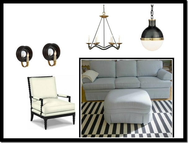
OPTION #1
The
pendant would be the entry light, the large linear fixture would be
over the island, the chandelier from our previous home over the dinette,
and the sconces would flank the fireplace over mantle.

Here is the lighting with some of the base pieces that will be in the room.
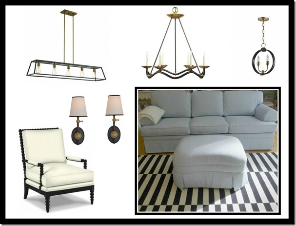
OPTION #2
This
option does not have any fixture over the large island, only a
chandelier over the dinette table which is round. The Hicks pendant
would be in the entry hall and the sconces would be over the fireplace
mantel.
OPTION #3
ENTRY ISLAND DINETTE FIREPLACE
OPTION #4

CONTINUING THE PROCESS!
After viewing all of the options I think it can give you a better idea of what will possibly work.
There will always be one, or two combinations that you will prefer over the others, and once you get to that point then be very critical of your choices.
Look at scale, color, texture and pricing. Yes, the pricing has to be considered by most of us, we all have the ugly.......
“B,” word =Budget!
Through this whole process always stay true to who you are and what you want.
There are many, many options out there, and it is so easy to be swayed.
This is why I spend time sourcing my desires first, and I really get in tune with what I love before moving forward with any purchases.
Once I have my options chosen then I can move to the next step of choosing what I love the most.
For
clients I like to only give 3 options, it is so much less confusing,
but for myself I can handle more, in fact I have to see all of my
options lined up as I have done in the above images .
Once
I have it narrowed down to two choices, then I spend some time in the
environment living with the options in my mind for awhile before ever
making a purchase.
I
realize this is somewhat systematic for most, but having worked with
clients for over 30 years I have found this method to be pretty fail
safe.
If
you love something, and buy with your heart that can work for some, but
on base pieces for your home I tend to like a more strategic plan.
Now
that you have read my plan of attack, and have seen some of my choices,
is there one combination you prefer over another, or would you mix them
up in another configuration.
Let me know in the comments. I hope this blog post will help you out in any of your future purchases for your very own home.
FYI:
Above fixtures were found from the following sites....
BELLACOR
LAMPS PLUS
CIRCA LIGHTING
LIGHTING NEW YORK
HUDSON VALLEY
FYI:
Above fixtures were found from the following sites....
BELLACOR
LAMPS PLUS
CIRCA LIGHTING
LIGHTING NEW YORK
HUDSON VALLEY


11 comments:
Kathysue, lighting makes such a difference in a homes decor!! I happen to like the combination #4. I am sure you will get many opinions, I just like the look of these together!!
xoxo
Karena
The Arts by Karena
Featuring Sharon Santoni
Thanks for all of you smart advice for selecting lighting. You are right--always give clients limited options--more makes their heads spin. I've got to vote for #1. I love the whole package. The two chandeliers complement each other very nicely. Good luck!
I know this is probably crazy but I keep in mind how easy or hard cleaning my lighting choices will be.
And I hope you do the wallpaper in your entry. What a statement! It's stunning!
I'll try posting this again. I suspect I did something wrong initially, so here goes. I mentioned in my first attempt that I did not have the luxury of reading every word of your post today, however, I knew that I liked the wallpaper grass cloth in dark blue and Option 2 in the lighing fixtures. I've mentioned this before that my girlfriend has this plan. I personally think Option 2 and the grass cloth are bold and the high ceiling can handle it very well. The finer black lines in the other options might get lost, but what do I know!! :) Just my two cents. Enjoy the process. T
I totally agree with Toy on Option 2 and and the grasscloth. I'm such a fan of the texture that grasscloth brings and the blue is stunning. With the luxury of 10 foot ceilings the space will be amazing. Must say I love a pendant over an island - my only reservation with the lighting but love the choices…wanting 2 pendants over the island, but you can always add the later if you need them! Happy Tuesday!
Oh I love the idea of the paneled walls...something that i truly want in my retirement home....I so love the blue grasscloth...such a beautiful, warm and dramatic look....I am going to be different and go with Option 3...but I love the lantern in Option 4...
I think option 2 works best for your sophisticated coastal cottage look and I love the navy grasscloth option as well. Thanks for allowing us all to go along on this voyage with you.
Wow so much going on for you....and all so exciting. Congrats....look forward to seeing/hearing more about your new home. While all the lighting combos are beautiful #4 really jumped out at me, it feels traditional but current and just really pretty! Good luck and as you say enjoy the process:)
I love option two and you cant go wrong with grass-cloth!
Lots of yeses for the grasscloth!! I love that, too. My favorite is option #3, Kathysue. Those sconces are lovely. Cheers, L
Love the grasscloth for sure....texture. I am partial to #3 or #4....glad it is your decision and not mine:)
Post a Comment