There are so many details, and layers to consider when you are designing a room.
Something
I have noticed when guiding clients, and even in my own life is it is
hard to not get caught up in making every detail a star!
What
do I mean by that? When we get to re-do a room, and finally get to add
some new details to our home it is hard to use restraint, and realize
that not everything has to be the newest trend, or to be the star in the
room.
In fact it is better to have one, or two leading actors, and the rest of the elements need to be supporting cast members.
There needs to be an easy flow to a room. You do not want your eye jumping from one element to the next.
When
I am talking about the star, I am not necessarily meaning the focal
point of a room. No, I mean something that almost shouts out, “look at
me!”
It could be a piece of furniture, lighting, artwork, flooring. Really just about anything.
Where we all can go wrong is when we want every element to shout, “Look at Me!”
This is a gentle reminder to you, and to myself……
Restraint in a room design is necessary,choose one or two elements that are the most important to you to be the stars in your room.
When
I started formulating my ideas for my family room, I realized after
studying the rooms I was attracted to that I needed to have a great
piece of art in my room.
Something that was bright, and cheerful that would grab your eye.
I realize I will have to be very careful when I add art to my room.
One
of the important supporting actors was going to be the lighting in the
room. Lighting is very important to me so it all has to blend well in my
minds eye.
Look at a room in your home. Can you pick out the stars,do you have too many? Which pieces are your supporting actors?
These are important details to think about when you are putting together a room.
We are all going to be experiencing Spring fever very soon, and most of us will be making some changes in our homes.
I hope this little exercise will help you when it comes time to edit and/or add any new pieces to your rooms.
Remember To Enter
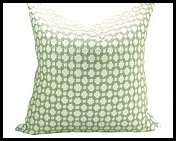
Don’t forget to leave a comment on my last post in order to have a chance to win your choice of a Schumacher Betwixt Pillow in the color of your choice from……..
BETWIXT pattern has 8 colors to choose from!
Go HERE to choose which color you want for your home.
Then come back HERE and leave a comment!!
GOOD LUCK!!


17 comments:
You had me with that first image. Simple and lovely. Winner :)
Great post and a good reminder, Kathysue. I'll be keeping this post in mind as I decorate our (finally!!!) finished basement.
~ Wendi xo
Awesome advice as always, not to mention so many gorgeous images!!!
What a great post. I say this to clients all the time, but it's hard for them to trust the idea. It makes one think the other elements need to be ho-hum, which isn't the case. You put it beautifully!!
Oh--- you are so smart! Now, if I could stop re-casting! My Stars keep changing roles!
I'm not sure who the Lead is at this time?
Great post and great advice :-) Hugs, Kat
I definitely have spring fever already. This has been the longest week! I love all your inspiration pics. I could happily live in any of those rooms. Heading off to enter your giveaway. Happy Weekend!
Such great advice! I think many people want everything to shine and then the room doesn't work.
Found you via your comment on Design Indulgence today re:the frame costing more than the artwork...YES could not relate more! Just recently boasted to Hubby how great the $85 thrift store lithograph looked now that it was reframed and hanging in our bedroom. He glanced at it and said, "Well it's a $300 frame job right?" (he was nearly correct...)
Anyway back to you and your blog - I am so happy to have drifted your way and I would like to enter your pillow drawing! Black and White would be my color of choice. Thanks :-)
Cheers!
Well said.
BRAVO!!!
a point well taken kathysue. we all know those rooms that make our eyes dart around until they bleed.
pinned every lovely example
xo
debra
ps; my ian mankin samples arrived, am thrilled!!!
Your photos were absolutely beautiful!! I would take any one of them!! franki
I love the idea of using four separate chairs instead of a sofa! I wonder if this layout would work in my long, narrow living room. - Lauren from MomHomeGuide
Well said Kathysue. I tell clients all the time about using too many trends and also giving the eye a place to rest!!!
Great post Kathysue, as usual you get us thinking about our rooms in a different and always helpful way.
Great post....and great advise.
Kathysue
Great advice! Love your blog and your Pinterest boards! Just found you and am a big fan!
Debbi @ the beach
Post a Comment