I love color and I love patterns mixed in a room. In fact I have been known to use as many as five different patterns in a room.
Right now bold graphic patterns are very in vogue. When you mix bold graphic patterns with the bright pops of colors that are also in vogue, I believe one must be careful in how many and what kinds of patterns we mix together.
There is no definite science to mixing patterns just some good guidelines.
A nice mix will consist of a common color story and also a mix of scale to keep it interesting as seen below………
You can see the color story was taken from the floral. The patterns are varied. The scale is large in the floral, medium in the stripe and a bit smaller for the Ikat and the grid patterns. A nice mix of patterns, color and scale. This is just a good guideline that will almost always work nicely in a room.
Below are the bold graphic patterns that are being seen in many room designs right now............
TRELLIS
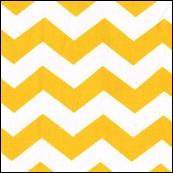
CHEVRON/ZIG-ZAG
IKATS
As you can see they are very bold in nature and they will demand attention in a room.
My question to you is, are we over-using these patterns in our rooms? I know there are no absolute rights or wrongs in design, it can be very subjective to the taste of the observer.
I have been observing what I would call an over-use of too many graphic patterns in one room. I think we as consumers can sometimes go over board on a good thing, especially in design trends.
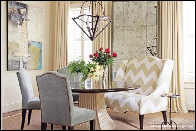
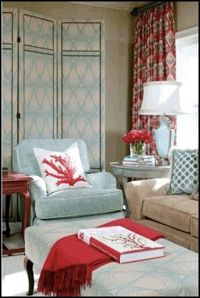
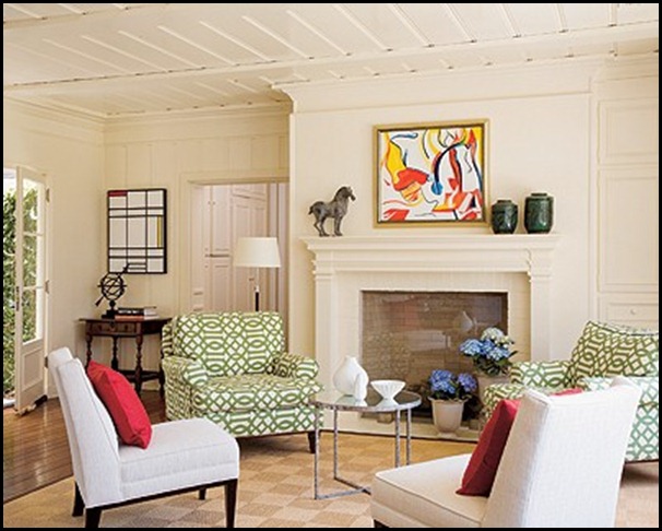
I am going to show you several rooms. I will let you be the judge whether you think the room is done well or possibly it has an over-use of graphic patterns. I have several examples of both.
I have my own opinion but will not be giving it on each room that I show. I was just made very aware of the over-use of these patterns while perusing blog land the last two weeks and that is what has prompted this post.
I will let you be the judge……….
There you have it!! Did you notice the rooms that had variations in scale and colors in the patterns they chose. Could you pick out the color stories origin in the rooms?
I hope this little exercise will help you be discerning in the amount of graphic patterns you choose to mix in one room. I know that once I started seeing it’s over-use in blog land it really made me much more aware of how patterns were being mixed, and which rooms were pleasing to my eye.
“Enjoy the Process” Of:
Editing the patterns you use in a room according to:
- Color
- Scale
- Style
Kathysue










28 comments:
I like pattern and color, but there were a couple that were too busy for me. There was just no place for my eyes to rest in the second room. Several of the rooms were quite nice, though. Love the last pic! Thanks for sharing.
I feel fairly confident that I could identify the ones that you feel are a bit too heavy on pattern. I tend to like pattern and texture in a room even more so than color. A really special graphic fabric, in my opinion, will stand out and shine if there are fewer patterns in the space. A favorite combination of mine is a stripe, a solid and a graphic print that's meant to wow.
Hi Kathysue: I believe it is all a matter of personal taste. My teenage daughter asked me to paint her room a (very) bright yellow. She felt so happy in it. My husband on the other hand, couldn't stand the sight of it so he would stay away from her room. It made her happy, it give him a headache. So, I don't know that we can say what is too much or what isn't. According to my taste, some of the rooms in the images above are way overdone and would drive me nuts. My best friend on the other hand, would thrive in them. She would feel totally energized by the very bold mixture of (many) different patterns.
Some of these rooms gave me a headache! Too much pattern, but more importantly, too much of a graphic pattern. Some of the graphic patterns, like the trellises and chevrons when overdone represent chaos to me. I'm just sayin....! Great thought provoking post Kathysue! Hey, I'm baaaack!
xo, Delores
I agree with Delores. Some of the rooms are rather headache inducing, if not downright dizzying. Too much of a good thing.
I like the graphics. I'd like to see a little restraint used, though.
Just completed a master bedroom redo and posted Sunday, yesterday. Not much pattern but varying shades of color...white. Summertime coming.:-)
I'm a big colour lover but tend to use quite a bit of restraint with pattern. I'm trying to incorporate more these days but maybe a teensy bit too much for me in many of those images:)
Hi Kathysue, great post and supporting images! I have a pretty high tolerance for pattern mixing, but two many modern patterns at once is just too much in my mind. Modern, bold color patterns need to be used with constraint, more so than traditional ones, I think, because they just compete too much for all the attention, sometimes making for a very noisy room. The rooms you show with a great amount of relief in white work best for me. I also like the ones who let one bold pattern or at least color dominate. Great, thought-provoking post. Loved looking at these images.
It takes a certain 'brain set' to live with a couple of these examples.
But all very nice for a visit.
Hugs,
Gerry
Like the other commenters, I think too much pattern takes away from the focus of the room. The eyes need to rest, and good design always takes the eyes through the room in a planned way. Too many bold, colorful patterns (I think you can mix more "quieter" patterns and colors) look frenetic. Who know where to look? While it may be a trend, I'm not sure it's the best design! IMO (but you asked!!)
Love the geometric fabrics and rugs in these rooms. A few are a little much, but most of them look gorgeous!!
without Too much analysis, I let my feelings lead the way and the eye followed. Found the turquoise with accents of red/coral a good mix -- not too busy, pic 6. Also pic 5 with the creams and beiges with subtle pops of turquoise in the painting and red in the roses. Serene with interest. Love that lantern in pic 5! My fave.
Kathysue, I see what you mean. To me... they are just too much. Although, these rooms are just not my style, so that may have a lot to do with my opinion.
Sometimes, less is more.
Have a pretty day!
Kristin
Kathysue, I love mixing patterns, but I think you have to pick and choose which will work and which won't. I tend to like the softer palet of mixes as compared to the bolder colors, they seem to be a bit overdone for my taste. Some of the rooms are really beautiful though.
Susan
4,5,7,8 and 9 are my favorites. Some are to busy for my taste. That is what makes the world go round.
Hope that your week is off to a great start.
Teresa
xoxo
A few of these rooms are totally overdone, as in make me dizzy the minute I walk into them...would make me crazy to live with them...others the more monochromatic ones are perfectly fine and actually work. I am all for a mix but its all about striking the right balance, and some of the above are a little too pattern heavy in my humble opinion. I like changing it up with a little fun pattern but prefer it on accent pieces as opposed to heavy drapes or big sofas.
Good thought provovking post if we are abusing the bold patterns that are out there in abundance.
I have trouble with any pattern at all! I think I was dropped on my head...
Great post! Some of the rooms made me dizzy and feel angry. I like to enter a room and feel relaxed and comfortable. I think we have to be careful, especially with graphic patterns. I think color palettes are easier to work with but graphics can be difficult. You really are a fabulous educator.
This was very interesting to me. I think a little goes a long way. I think we see things often times in blogland and immediately think it should be in our own homes. Each home has such a different identity and sometimes it works and sometimes it doesn't. Thanks for your sweet comment about Easter inspiration. I will be checking it out!!
Definitely a few of these with a little too much going on!! What a great exercise Kathysue! I always learn something when I come to visit you and I love that :)
Nancy xo
Love the fabrics and colors in your first photo.
I love a great mix, but personally do not choose to live with the bold geometric patterns. Though playful and fun, I would tire of them very quickly. Timeless, they are not.
You really know how to make a point!
Once you showed us your images it was so obvious where to draw the line. Great post my friend!
Thank you.
It is interesting, when you begin looking around, that certain fabrics are being used a great deal. I think that is when something becomes "trendy". I think it's important to pick things, fabrics included, that you will love for many years to come!
xo Elizabeth
I like most of these, but some are just too jumbled to me. You are creating an ambience in a space and when it's all about how many patterns we can throw in a room, it just gets too crazy. I don't like the orange horizontal stripe room. Those curtains would be enough! The stripes kind of steal the thunder from the bold curtains.
Hi Kathysue! A few of these rooms would drive me crazy. How could you possibly relax with so much going on? There is so much pattern your eyes don't know where to rest.
hugs,
Sherry
I too am big on mixing patterns.
Whether it be in my home or my wardrobe, everyone knows I will have on a number of colors and patterns.
I think when they are expertly mixed as many have done here, it doesn't look to jarring.
Great Great Post.
Rashon aka Mr. Goodwill Hunting
Every room needs a focal point with architecture and also with fabric. Too much and then nothing stands out. Awesome post Kathysue...way to rein us back in :)
Great post, Kathysue. I love how you pulled us back to focus on what we've been seeing so much of that it almost tends to run together!!
Post a Comment