The other night I was watching Candace Olson on TV. She was designing an open concept home. The familyroom was connecting to the kitchen architecturally but not visually. You can see the episode HERE!
The kitchen had been recently renovated in a beautiful, sleek modern feel. The family room or great room had no connection other than its location to the kitchen. There was no flow from one space to the other. It made me think back to a phrase I used often while working with clients.
“It visually flows,” is a phrase I have used throughout my career in design. In fact I used it so frequently, those who knew me or worked with me, knew it was one of my catch phrases and one that was very important to me.
There is nothing worse than going into a room where the eye does not know where to look first. A room that will make your eye jump from one object to another without any flow at all.
How do you attain a room that will visually flow?
I think it has a lot to do with the feel of a room and also the colors and patterns that are used.
If you are using color in your rooms it is important that the colors are dispersed throughout the room in an easy flowing manner. The same goes for patterns they need to coordinate or have some connection in pattern and in color.
The room should maintain the same feel as the adjacent room if they are open to each other. For instance it would not look like a well designed space if a person had a kitchen that looked like this……..
A charming cottage kitchen with country accents has absolutely no continuity or “Visual Flow” to this more modern sleek looking room.
There is no connection in style, color or feel.
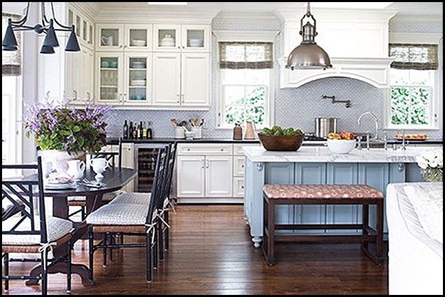
Here is an example of a room that visually flows gently into the next room.
This home has an open concept. You can see the edge of the sofa that is in the family room. Let’s look into the family room………
Notice how one room visually flows into the next. There is no jolt to the eye, there is a soft transition from one room to the next. How did they get such continuity?
The homeowner has chosen a common color pallete. They have chosen a soft neutral color scheme with a touch of blue.
There are also some similar textures from one room to the next. Take notice of the linen fabric on the sofa and chairs,it is also repeated in the cushions in the eating area of the kitchen.
Look at the chandelier, the small table by the chair, the eating area chairs and the hardware on the door. Notice they are all made out of black wrought iron, and a little of the metal is used in each room.
They mixed in another metal in both rooms by repeating the sink fixtures finish in nickel by also using it in the hanging fixture and the two sofa table lamps.
Next look at the simple accessory of the wooden vine ball it is textural just like the natural weave of all the roman shades on the windows.
The small wooden log tables texture is repeated in the kitchen counter where they used a wooden bowl to hold the green apples.
As you can see by studying images of a room you can learn a lot about how to make a room “Visually Flow.” It is all about repeating colors and textures and the feelings in a room in relation to the adjacent room or rooms.
Now that you have done a quick study with this room, how is your own home visually flowing? Take a look around and see if you need to make a few adjustments.
Sometimes it is as simple as removing something that pulls the eye to abruptly. Also, maybe taking some accessories from another room and adding them to the mix in the adjacent room will give you some continuity.
Have fun, play around a little. Who knows you might come up with a whole new look by adjusting just a few things in your home.
“Enjoy the Process!” Of:
Making a few adjustment so your rooms will, “Visually Flow!”
Kathysue


23 comments:
Well said. I just had this exact conversation with a new client today and maybe would have said it a little more clear if I had read this first ;).
How pretty, Kathysue! I love the flow of that beautiful home...beautifully done! I have also had to deal with flow in my open concept home...not easy. Love your letter post...so you! Happy weekend!...hugs...Debbie
I've been working with visual flow this week as the living room progresses. I think I am making it work. Time will tell!
Love these images. The 3rd and 4th images really speak to me.
Agreed, a well designed room is one that visually flows all throughout the home. I love the examples you have shown. Have a great weekend!
Hi Kathysue, this brings up one of my absolute favorite parts in designing a space. It's perhaps the most common mistake to overlook this. I always back up from as many rooms I can see and decide on all colors that way. In my own home I have lots of bold colors and open spaces, and I love to stand back and see how all the colors play together. Maybe the color in the first room is picked out in the room you just barely glimpse on the end.
i love adding flowers to a space - i want a tree BADLY - but i don't have the room :o(
I agree Kathysue! I also try to repeat colors from room to room so there is continuity throughout. I love the kitchen and family room images. A perfect example of rooms that flow together.
I love open spaces! Great post! Happy weekend! xx
I always learn so much from you. Your posts are so informative and help teach us all. You're the best. Thanks. Hugs, Marty
Hello Kathysue,great post,I felt inclined to coment too! I think that it is very important and if it is not done is noticed of felt immediately.I have one room in our home that is separate from the rest of the public rooms,it is sunken and has garden doors.I have done that room alot different and it feels ok,since it is separate from the others.People seem to react a little surprised when they first see it,a nice change for me too.
Fun post Kathysue. I'm sitting on the sofa in my great room peering into all the adjoining rooms and think it flows pretty well. I have a mainly neutral color palette and that helps, but whenever I add a color to one space I feel I need to hurry and add it to the other areas so I get that cohesive feel that you talked about.
Great post. It's so important to be careful when there's rooms of different colours. I often try to pull the odd colour into the other rooms with accessories so it looks planned and not random.
I completely agree. I have gone into some homes where I thought completely different people decorated each room ( kinda like a show house) a little too jarring for me. Great Post as usual.
I'm going to take some time and watch Candace's episode - so much to learn and so little time. That's why reading your posts is so entertaining and valuable, Kathysue - your little nuggets of wisdom are just the right dose for this tired blogger! Happy weekend!
Kathysue... U rock!
Hugs!
Have a pretty day!
Kristin
Totally agree that one room needs to visually flow to the other. to take that a step further I believe that the outside and inside should also reflect each other. Particularly if you are planning from the ground up. As simple as that sounds, a lot of people don't get it. You have some perfect examples here.
LOVE those last 2 rooms! Have a wonderful weekend, Kathysue!! xo
I completely agree! I just took a virtual tour of your home and it has fantastic flow!! Especially from the kitchen to the dining room - that green and color green is divine! Your home is beautiful.
I love open space. I can't live in a home without flow. Great post, Kathysue.
Have a great weekend.
Teresa
xoxo
I love the kitchen and family room images. I agree about the visual flow. Besides the "look" of the visual flow it also provides a calmer feeling to a room...wether the room be casual or formal. Thank you, Kathysue for again being so very inspiring.
I saw the Candice Olson show the other night too...and I agree with you that this is such an important design concept...it carries out into the garden too. Everything should flow together or it is so disrupting to the senses.
Sorry I'm late getting to you today, but I'm so glad I did! This is such a good, educational post! I forwarded it over to my design assistant and my intern. This is better than taking a class for them. Ever thought of teaching, Kathysue?
I LOVED that episode (actually, love most of them) with Candice. Your post is very informative and makes your eye take the time to wander through the images and notice all the details to be able to connect with and understand the cohesiveness of those two beautiful spaces. I also use this phrase a lot, and try to explain how important it is. It's also relevant as you noted, not to have something shocking to jolt you.
I'm currently changing palette's, so the flow is taking a little longer than normal. :) xo
Post a Comment