When I am working on a project I like to pull together images that have color combinations that I am contemplating on using. It is fun to see how others combine colors and in a room.
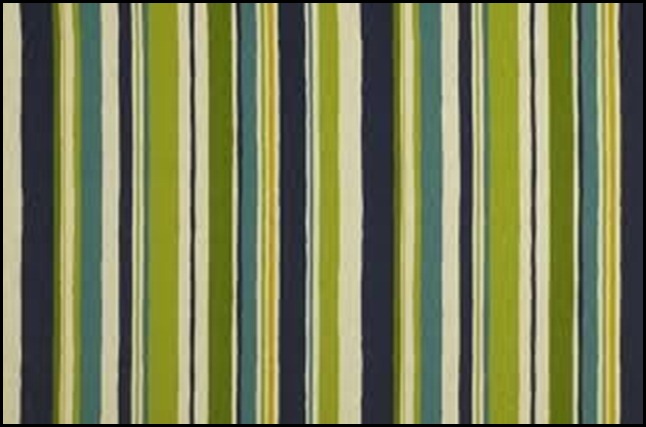
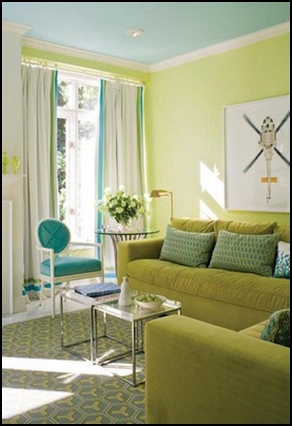
You are about to see different rooms with one of the color combinations I am going to use in my on-going project.
Darling throw and I love the mix of the bright pops of color with the cow hide rug and footstool. Using the wood coffee table ties it all together.
What a fun mix of fabrics. Notice the large scale pattern mixed with the smaller zig-zag pattern on the stool.
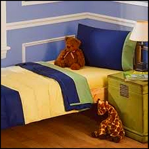
Hmmmmm?! Interesting. Color cues can come from anything!!!
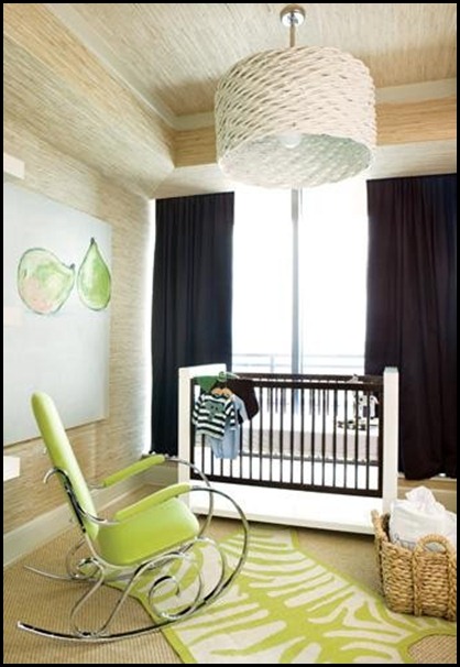
Fun Rug, I also love the texture of the basket with the shine of the chrome.
Johnathon Adler via Decorpad
Artist Laura Trevey via her blog Bright,Bold Beautiful
We can get our color cues from all kinds of sources. Nature is one of the best sources for color combinations.
Can you tell what direction my design plan is going?
I have a few more puzzle pieces to share with you tomorrow!!!
“Enjoy the Process” Of:
Researching interesting color combinations!!
Kathysue












12 comments:
I am loving the combinations.
The green is wonderful!
It is so grey, cold and snowing yet again here in Boston. This beautiful post is just what I needed! Love the photos (ok maybe not the sneaks). Be sure to check out my post today for an "all things Ina giveaway".
Very pretty combinations...I am thinking green and blue.
Kathysue, you know I love pink! But , that green is so so so pretty too! Bright and cheery!
Have a pretty day!
Kristin
Such a pretty combination...my favorite is the Jonathan Adler room!!
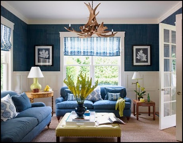
I love the very first picture. Just my style. What style are those sofas? Are they English roll arm? That is exactly what I am looking for.
Hello, Kathysue!
Thank you so much for your comments on my blog today! It was very nice having you there. :-)
I'm so into blue lately and seeing with green here made me feel even more "in love" with blue. Really interesting post! Good job!
Have a wonderful week!
xo
Luciane at HomeBunch.com
Hi Kathysue, just went through a few posts and I want to do my whole house over in these pretty colors. And I love the urns up on the stands. I could so move into your house. Black and white toile is a favorite.
Such a fresh and crisp color combo!
This color combo is stunning and fresh Kathysue!! Makes me feel like 'Bring on spring!!!' Can't wait to see what you are cooking up!
PS. Thank you for your prayers, we got a hold of all my family members by telephone and every one is safe!
Nancy xo
I think aqua and green is a good color combination.
That second picture is one I have had in my files forever!
Post a Comment