Monday, February 28, 2011

What Is Your Design Spring Board?


Since Spring is in the air and many of us will be starting some new projects in our homes I thought I would bring back one of my post that gives a few guidelines on where to begin.

 I  hope you enjoy reading it again! For those of you who missed it, I hope you get some new food for thought. KS


In my years of consulting there was one question that was asked by most, if not by all. Where do I begin? Which should I choose first? The sofa, rug,curtains etc? 

 I wish there was one pat answer but it truly will vary from project to project. I did offer a guideline that seemed to apply in the cases where the homeowner was doing an entire room with new purchases.

I would tell them to choose the least available element first. In other words, a rug or sofa will be much more limited on choices that you will like than maybe curtains or accessories.

 Paint is a bottomless pit, paint can always be customed mixed, so I never start with a paint unless the walls are going to be the statement and all other furniture pieces are going to be neutral.
In bedrooms I would have the bedding chosen before we would move onto other choices. 

 In living areas, such as living rooms or family rooms. it would be the sofa or an area rug.

There were the occasions where there was a fabric or an accessory that the homeowner absolutely loved and we would use that as a jumping off point, or what I like to call a spring board.

 On many blogs you see design boards and I love looking at those. Do you ever wonder which element they started with first, what was their spring board?

 In this post I thought it would be fun to look at some rooms that are well done and think about which of the elements the designer or homeowner would possibly have chosen first.

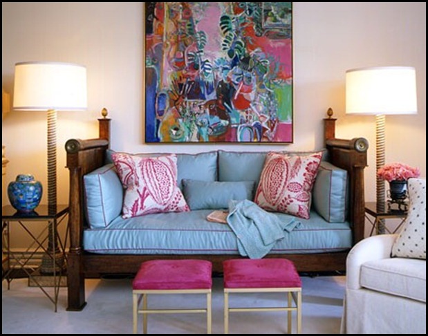
Here is a perfect example of a room with a lovely rug. I would venture to say the client wanted neutrals and some blue in her room so the shade of blue for the fabric was the first choice.

  The reason I think that is because there can be a multitude of different shades of blue in the rug and it will still work. The color of blue on the sofa and day bed are a very specific shade of blue and they are the statement piece in the room. What a gorgeous room done by none other than Candace Olsen.

This room is done in all neutrals with a pop of black and the only lively colors are in the artwork.
 I would imagine that the rug with its interesting border was chosen first for this room.

The right hue of neutrals could be taken out of the background of the rug. The fabrics on the sofa and chair were obviously chosen for their texture and for the fact that they match the rug quite nicely.

 What keeps this room so interesting is the colorful artwork and the use of black in all the right spots. What a warm and inviting room.

Here we have a very handsome bedroom. The back wall is covered in a unique patterned wallpaper. This would be my first choice. In this room I think the spring board is the wallpaper.

 There will not be that many wallpapers that will be pleasing to you so I would find the perfect paper and work off of that.  They kept all other pieces dark and sophisticated and then added this great pop of bright yellow to liven it up.

This keeps the room from not becoming  too serious and dark. The yellow also brings out the gold tones in the wallpaper back.


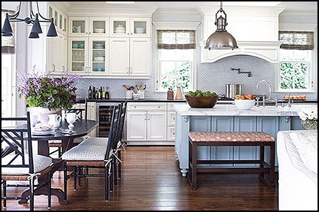
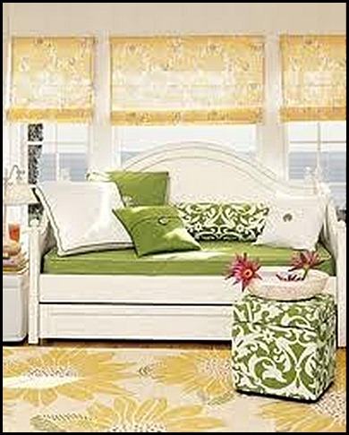
This room is a good example of one that could have started with several pieces such as the fabric on both chairs or the wonderful armoire.

 Since the armoire is a statement piece with an unusual color I will guess the armoire is the room's spring board or jumping off point.

 Because this room has a country feel and also looks like a home that is on the water, all the other choices were probably pretty easy to make according to color and theme.


I find this picture interesting. Since this is such a large statement piece of art I think the room started here.

 I am not one that matches art to a room, because that can look contrived and I find art to be such a personal statement.

  You will notice just washes of the green overlaying the beautiful lavender color. Using green in this room is fresh and a natural with this piece of art.

The room is kept interesting with the use of texture and pattern in the fabrics. I like these fabrics. These are what I call non-commital fabrics. They are fabrics that will go with just about anything.

I hope this gives you a few options of how to get a jumping off point or Spring board for your next room project.

 I gave you guidelines, but never be afraid to use an accessory that you love as your starting point.  If it inspires you, you can plan a room around it and you will love the process of planning and the end result of a room you love to live in.

For a great example of how a designer started a design plan for a room go over to Design Indulgence.  Sherry has a mood board of a room design. She tells her readers exactly which element she chose first, second and so on until the board was complete!!


"Enjoy the Process" Of:

 Finding your own Design Springboard for your next project.


Kathysue


Saturday, February 26, 2011

“The Call Of The Computer!”

You can probably tell by a few of my post I have been in a thinking and analyzing  mode. One of the things I was thinking about is, Why is blogging so addictive  fun!!
I think it fulfills a few needs we as human beings on the creative curve seem to crave.

Change:
No matter what time of the day you sit down at your computer there will be someone out in blog land that has just made a change. Now why would this fulfill a need?
Well, if we don’t have the time or the resources or the ability to make the change in our lives or our homes we don’t mind one bit living vicariously through someone else’s achievements for the day.


Inspiration:
Oh My!! I  hardly need to say why there is so much inspiration out in blog land. There are so many amazing bloggers that inspire me with their creativity.
All you have to do is go blog hopping for a short period before you will find a blog post that will make you take pause and think and you will be inspired.


Knowledge:
By reading some blogs we can get a wealth of free information on just about any subject. I of course am referring to design blogs, because that is where my interest lies.


Possibilitly:
This sort of goes along with inspiration, but at the same time it feels a little separate to me. I see some blogs and what they are presenting and I think to myself, Wow! I think I can do that!!!


Motivation:
I have days where I am totally un-motivated and I will read a post and all of the sudden I feel like getting up or out to do something.
Now, I do not know about you all, but this sounds like a wonderful prescription medication to me and a pretty harmless, addiction, fun thing to do.

Excitement:
I  don't know about you all, but I get soooo excited when someone get's something new for their home. I also get equally excited if they just move things around and make a change. I love for others to make their homes look and feel just like they want.

I have told you before I get excited easily, I just am that kind of girl, I love life and all it has to offer.


So if it  is alright with all of you I am going to continue with my addiction, reading of blogs!!

How about you all, do you feel the, ”Call of the Computer!?” What do you do when you hear it calling your name???

Enjoy the Process of:

Choosing the blogs you want to read, and reading however many and whenever you would like.

Kathysue

Friday, February 25, 2011

Visually Flowing

The other night I was watching Candace Olson on TV. She was designing an open concept home.  The familyroom was  connecting to the kitchen architecturally but not visually. You can see the episode HERE!

The kitchen had been recently renovated in a beautiful, sleek modern feel. The family room or great room had no connection other than its location to the kitchen. There was no flow from one space to the other. It made me think back to a phrase I used often while working with clients.

“It visually flows,” is a phrase I have used throughout my career in design.  In fact I used it so frequently, those who knew me or worked with me, knew it was one of my catch phrases and one that was very important to me.

What do I mean by visually flowing? Have you ever gone into a room and your eye literally would gently scan the entire room without any jolt or interruption. That is what I mean by visually flowing.

There is nothing worse than going into a room where the eye does not know where to look first. A room that will make your eye jump from one object to another without any flow at all.

How do you attain a room that will visually flow?
I think it has a lot to do with the feel of a room and also the colors and patterns that are used.

If you are using color in your rooms it is important that the colors are dispersed throughout the room in an easy flowing manner. The same goes for patterns they need to coordinate or have some connection in pattern and in color.

The room should maintain the same feel as the adjacent room if they are open to each other. For instance it would not look like a well designed space if a person had a kitchen that looked like this……..

untitled (516x555)
A charming cottage kitchen with country accents has absolutely no continuity or “Visual Flow” to this more modern sleek looking room.

2 (500x280)
There is no connection in style, color or feel.


Here is an example of a room that visually flows gently into the next room.
kitchen (470x312)
This home has an open concept. You can see the edge of the sofa that is in the family room. Let’s look into the family room………

family room (470x312)
Notice  how one room visually flows into the next. There is no jolt to the eye, there is a soft transition from one room to the next.  How did they get such continuity? 

The homeowner has chosen a common color pallete. They have chosen a soft neutral color scheme with a touch of blue.

 There are also some similar textures from one room to the next. Take notice of the linen fabric on the sofa and chairs,it is also repeated in the cushions in the eating area of the kitchen.

Look at the chandelier, the small table by the chair, the eating area chairs and the hardware on the door. Notice they are all made out of black wrought iron, and a little of the metal is used in each room.

They mixed in another metal in both rooms by repeating the sink fixtures finish in nickel by also using it in the hanging fixture and the two sofa table lamps.

Next look at the simple accessory of the wooden vine ball it is textural just like the natural weave of all the roman shades on the windows.

The small wooden log tables texture is repeated in the kitchen counter where they used a wooden bowl to hold the green apples.

As you can see by studying images of a room you can learn a lot about how to make a room “Visually Flow.” It is all about repeating colors and textures and the feelings in a room in relation to the adjacent room or rooms.

Now that you have done a quick study with this room, how is your own home visually flowing?  Take a look around and see if you need to make a few adjustments.

 Sometimes it is as simple as removing something that pulls the eye to abruptly. Also, maybe taking some accessories from another room and adding them to the mix in the adjacent room will give you some continuity.

Have fun, play around a little. Who knows you might come up with a whole new look by  adjusting just a few things in your home.

“Enjoy the Process!” Of:

Making a few adjustment so your rooms will, “Visually Flow!”

Kathysue

Wednesday, February 23, 2011

LETTER, LETTER ON THE WALL!!

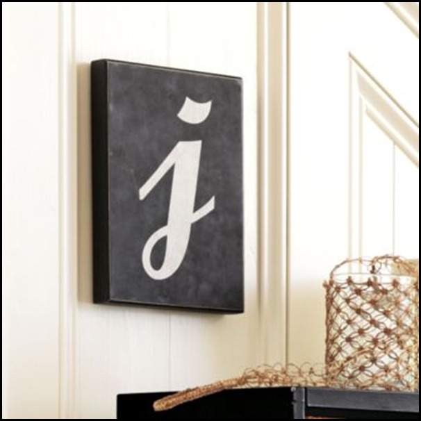
I have a love for letters or numbers in design. I use a letter “P” in my own home and I have several displayed throughout.

On  the Mary Tyler Moore show, Mary  had a very large “M” on her wall. I believe that was in the early 70’s and that began my love of letters on walls. I had a letter “P” on a bookshelf very much like her letter, “M.”  In my boy’s bedrooms I had their names on the wall.
mary tyler moore (540x405) 

This is a design element that has stuck with me much of my adult life.

I have images of displays that are done with letters that I have saved in my files.

Nautical_Boys_Room_LismanStudios7-17thumb121[1]
I actually saved this display as inspiration for the playroom re-do I am working on

2ba78daac513[1] 
A nursery done by Sarah Richardson.
1[1]

042909%20letter%20trend%201[1]

534f76151d30[1]
I love this idea and have thought seriously about using this in my guest room. What do you think?

Ballard
Ballard
skonahem[1]
Picture1[1] 


I am so excited because yesterday something came via a little brown truck in a great big package!!
It came from Grandinroad catalog!!
2 (282x282)
A Great BIG TWO Foot Letter “P!”

It only came in antiqued yellow so I will probably be painting it, but it is so amazing!!! It doesn’t take much to make this girl happy, does it?!!

The letter is made out of metal and it has an antiqued finish and I actually do not mind the yellow at all. I need to put all the other elements together to determine if it will look better painted another color. I have a couple of good options up my sleeve.

So now I have added yet another letter,”P” to my collection. I did a post on all my letter “P’s” HERE if you would like to see them.

Do any of you decorate with letters in your homes? What are some of the ways you have used them?

“Enjoy the Process!” Of:

Using Letter’s as a design element in your home!

Kathysue

Sunday, February 20, 2011

Blog Mission Statement

This is a hard time of year for many. I have read several post on questioning why they blog or they are feeling what I call, “The In-Betweens.” There also seems to be a bit of meanness out in blogland that is occuring. I have read several post on that subject also.

All of this made me think and take pause about blogging and why I blog. I also think this time of year we are all taking a bit of time to re-evaluate our lives.

When I read that one of my favorite bloggers, PK of Room Re-Mix was quitting, it really made me start thinking as it did for many.

Janell at Isabella and Max blog wrote a post here on is blogging sustainable?

A to Z has also written a wonderful post about some of the many pit-falls that can occur while blogging.

Kat's post on some of the meanness that can occur in blogland, on her blog Low Tide High Style.

On my very own sidebar I have a  post written by Sande at A Giftwrapped Life that so eloquently describes why we blog.

Before starting a blog, I thought long and hard for over a year before taking the plunge.


I had many friends in a design chat room that were encouraging me to do so, and even my very own family were cheering me on.

One of the things I did was to really examine why I would write a blog and what I wanted my blog to be like.

I made a mission statement. Nothing formal or fancy, just something to remind me of why I was writing a blog.

When I get off track, and trust me I have done so, I look at the mission statement to get me back to who I am and what I want my blog to be.

When it is all said and done, I have to be true to who I am.

As a Design consultant for over 30 some-odd-years, I became somewhat of a teacher to my clients. Teaching would have been my second chosen profession after Design consultant.

I wanted my clients to be able to make choices on their own based on what I had taught them. I had long term relationships with many of them and consider them friends.

This profession was so “Good” to me and that is why my blog is called, “The Good Life Of Design.”

It seems we all have the same demons, rewards and doubts if we are bloggers.
I knew these issues would come up from time to time, so that is why I wrote a mission statement of what I thought I wanted my blog too look like and be about.

My Mission Statement

In writing my blog I want it to be an extension of my life in design now that I am retired.

I want to:

  1. Write about the process I go through in designing a room.
  2. Hopefully teach as I go along.
  3. Be motivating to others.
  4. Make others feel as if they can do it!(design)
  5. Give tools and methods to my readers on what has worked for me over the last 30 years in design.
  6. Share some of my home projects
  7. Keep the look of my blog simple and uncomplicated.
  8. no advertising,
  9. no blog list on sidebar, I never want anyone to get their feelings hurt if their blog is not listed, so I choose to not list any.
  10. No pictures of my children or grandchildren
  11. If I can not say it to a stranger then I should not put it on my blog.
  12. Keep my private life private.
  13. Try to be uplifting
  14. Hopefully try to make a difference
  15. Have fun!! When it quits being fun, time to quit!
  16. Try to not get caught up in the number’s game of how many followers and how many comments I get each day.
  17. Try to keep blogging in perspective and keep balance in my life.
  18. Write about what I am interested in.
  19. Stay true to who I am and what I stand for in my life.
And Most Importantly!!

Try to:
 “Enjoy the Process” along the way.

Kathysue

Saturday, February 19, 2011

Play room Progress

The last time I did a post on the playroom it was about the different fabrics I was choosing for some cushions. I thought I would catch you up to speed on what is going on!!


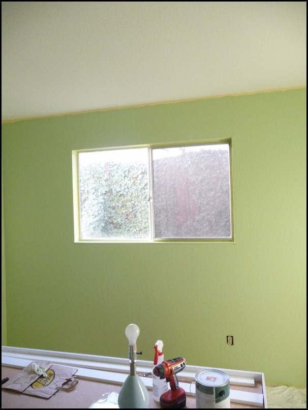
Painting of walls: Done

PAINT 001 (600x800)


Crown and Baseboards painted: Done

Play room and Hillsboroug 001 (800x600) 


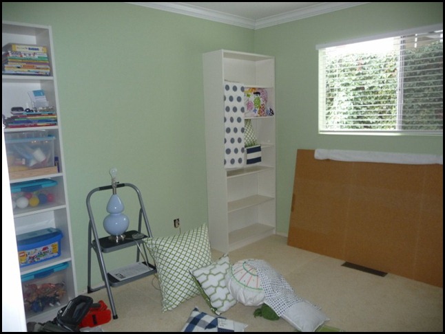
Bookcases put together: Done

Purging process 008 (600x800)
Disclaimer:
I put toys on  the shelf to see what will fit, this is NOT how they will eventually look. I needed to go through this process in order to see what will fit and what size containers I will need. All part of the purging process.


Fabrics Chosen: Done

PLAYROOM fabric combos boy girl 004 (600x800)
Boy’s fabrics


PLAYROOM fabric combos boy girl 009 (600x800) 
Girl fabrics
With a quick change-out of pillows it will go from a boys playroom to a girls playroom.
Playroom In Progress 015 (800x600)
My project basket.


Crown molding installed: Done

Playroom In Progress 011 (800x600) 


What is next, You ask?
Play room and Hillsboroug 018 (600x800)
Special Project!!!!
playroom bed and samples 002 (600x800)
To Be continued……………
Kathysue

Friday, February 18, 2011

The Art Of Pillow Display!!


I know that there is an ongoing debate of how many pillows are considered to be too much on a sofa. Today I am not talking about sofa pillows, but  pillow displays for day beds, and how to configure them in a manner that will be pleasing to my eye.

In yesterday's post you saw two of the fabrics I might use for cushions in my playroom re-do. Since I am going to have quite a few pillows in this room I thought it would be a good idea to really look into the different configuration that pillows can be placed in a room.

There are so many varied ways that one can display their pillows. After doing a little research and really analyzing the images I chose, I was surprised by what I seem to like and what I don’t like at all.

I think it is important to know a few things before buying or having pillows made for an upcoming design project.

  • How many pillows can a homeowner tolerate?
  • Do they like varied sizes and shapes?
  • Should there be a mix of coordinating fabrics?
  • How many different fabric choices will be pleasing to their eye?
  • Do they like symmetry or do they like a more casual look?
  • Should the pillows be tightly stuffed or more loose with a down filling?
  • How about embellishments, ruffles, welting, braid?

As you can see there is a lot to think about when designing the type of pillows and the placement of pillows on a piece of furniture.

Since I am re-doing our playroom, I am in need of a few pillows. I have already acquired some that I am working with, and I think I might need to have a few custom pillows made.

I did some looking around on the web to see which direction I am going to go with my pillows.

Let me show you what I found and I will tell you what I like or dislike for my own personal taste, and maybe you will start to realize what you like or dislike also …………

1 (201x251)
Sorry for the blurry image, but I really needed this image because I like it a lot.  This is what I call a more casual look.

Notice how the pillows are a bit heavier on the left side. I like the use of three different fabrics and the tailored look of the pillows.


2 (360x460)
I love this image for my family room, but today I am talking about daybeds. In this picture I like how comfortable this feels.

I can see lying here to take a little nap or read a book. It is inviting. Again, I like the tailored look of the pillows and the use of three fabrics.


4 (301x400)
This just has too many pillows for my taste. I am not sure I like the varied sizes and shapes of pillows used here.

There is a total of four fabrics being used here. The jury is still out on how I feel about that.


comfortable (383x344)
This looks comfy and inviting to me. I think it is the idea of having the majority of the pillows off to one side.


character pillow I like (398x421)
Very comfortable looking, but what stands out here to me is the character pillow. I think this all works so well because of the cute little owl pillow.

I had not thought of using a character pillow before, but this image has inspired me to visit the idea.

You can tell that these pillows are loosely filled and that makes them look inviting and comfortable.


comfy with pillow at an angle (357x495)
Here we have another character pillow of sorts. The little doxie pillow is adorable.

I am realizing that character pillows vs. a stuffed toy is a more grown up look for older children. It helps to keep the room playful.

I love the off-set pillows more and more. Having one large pillow at an angle in the corner is a look that I am attracted too.


house beautiful like rectangle lumbar instead of round bolsters (460x360)
House Beautiful
This image is introducing me to another idea for pillows at the end of a daybed. Most of the other images had round bolsters. I like the idea of a rectangle lumbar pillow instead.


See how fun it can be to really examine all the details to discover what you will really love in the room you are designing?

I have more images to discuss with you all, so come back for my next post and I will show you more. I did not want to make this post too long.

Enjoy the Process!” Of:

Really examining the details that you plan on putting in your rooms.

Kathysue

Thursday, February 17, 2011

You Should Always Order A Sample!!!

I think most of us will agree that we should always get a sample whether it is paint, fabric or wall coverings.

Without a sample we will not be able to tell how it works in the room with lighting, and also, how it marries to other fabrics and colors in the room.

Believe it or not, a color or fabric you might love, just might not be good with the other elements in the room.

When it comes to fabric, what we see on the computer screen will not only vary in color and texture, but the pattern might also vary in size.

It is important to read all of the fine print in relation to the fabric or wallpaper. The design repeat is a pretty good clue on how large a print could possibly be.
I bring all of this up because I recently posted about the samples of fabric I was ordering.

It was fun getting everyone’s varying opinions on which fabrics to use for the cushions. I showed the samples that were on the website. Here is an example of one of the fabrics…………
SAMPLE ON-LINE
1 (600x403)

ACTUAL SAMPLE
playroom bed and samples 003 (800x600)
I think you can tell that the actual fabric samples stripe appears much wider than the on-line samples picture. The white is actually more white in person.

Let’s look at another sample…………………..
ON-LINE SAMPLE
7 (600x423)

ACTUAL FABRIC SAMPLE
playroom bed and samples 004 (800x600)
Both of the samples I have shown are good examples of why one should order a sample!!! The actual size of the pattern is soooo much larger than is represented on-line!!

Whew!! I am sure glad I ordered samples! Now for the fun but hard part- choosing just the right one!!

I am really excited because I actually have three great options, but I will have to admit, I am leaning more towards one over the others. Don’t you just looooove getting samples in the mail?!

You will just have to stay tuned for the reveal of which fabric I am choosing!!!

Have you ever ordered anything without ordering a sample and been disappointed or shocked at how different it looked in person?

“ Enjoy the Process” Of:

Getting Samples in the mail!!

Kathysue

Wednesday, February 16, 2011

Do YOU Have “The In-Between’s?”

Do you have the “In-Betweens”? You know, it is not the exciting time of the holidays or the uplifting time of Spring. We are just stuck in the “In-Betweens!”

Symptoms that may occur:
  • Feeling tired.
  • No ambition to do anything.
  • Lack of excitement or enthusiasm.
  • The need to stay home and cuddle up with a blanket.
  • When looking around one’s home, nothing looks right.
  • Feeling the need for a whole transformation of one’s home.
  • Nothing seems to inspire you.
  • Avoid looking in the mirror.
Do any of these sound familiar?

Possible Cures:
  1. Enjoy cuddling under the blanket by adding a cup of your favorite hot beverage and a good design book or magazine.
  2. When grocery shopping buy a bouquet of flowers and a couple of new house plants to brighten up your space.
  3. Place pretty fruit in a bowl on your counter.
  4. Remove a few accessories from cluttered areas to open up the space
  5. Start making a list of projects starting with the small ones
  6. Go to an antique show or a garden show to get inspiration.
  7. Take a walk and enjoy the beauty around you.
  8. Look in the mirror and spruce up a little. Blush and lipstick go a long way in helping us look a little perkier.
  9. Make a lunch date with a good friend and talk about how you feel.


I have a lot going on right now and I am totally excited about the process of getting our playroom done, but I still have been a recipient of the “In-Betweens.”  I am working my way out of them by doing some of the above suggestions.

I hope this helps a little to know you are not alone in this malady!!
What do you all do when you get the ,”In-Betweens?”

  Please share we can all use good advice to get us through this time of year!!

“Enjoy the Process” Of :

Figuring out how to get rid of:
 “The In-Betweens!”

Kathysue

Tuesday, February 15, 2011

SPRING COLOR!!

 Valentine’s Day is over, and let’s face it, love in the air makes everything look and feel better, even with rain and snow!!

 Now that this holiday has passed, I thought I would share some images of something I am looking forward too.

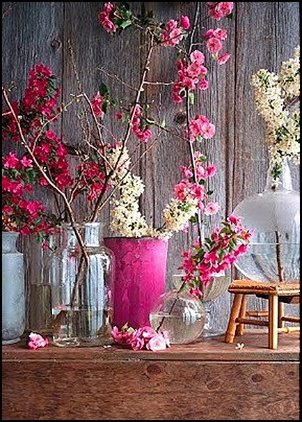
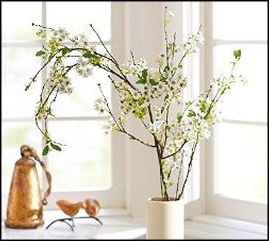
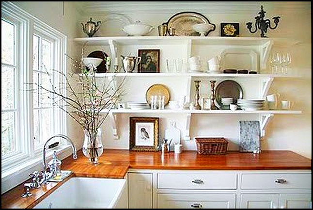
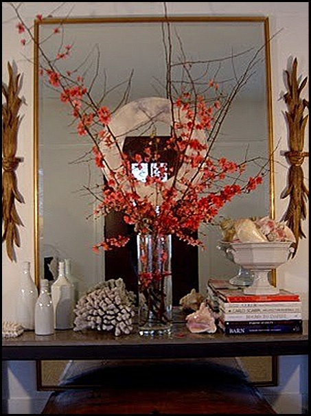
Flowering branches in large vases or urns!!! I love this time of year when we can purchase just a few branches and get such a wonderful display of the colors of Spring.

This past weekend I went to an Antique Faire in Hillsborough, California. When you entered the large building at the Fair Grounds, there was a breathtaking display of flowers done by the florist at Filoli, which is a historical home and gardens worth going to see if you are ever in the area.


Just look at this huge display of flowering branches………
Play room and Hillsboroug 002 (600x800)
I am not sure you can tell just how huge this arrangement was, but I would venture to say it stood a good four feet high or, maybe even a bit more.
I love how they draped the jasmine off to one side and down the front of the urn. Just beautiful! Shall we look at more displays of Spring Color?


1 (354x365) 
It doesn’t always have to be tall branches or a grand display. Just look at how simple this display is and yet it still has the same impact.

5 (320x400)
Multiple clear green glass containers make a wonderful show of Spring Color!!

3 (285x400)

6 (250x224)

2 (475x516)
I love this vignette.

4 (365x365)

CRAB APPLES (300x400)
I love crab apple blossoms. They are so pretty.

7 (400x267)

FRENCH LARKSPUR (534x800)
via French Larkspur blog
A simple bucket looks so textural in this vignette.

NEWLY WED DIARIES (298x400)
via Newlywed Diaries blog

SMALL MOUTH VASE (320x424)

FORSYTHIA (310x400)
Forsythia is one of my favorite blooms to use like this. We can not grow it in our area. I live in California, but oh, how I wish I could. Isn’t it spectacular?!

In looking at all of the above images, I  examined them closely to see which blooms I prefer and which containers go best for this type of display for my home.

For just a few branches or a single branch, I think a smaller mouthed container looks best

I think I prefer a blue or green container for beautiful pink blooms.

For the forsythia, I love a clear vase or urn - nothing that takes away from the grand show of the forsythia.

In choosing your branches consider the containers size, color, shape and texture. I am going to look for some pretty pink blossoms to put in a very large clear green vase that I have for my dining room table. I also think some pretty pink blooms might look stunning in my living room in a blue and white porcelain vase.

If you get some blooming branches which one’s do you prefer? Do you have a special container that you put yours in?

“ Enjoy the Process!” Of:

Looking forward to Spring by bringing in a few blooming branches in your home.

Kathysue