I am sure our first thought when it comes to a place for us to rest our eyes is of lying down somewhere comfortable and having our eyes closed. I am not talking about that kind of rest.
What I am referring too is, "Where in a room does the eye rest?"
The amount of patterns in a room will always be subjective to how many patterns the homeowner can tolerate.
None:
A couple:
A Few:
An Abundance:
Little Green Notebook
If there is too much pattern and color going on in a room the eye will not have a place to rest. Pattern makes movement on the eye and in the brain. Too much color and pattern can make the eyes weary.
One design principle that is not talked about very often is where in the room your eye will go to rest.
We all have a different tolerance for the amount of patterns or colors we can handle in a room. Whether it is a few or many, always remember you will need a place in the room's visual flow for the eye to rest.
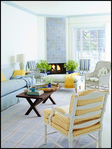
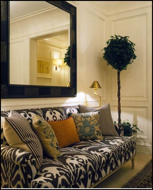
What can we do to achieve a resting place for the eye? If you look at all the images above you will see a large spance or back drop of a solid color. Or you will see a lot of white. Solid neutral back drops are a great place to rest the eye. Also, by adding a solid color on a pillow or having a solid sofa will allow the eye to rest.
When you are working with a lot of color or pattern your eye and your brain will need a rest and white will almost always give you the respite you will need.
I have read that a lot of designers will have homes void of too much color or pattern due to the fact that they work with those elements all day long. Coming home to it is just too much to deal with.
Be in tuned to how much pattern you can tolerate in a room and always make sure you have an area to rest the eye!!
“Enjoy the Process” Of:
Giving your eyes a restful view in your rooms!!
Kathysue

![SL0403008d_1_y[1] SL0403008d_1_y[1]](https://blogger.googleusercontent.com/img/b/R29vZ2xl/AVvXsEialnSJ-Ac1_cAPGJrwdQxT0NbxH9tD6XhwsnuyB5IcFfalzFZz1kJ8lHBk-RlVkgD_oEQ7hi98i2la_8iVstbiJcEgrNGKBMKRouSPuTHOoU9Oqa7Mfcvrsg1VMCdJhHe6ljSpNyE436g/?imgmax=800)


All of this makes so much sense and had me looking around my home at patterns. Thankfully, I didn't go overboard!
ReplyDeleteThank you for another interesting post. You always semm to find fresh ideas to explore!
XO,
Jane
You are right, sometimes it can even just be a small area of a room which makes you feel instantly at rest and "at home".
ReplyDeleteLiz
Well said, Kathysue and wonderful examples! My eyes are enjoying the "less is more" right now. While I used to be crazy over colors (bold colors), my palette is slowly shifting to more subdued ones. I think my eyes and brain approve. lol Have a great day, *Becca*
ReplyDeleteI tend to gravitate toward pattern even more than color when I look at a room. I love pattern so much that it's sometimes hard to edit myself.
ReplyDeleteI just realized that I don't like a lot of patterns in one space. I think the most I can handle in a room that gets a lot of use is two (3 tops)!
ReplyDeleteGreat post, Kathysue, and a topic that should get more play than it does. I hate being in the middle of anything, but I'd have to say that's where I am when it comes to pattern. I have a pretty high tolerance for pattern and saturated color, but even I don't tolerate the extreme mixing of pattern like the last image. I need patterns and color to relate in some way, and the last image is just too much of a stretch to me! So put me in the middle!
ReplyDeleteGreat point!! For me - too much pattern would be very unsettling. I need subtlety in pattern and color.
ReplyDeleteFantastic point, Kathysue. I am a huge lover of layering patterns, so I tend to leave some wall space unadorned. A successful space in my mind, does need some calm. The trick is knowing the balance and when to stop.
ReplyDeleteI adore rooms that have tons of colour and pattern and yet in my own house I use very little pattern. Hmmm, maybe I'm one of those designers that needs a rest. Never thought about that.
ReplyDeleteGreat post Kathysue. My eyes do need the real rest!
ReplyDeleteKathysue, this is very interesting to think about. I think I'm changing from lots of color to less, and also bringing in more white. This is helpful info! Linda
ReplyDeleteI can probably tolerate 3 similiar patterns but no more. This is very interesting. Thanks!!!
ReplyDeleteYep...I looked around my house and you're right, there's always a place where your eyes rest looking at it. Your point is perfect! Thank you for the idea. Come over and visit, I'll be thrlled to have you Kathysue.
ReplyDeleteXOXO
FABBY
Great post. Important things to think about. Thanks!
ReplyDeleteKathysue,
ReplyDeleteI'm sending your package tomorrow...so for the delay, but I've been swamped! Yes,for me a room does need a calming element while maintaining my attention. It need to move me, and move me to relax too!
I find the few patterns in the same color range in #4 quite soothing. Very nice!
ReplyDeleteI'd never really thought of this before, but you are totally right on. And you know what, the first picture is the one that drew me the most. The neutral background with a rich wood table, that was easy on my brain! Lisa ;-)
ReplyDeleteGreat images, too many patterns make me feel dizzy. I will always be a fan of simple and soft spaces where the eye has a place to rest. I do love color though. The right amount of color can make up for a lack of pattern but every room needs a few layers of texture to keep a happy balance. :)
ReplyDeleteI agree. It's really not a good idea to go overboard with patterns. Have a wonderful day, Kellie xx
ReplyDeleteSuch a valid point! I'm in agreement with you, and personally I can't handle a lot of pattern in a space, I find it so UNcomfortable!
ReplyDeleteKathysue, That is a good point I have never thought of before! Makes SO much sense! I could tend to go overboard ... Thank you for the reminder to reign it in!
ReplyDeleteHave a pretty day!
Kristin
I realize I don't like much pattern and yet I have quite a few patterns going on in my own home but the color intensity is very similar. I much prefer the image with no pattern above. I wonder if there's any psychology to it? Would you happen to know anything about that Kathysue? I'm quite introverted and I don't like loud people or loud interiors. Vanna
ReplyDeleteI think you are so right Kathysue, every room has to have portions that allow your eyes to rest! I too love color and pattern but want to come home to something soft and soothing. Hope your week is ending well my friend!
ReplyDeleteNancy xo
Great post Kathysue, I completely agree!
ReplyDeleteMaria
I like your pattern and color, but I do like flow too...
ReplyDeleteYour last statement is SO true. My home is all neutral with occasional pops of color and very little pattern. I find it so restful but I also enjoy those rooms with an abundance of pattern. A real jekyll & hyde problem we designers have...we love it all! Thanks for the good advice.
ReplyDeleteSo true! I work with color and pattern all day and yes, indeed, my house is pretty spare - even though color and adornment is my true love and defines my interior design style. I just need to rest my eyes (mostly my brain) a bit after I get home!
ReplyDelete