Monday, January 31, 2011

Let’s Elevate The Situation !!!

TRANSITIVE VERB:
ele·vat·ed, ele·vat·ing, ele·vates
  1. To move (something) to a higher place or position from a lower one; lift.
  2. To increase the amplitude, intensity, or volume of.
  3. To promote to a higher rank.

What am I talking about? I am talking about elevating our homes looks and our homes accessories to a higher stature and also a higher level of style.

I know we have all done it before!! Sometimes a room or an accessory just needs to be elevated. It needs to reach for a higher plateau, a higher standard!!

Sometimes when we go to pull together a vignette we need an object to stand taller/higher, it needs to be elevated.

All vignettes whether on a table, or mantels, or shelves need to have highs and lows in order to be interesting. It also helps to keep the eye moving around the room.

Summer changes 031
I have elevated a small lamp and some shells by placing them on top of a stack books.

Summer changes 016
A glass bubble ball is elevated in the same manner.

Another way to elevate an everyday, ordinary accessory is by putting them in pretty containers. This will help elevate their look and importance in a room. I have done this in my guest bath and my master bathroom’s.

b6 (478x640)
Everyday cotton swabs and cotton balls can become decorative in a pretty apothecary jar. Now instead of just looking ordinary they have been elevated to a higher level of importance in the room.

master bed and bath 027
In my master bathroom I have placed cotton swabs in one apothecary jar. The other jar holds our everyday bath soap and a loofah. Notice I have also elevated my soap by stacking two soaps together and placing them on a pretty glass dish.

You can also elevate an item by putting them on a pedestal or a decorative base.

mirror (478x640)
By using a decorative column I have elevated my plant to new heights.

hall (478x640)

2 (478x640)
This is a before picture!! I have my blue and white porcelain urns on the floor. I love them, but felt they needed to be elevated. So I placed them on a decorative platform and now they have become elevated and I think they look so much better…………

entry pedestals 009 (600x800)

entry pedestals 003 (600x800)
The pedestal's were purchased at Homegoods for $7.99 ea. I think that they truly elevated the urns not only in height, but in value, they "LLM" (look like more)!!

I have to thank my dear friend Mrs. “B” for going shopping with me and pointing these out for me to purchase. She is also the one that made up the saying. "LLM", Looks like more!!!!

Do you elevate your accessories in your home? What are some of the ways you have done that?

“Enjoy the Process” Of:

Bringing your everyday accessories to a new level!!!

Kathysue

Saturday, January 29, 2011

I Have To Share My New Find With You!!!

I have found a new product that is so good that I had to share it with my readers!!!
It is called Boi~ing by Benefit and you can purchase it at any Sephora or Ulta for $18.

boiing (250x250)

I am really a discerning shopper Picky  especially when it comes to products that I am putting on my face.

I have passed the age of the natural glow and have resorted to products that will give me an artificial fake glow.

There are so many products that promise to do one thing or another, but ultimately it is up to the individual to be the judge.

I was skeptical that anything could hide the ever-darkening dark circles under my eyes.

I put a thin layer on, and then shopped around to see how it would settle into my creases. (what I lovingly refer to as my smile lines from many, many years of smiling.)

To my surprise it did not crease or look crepey!! DONE!! Up to the register I took my new found best friend!!

I will say it is best to put on thin layers and build, kind of like spackling. Don’t laugh I am serious. Remember thin layers, get a good base going!!!

Stop laughing, you know exactly what I mean or you would not be laughing.
Trust me ladies of all ages, this stuff is GREAT!!!

“Enjoy the Process” Of:

Hiding whatever you can on your face with Boi~ing!!!!!

Kathysue

Friday, January 28, 2011

Happy Bright Saturday!!

Living in California we have pretty nice weather most of the time. We had been told by our weatherman that we would be having sunny but crisp weather for about eleven days.

Well, he made a mistake and we have been having lots of fog until the late afternoon.

I am a Spring time kind of gal and when it gets gloomy so does my mood. Hubby calls it the mully-grubs!!
Yes, even Kathysue can get in the mully-grubs.

I don’t like staying in this kind of mood for very long so I look for things to inspire me and get me out of this gloomy mood.

Looking around on the web  I found these two very colorful rooms that made me smile and made me think of Spring which is right around the corner.

I hope you enjoy them as much as I did…….


designer Krista Ewart beach cottage (360x460) (360x460) 
Designer Krista Ewart

2 (360x460)
Krista Ewart
I don’t know about you all, but I feel like I could break out singing,

 “Happy Day’s are Here Again!”  ♪♫♪♫♪

I hope you all have a wonderful weekend,

“Enjoy the Process” Of:

Whatever you plan on doing this weekend!!!

Kathysue

Wallpaper Choices!


As I mentioned in my post on “What is On my Mind” for 2011, I showed a picture of wallpaper.

The reason for that, is I want to change the existing entry hall wallpaper in my home. I was trying to remember how long we have had this wallpaper up, and it has been at least 17 years. My how time flies when you are having fun!!
IMG_2186


As with all changes that are made in our homes there is usually more than one room to think about when you have an open room concept.
untitled (478x640)
To see my home you can go to my side bar and click on House Tour and it will take you to Terri’s blog La Dolfina. She so graciously did a blog post on my home after a visit here. 

You can basically see the living room, the kitchen and the guest bath from the entry hall. All of the papers will have to coordinate.

If you were to stand in the middle of my entry you would look to the right to see the kitchen and family room.

If you look to the left you will see the living room take a couple of steps forward and look to the left and you see the guest bath.


I am a planner so I have to have some idea of what will work in all the adjacent rooms before making the final plunge.

In my experience if a plan is not made a person might be putting themselves in a box or a design that they might not like for the adjoining rooms.

The existing kitchen/dining room wallpaper will be staying the same, so I have to keep that in mind.

 I am not sure about the guest bathroom. That will be determined once I make my final decision on the entry.

In my previous post on How to Look for Wallpaper I mentioned that one must keep in mind, the feel, the colors and the patterns that could possibly work in their room.

I am looking for wallpapers that have a fresh, crisp and open  feeling!
The colors will have to work with green and white, black and white and blue and white.

Let me show you a couple of patterns that have caught my interest as possibilities.
baldwin bamboo chinoiserie chic blog (313x400)
This pattern is Baldwin Bamboo by Scalamandre. I love the fresh look it gives in this kitchen. I first saw this on Chinoiserie Chic Blog. If you need a dose of Chinoiserie, Beth’s wonderful blog is the place to go. I love my visits there.

I realize that everyone’s monitors will show the greens differently. I would never order a wallpaper without ordering a sample first.

This paper has the green and white and a touch of porcelain blue. I am adding more blue and white to my home, so I feel this might be a perfect combiner paper.  I call it a combiner paper because it would combine the look of my living room with the look of my kitchen/dining room.

Baldwin Bamboo by Scalamandre (398x400) 


Most wallpaper companies will send a 6-8ft drop of a paper. I have known companies like Schumacher to actually send a double roll.

There will be a cost for a sample, but it is well worth it. You must always sample it in your home and also you need to see how the pattern will lay out on your walls.

Cowan and Tout Bamboo  Decorpad (391x600)
This Cowan and Tout paper is easy on the eye and stays neutral with the use of just green and white. Not as exciting as the Baldwin Bamboo, but definitely a possibility.


cowan and tout bamboo different colorway (400x297)
Cowan & Tout in green

Since I am adding more blue and white I will probably get a sample of this paper also, you never quite know what will work until you have a sample in the room.
 cowan and tout bamboo blue (348x335)
Cowan & Tout Bamboo
I am just  beginning my looking so I have a lot more to explore, but I have loved these two patterns for awhile now. I think I have to at least explore the possibility don’t you?
What do you think of these patterns so far?

“Enjoy the Process” of:

Exploring the possibilities with wallpaper for your home!

Kathysue

Wednesday, January 26, 2011

How To Look For Wallpaper??!!!

Yes! there is a method to looking for wallpaper, read on.......


sarah richardson (341x454) 

......Looking for wallpaper can be daunting. Most wallpaper stores will have thousands of books with hundreds of choices in each book.


store (259x194)

Before going shopping I think it is a good idea to think of the room and the feeling you want it to have, and what colors you like. It is also good to keep in mind what patterns you tend to gravitate towards.


Chloe Sevigny's Home! Green imperial trellis wallpaper
Imperial Trellis seems to be a favorite pattern for so many people.

Looking on line can help in this process. Start by just looking at patterns that you are attracted too.
Save those images, so when you look back you will have a frame of reference. It is amazing how unconsciously you will gravitate towards certain patterns.


collage (367x400)
As far as colors go, you of course will have to keep in mind what colors are already in the room that will be staying. It is good to have swatches of existing fabrics and colors that are in the room with you.


Cowan and Tout Bamboo  Decorpad (391x600)

The best way to look at a wallpaper book is to pull the book out slightly on the edge of the shelf so it can open just enough to fan through the pages. If you see a color or a pattern you like in the fanning process then pull the book off the shelf and take a closer look, if not put it back on the shelf.

There is no reason to spend time turning page by page in a book of flocked papers when you are looking for grass cloth or looking at a floral when you want stripes.

The fanning process will make your looking go more quickly.
Also in my experience after about two hours of looking your brain can no longer digest anymore color or pattern so take a break and come back another day to do more looking if you do not find what you are looking for.

Wallpaper stores have their books in order of style or types of wallpaper. They will also have a wallpaper resource guide that is like a wallpaper dictionary. The wallpaper books will be put into categories for you.

Let’s say you are looking for sail boats, they will list all the books that have sail boats in them or stripes or a geometric pattern. Ask to see the resource guide book and then the clerk can direct you to the books that are listed that they actually carry in the store.


Most stores will also allow you to check the books out and take them home for a day or so just like the library does.

Once you have the books home I suggest that you open the books up to the patterns you are considering and place them in the room where you will see them first thing in the morning.

I prefer to look at whatever I am trying to decide on for my home first thing in the morning.

Your perspective is fresh and uncluttered with the thoughts of the day. You will automatically gravitate towards the paper that you truly love. As we look throughout the day we will talk ourselves in or out of something several times.

Being fresh in the morning has always worked for me in my decision making process. What I talked myself into loving at night, I will usually not like in the morning when I am being true to myself!!

Once you find a few patterns that you like ask to order samples of each. Wallpaper companies offers samples for a price, but the size of the sample will vary from company to company. Get the longest sample you can a good 6-8 foot drop is the best way to go.


Some companies have pre-cut samples measuring only a little under two feet. Ask to order 3 of those samples, then you can get a better idea of how the pattern will possibly lay out.

This is exactly what Sherry from Design Indulgence blog has done with her own wallpaper choice.(Be sure and visit Sherry's blog she is a delight and her blog is inspirational and a fun read!!)

 
I never, ever order wallpaper without sampling it first. Once you have the samples inside your home the decision will become more obvious.

These are just a few of the pointers I have learned from personal experience when looking at wallpaper.

 Since I plan on looking for new paper for my entry I am reminded of just how to look for wallpaper and I thought I would pass along my thoughts on the process.

I have a few more pointers, so come back, and hopefully I will be able to show you some of the papers I am contemplating!!

“Enjoy the Process” of:

Looking for wallpaper more strategically!

Kathysue

Tuesday, January 25, 2011

It’s Baaaaack!!!

Actually the line was, “They’re Baaaack,” from Poltergeist, but I was referring to Wallpaper!!!! so It’s Baaaaack fit the title better!


391c70f1fb39[1] graham brown wallpaper (329x402)
Graham Brown Wallpaper


We have been seeing wallpaper for quite awhile in design magazines and more and more designers are using it in their projects .

We all have a love/hate relationship with wallpaper, thanks to the horrible over-use of it in the late 80’s early 90’s!! Remember all the co-ordinates?
Why use one paper in a room when you can use three and don’t forget the border and the matching fabric, YIKES!!! No wonder wallpaper had a bad reputation. Then there is the dreaded removal process, Urrggh!

Wallpaper for 2011 is much more graphic than it’s floral frou-frou predecessors. The colors range from soft tone on tones to bright and cheerful clear colors.

I  found a few examples of looks that I think are current and fun for today’s homes.

meg braff house beautiful (360x460) 
Meg Braff House Beautiful
Bright  graphic floral!!


entry (485x360)
Graphic Chinoiserie


1 (400x500)
Beautiful metalic damask in panels


3 (365x503)
Over-scaled lattice pattern makes this look more current.


2 thibaut (355x410)
Thibaut Wallcovering


5 (247x320)
Imperial Trellis

Chloe Sevigny's Home! Green imperial trellis wallpaper 


4 (550x550) 


9 (320x320)

10 (320x320)
Be still my heart. I love, love this entry hall!!!


8 (229x320) 


7 (202x320) 


12 (550x550) 


13 from Restoration Home blog (400x225)
Restoration Home Blog


8eb4af96e5d6[1] Kelly Wearstler (500x375) 
Kelly Wearstler Imperial Trellis


509a7220b4c0[1] (380x572)
Another favorite of mine.


42365456b9ca[1] Thibaut Wallpaper Pattern Addison Damask CollectionRiver Road (532x600)
Thibaut Wallcovering Pattern Addison


abbott-houston-1108-3_lg[1] Veranda Osborne and Little (375x500)
Osborne And Little


wallpaper_2[1] 


8e7e847c6b63[1] (300x400)
Talk about over-sized, I would say this is super-sized!!

Which one of the above pictures is your favorite? It is hard for me to just pick one!!

Do you see yourself using wallpaper in the future?

Remember never say never!!

“Enjoy the Process” Of:

Looking at an old friend in a new way!!

Kathysue

Monday, January 24, 2011

I Love The Color Of A BRUISE!!

Yes, you heard right! I love the color of a bruise. I know you have heard the saying, I was black and blue all over?! Well, that is exactly what I am talking about. I am talking about the colors black and blue.

I did a post about wanting to put more blue and white in my home and one of my wonderfully talented readers, Diane James author of the blog The Buzz, asked me this in her comment:

"Love the stronger blue and white patterns coupled with a punch of green, yellow or pink - what would you do with all your black and white, Kathysue?"

So this post is dedicated to you Diane!

I will keep my black and white and I will be adding all of the above mentioned colors to the mix. My home already consist of black and white, blue, yellow, green and pink.

If you had a chance to take The House tour that Terri did on her blog, LA DOLFINA, of my home you will see all of the colors mixed.

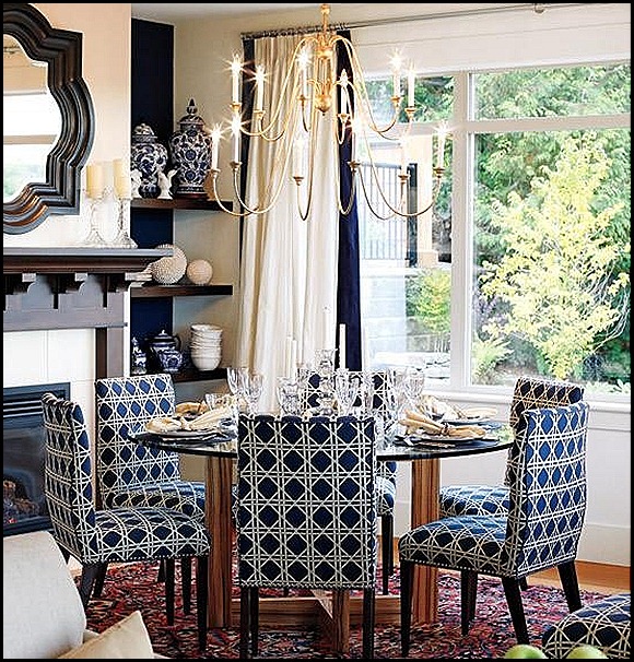
I gathered some pictures of rooms that are blue and white with touches of black that will show you if it is done right it makes a beautiful room.

Of course I will have to have my punch of green and a bit of pink here and there.

You are about to see some rooms that are the color of a bruise, Black and Blue!!……….
DECORPAD (360x460)
Decorpad


4 (600x524) 


ashley whittaker house beautiful (360x460)
Ashley Whittaker 


3 (400x320) 


2 Delphine Krakoff (499x534)
Delphine Krakoff


1 (400x400) 


Bear Hill Interiors (309x454)
Bear Hill Interiors


jennifer mcgee design  Effortless style blog (471x339)
Jennifer McGee Designs via Effortless Style blog


Emily Jenkins Followill Photography (340x450)
Emily Jenkins Followil Photography


elizabeth culter (400x322)
Elizabeth Cutler


touch of black (600x450) 


Windsor Smith (466x600)
Windsor Smith


J. Savage Gibson Photography (400x400)
J. Savage Gibson Photography


phoebe howard (600x399)
Phoebe Howard


sarah richardson (550x575)
Sarah Richardson


After seeing all the above images are you a fan of black and blue?

I think you can tell when touches of black are added in just the right areas, and in the right amount, it makes a wonderful statement in a room with blue and white.

 In most cases I would add a pop of green to make it more to my liking, but I am totally drawn to all of these rooms color schemes.

Diane I hope this post answers your question that you left in the comments!? I sure had fun pulling it all together.

All of my readers that leave comments truly inspire me and make me try harder. Because of you I am learning more every day, thank you for that!!!
 Also, thank you so much for your continued reading and commenting. I look forward every day to see who has visited and what you have to say!!

Enjoy the Process” Of:

Researching color combinations that are appealing to your own design aesthetics.


Kathysue