home about me our home

Wednesday, March 13, 2013

Do You Live With Colors That Make You Smile?


Color is back in a big and beautiful way!!
 
Everywhere I look I am seeing bright, beautiful colors.

I am sure you have all noticed in Spring fashions we are being shown beautiful and fun color combinations.


You don’t have to find color inspiration at the clothing stores, or even in home design centers, just look around you. Color inspiration is everywhere.

If an image is attractive to you, study it and figure out what it is that you love about it. It does not have to be a literal translation.


Look at an image and write down the key words that refer to the colors, texture, feel of the image and then see how you can translate those words into your room.

Today I am going to show you some images that inspire me and how they can translate into home décor.

Inspiration……


Mother nature is always the best colorist, just look at this gorgeous clematis in blues and greens.

Translation:

Obviously this room with it’s bold stripes is not for everyone, but you can see how natures color scheme can translate to a room.


Inspiration:

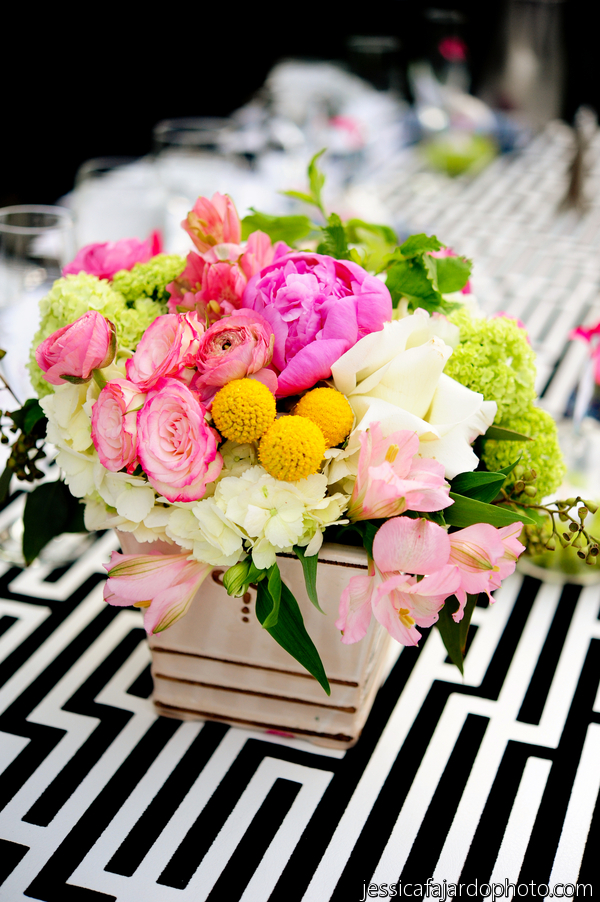
Spring time pastels work well with a black and white backdrop.

Here is a room that shows just how well it can work…..


Inspiration:


Blues, greens, yellow and neutrals all tied up at a boat dock. Look around you will be surprised at how colorful our world is and how many winning combinations it has to offer.

Let’s look at these colors translated into a room………


This is not a literal translation but all the color cues are here, the rough textures of the basket luggage are found in the rug and the blinds.

Inspiration:

Beautiful blues and greens with the rough natural texture of a basket. Notice the blue in the denim jeans as well.


Translation:


Blues, greens, neutrals they are all here, even the rough texture has been translated in the finish of the cabinet.
Inspiration:


Translation:


Even though this blue and yellow combination is not as bright as the above it still gave us our color inspiration in a more traditional manner.

Inspiration:


A stack of beautiful cashmere sweaters ranging from turquoise to greens. You might see something similar when out shopping for clothing. Look around at how they display colors in the stores.
Translation:

Again this is not a literal translation but the color cues are here.

It is so important to surround yourself with elements that are pleasing to your eye. So many live in a colorless world or one filled with colors they don’t really love.

Today start looking at your world a little differently. Look around you for color combinations that are attractive to you. 

Think of ways you can add them to your own home in a manner that is pleasing to your own personal design aesthetics.

QUESTION TO ASK YOURSELF:

Are you living with the colors that make you smile!?

Monday, March 11, 2013

WHO IS THE WINNER OF THE PILLOW!?


And the winner is....................


LAUREN


Lauren said...I love the Betwixt pattern and would LOVE to win the pillow! I would choose the color Water for for family room. Thank you so much for the opportunity!!


CONGRATULATIONS LAUREN!!

YOU WILL BE RECEIVING THE.....

 SCHUMACHER BETWIXT PILLOW IN THE COLOR
WATER


Friday, March 8, 2013

What Is The **STAR** In Your Room?


There are so many details, and layers to consider when you are designing a room.

Something I have noticed when guiding clients, and even in my own life is it is hard to not get caught up in making every detail a star!


What do I mean by that? When we get to re-do a room, and finally get to add some new details to our home it is hard to use restraint, and realize that not everything has to be the newest trend, or to be the star in the room. 

In fact it is better to have one, or two leading actors, and the rest of the elements need to be supporting cast members.


There needs to be an easy flow to a room. You do not want your eye jumping from one element to the next.

When I am talking about the star, I am not necessarily meaning the focal point of a room. No, I mean something that almost shouts out, “look at me!”


It could be a piece of furniture, lighting, artwork, flooring. Really just about anything.

Where we all can go wrong is when we want every element to shout, “Look at Me!”


This is a gentle reminder to you, and to myself……

Restraint in a room design is necessary,choose one or two elements that are the most important to you to be the stars in your room.


When I started formulating my ideas for my family room, I realized after studying the rooms I was attracted to that I needed to have a great piece of art in my room. 

Something that was bright, and cheerful that would grab your eye.

I realize I will have to be very careful when I add art to my room.


One of the important supporting actors was going to be the lighting in the room. Lighting is very important to me so it all has to blend well in my minds eye.


Look at a room in your home. Can you pick out the stars,do you have too many? Which pieces are your supporting actors?

These are important details to think about when you are putting together a room.


We are all going to be experiencing Spring fever very soon, and most of us will be making some changes in our homes. 

I hope this little exercise will help you when it comes time to edit and/or add any new pieces to your rooms.

Remember To Enter
Don’t forget to leave a comment on my last post in order to have a chance to win your choice of a Schumacher Betwixt Pillow in the color of your choice from……..
  

il_170x135.426151974_mq11il_170x135.427442780_1242il_170x135.426166246_tm34
BETWIXT pattern has 8 colors to choose from!
Go HERE to choose which color you want for your home.
Then come back HERE and leave a comment!!
GOOD LUCK!!