Thursday, January 26, 2017

10 Area Rugs For Entry Halls


I am a believer that the entry into a person's home should be the first glimpse of what the guest will see as they see the rest of your home.

 It is your home's very first greeting. Basically it is your home's opening statement.


What do you want you home to say to your guest?

You might want to introduce the style, and feel of your home, or maybe you want to introduce one of the main colors you will be using in your home. 


Entries are the perfect place to make both of these statements.
 
 
For such a small area it can really have a big impact on your home! 


Try to keep that in mind when you make decisions on what to place in your small area, actually whether it is a big, or small entry it will have a big impact on your guest.


We all have walls, flooring, doors, and ceilings in our entry, no matter how large or small. When you think about it you have quite a canvas to do something beautiful. 


I find it helpful to write down what I want my guest to feel when they enter our home.


Here is what I wrote for my own personal entry hall to better give you an idea of what I am talking about.
 
 
“You are about to enter the place we love, and call home, as you enter I hope you know your are welcomed here. We hope we have made you just a bit curious about how the rest of our home will look by our choices in colors, wall treatments, and the other elements we chose to greet you.  We love beautiful things, but nothing is too precious in our home that it will ever be more important than YOU.  We hope your feel at peace, and relaxed while you visit here.”
 
When you think about it, it is a pretty tall order for usually a very small area.


So that my dear friends is why I spent two whole days looking for a small 2X3 ft rug for my entry doorway.


I had to keep in mind the over all style of my home and the color scheme. 
 
Style: Traditional with a coastal feel, somewhat ofa
          Nantucket or Hamptoms vibe.
Colors: Black and white, or blue and white.
Patterns: Geometrics, and stripes.


I found the whole process interesting. Once I really got into it I would look at the rug and ask myself does this look like something I would choose, do I really love it?
 
Here is a line up of some of the rugs that caught my eye.....
 #1
 
#2


#3


#4


#5


#6


#7


#8


#9


#10


I think I have plenty to choose from so now I have to narrow down my choices by dissecting them by size, care and price!!!
 
Which one is your favorite for my entry!!
 
Here is a little reminder of the elements that will go into my small 53" X 93" room...
 
via 
Are you happy with the way your entry greets your guest?
 
For more ideas on entry halls and area rugs take a look at my pinterest boards....
 
All above images were from these two boards......


Sunday, January 22, 2017

The Big MISTAKE I Made!!


Hindsight is 20-20 so they say. 

In hindsight I realize that I made some mistakes that I wish I could go back and remedy. 

Since none of us can go BACK I thought I would do the next best thing, and share what I have learned with all of you, especially the younger ladies that follow my blog.

FIRST!

Why oh why did I not take care of my neck and hands like I did my face? 

Here's the deal, I have pretty good skin, thanks to my gene pool, but and it is a big BUT

Genes can only carry you so far and as you get into your 40's-50's-60's and beyond the lack of care, and attention you paid to your skin will show up in ways you never thought possible in your youth.

I am following a very good skin care regime now, but I am 66 years old, if I did this in my 30's and 40's I truly believe my skin would look much better than it does now.

If you are interested in the skincare regime I am using you can read about it HERE!!


Back to my neck and my hands. I use to have pretty hands, people would actually tell me that I had pretty hands. Well, I have not heard that nice compliment in a  very long time. I never used gloves while cleaning, sure I used and still do use hand cream. 


Neutrogena is my all time favorite. However I did not protect my hands from damage from the sun, and it would have  been so simple to apply a sun screen to my hands like I do to my face.


Trust me on this one ladies, USE SUNSCREEN on your hands, and wear gloves when doing dishes and cleaning. You will be so thankful when you get my age that you did this simple thing.

They say you can tell a women's true age by her hands and neck, those two areas show our age.

There are lots of things people can do to their faces to make them look younger, but those two areas are the Tell All areas.

Recently in my skincare regime I have been using a vitamin C serum. I not only use it on age spots on my face but also on my hands. I will have to say in the last few months the spots have lightened a good 50% so I will continue using this product on my hands as well.....


So if you are not using sunscreen on your face and hands and treating your face, neck and hands as equals in the skincare department, start NOW! It literally takes a couple of extra moments, and you will be so glad that you did as you become a bit older!!


Friday, January 20, 2017

Update On Our Entry Hall Design


In my last post I wrote about our plans on making some changes to our very small entry hall. It needed some personality and we wanted to add our own personal touches.

We have contractors coming to give us some estimates on the cost. That was exciting!! Of course we don't have the bids yet. Once we get that it might not be quite as exciting to my sweet husband.

Since the work will be starting as soon as we decide on the contractor I knew I needed to have the lighting ordered and on its way since that will be one of the first parts of the installation.

I had a line up of contenders.....

 I did mock ups of each of these fixtures and I had my favorite chosen.

Once the contractor did some measuring I realized that my favorite which was the second one pictured would not fit the overall design.

Of course that led me to more looking and looking at every little detail and measurement. I decided on the size I needed and went from there.

I always kept in mind the overhead lighting fixture.....


I knew I could go two directions. One would be an antique brass because of the canopy and the bottom cap on the fixture. The other could be a dark bronze more of a blackish metal because of the trim.

 Remember it is important to look beyond just the one element your are choosing. You must always look at it from the point of view of the whole context. You will want a nice seamless flow.


Next I had to think beyond the entry hall into the great room which can be seen from the entry hall.

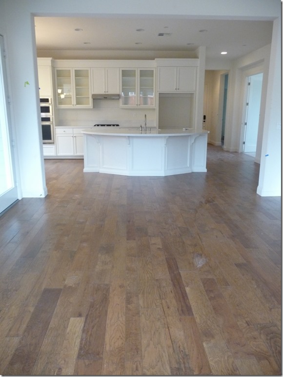
This is a picture taken of our home before we moved in, you can see the front door from the Great room. It is almost like a shotgun house.

With that in mind I needed to take into consideration the sconces, and lighting that are in my kitchen dinette and Great room since you will see them all as you enter our home.

We actually brought this from our previous home. This chandelier was purchased on clearance for $39.99. We reconfigured it a bit, but what we purchased as a temporary lighting fixture for our previous home has turned out to be pretty permanent. I do want to change it down the road, but it is not a priority right now.

Next was the great room lighting.....

These sconces are an aged bronze designed by Thomas O'Brien, the Bryant sconce is carried by Visual comfort. HERE!

I also have an aged bronze tri-pod floor lamp in our great room......


I found this tripod floor lamp HERE!

By now I imagine you can see the direction I am going!

I truly thought I wanted to use an aged brass in the entry hall but I had a little uneasy feeling about using the brass even though the overhead light had brass in it's design. I have a little saying that has been tried and true for me.

"When in doubt, DON'T!"

So I waited, did a great deal of thinking, and debating in my brain. I finally pulled the trigger and the order has been placed for two of these sconces.........


I ordered mine through Bellacor since they were offering free shipping and a 15% discount.

The reasons that I chose this particular sconce are the obvious one, it goes with the other lighting finishes in my home. 

I don't think they have to necessarily match, however with the way my home is set up, it feels the best solution to me. However, I hope you realize you can mix metals beautifully with careful thought and execution.

I liked the warmth of the aging of the bronze. I like it's clean yet curved silhouette. 

It also lends itself to a traditional feel, which my home evokes. Notice the little key on the side, I love that feature and with this particular fixture it is actually functional. 

The stem of the light can go up or down according the the height your room requires. Last but not least I love the little shade and the little ball finial on top.

I did a mock up using another entry hall just to see the elements together. This is very similar to the look I am going for. You will have to envision a slab mirror in the center panel that will be behind the mirror we are using.

I am very comfortable with the over all look and so is my sweet hubby. So my dear readers the lighting is ordered and we are waiting on the bids!! To say I am excited is an understatement!!