I am sure our first thought when it comes to giving our eyes a rest would be of us lying down somewhere comfortable, and
having our eyes closed. I am not talking about that kind of rest.
What I am referring too is.....
"Where in a room does the eye rest?"
If there is too much pattern going
on in a room the eye will not have a place to rest. Pattern makes
movement on the eye and in the brain. Too much color and pattern can
make the eyes weary.
The amount of patterns in a room will always be subjective to how many patterns the homeowner can tolerate.
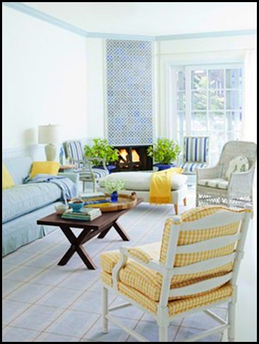
None:
A couple:
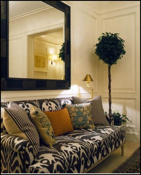
A Few:
An Abundance:
via Little Green Notebook
One design principle that is not talked about very often is where in the room will your eyes go to rest.
We all have a different tolerance for the
amount of patterns, colors, or elements we can handle in a room. Whether it is a
few or many, always remember you will need a place in the room's visual
flow for the eye to rest.
What can we do to achieve a resting place for
the eye?
If you look at all the images above you will see a large expanse, or back drop of a solid color. Or in some cases you will see a lot of white.
Solid neutral back drops are a great place to rest the eye. Also, by
adding a solid color on a pillow or having a solid sofa will allow the
eye to rest.
When you are working with a lot of color or
pattern your eye and your brain will need a rest, and white will almost
always give you the respite you will need.
I have read that a lot of designers will have
homes void of too much color or pattern due to the fact that they work
with those elements all day long. Coming home to more color and pattern is just too much for them to
deal with.
What Can You Do ?
Sometimes all it takes is a little bit of de-cluttering. Remove a few things and see how much better your room can breathe.
Take all of the accessories out of the room then begin by putting back the larger pieces first, and only put the pieces out that you love. After you do that look around and see where you want to add some smaller objects and add them judiciously.
This will open up some visual space and give your room a more open and airy feel.
Be in tuned to how much pattern you can tolerate in a room, and always make sure you have an area to rest the eye!!

![SL0403008d_1_y[1] SL0403008d_1_y[1]](https://blogger.googleusercontent.com/img/b/R29vZ2xl/AVvXsEialnSJ-Ac1_cAPGJrwdQxT0NbxH9tD6XhwsnuyB5IcFfalzFZz1kJ8lHBk-RlVkgD_oEQ7hi98i2la_8iVstbiJcEgrNGKBMKRouSPuTHOoU9Oqa7Mfcvrsg1VMCdJhHe6ljSpNyE436g/?imgmax=800)


I had a wonderful gardening instructor who emphasised that in a well designed garden the eye needed a place to rest...as you say it is just as important in interiors. A very important thing to think about.
ReplyDeleteGreat advice. Something most people do not think of. I will have to check out our own home to check....
ReplyDeleteGreat point! I've noticed as the years have gone by that I need a more calm look to my decorating. I can well imagine that a designer needs a place of visual calmness after dealing with the all the design put into other people's homes.
ReplyDeleteA great post Kathysue....something we can all learn from and you chose the best examples!
ReplyDeleteHave a great day!