The
announcement of NEW MODELS always brings out the curiosity in me.
In
our new community they just opened up the new models, it has been
10years since they updated their homes.
Things have changed quite a bit
in the last 10 years in home interiors so I was excited to see what the
new offerings would be.
As
in all models I knew I would like some elements and would not like
others. They offered some very nice floor plans and I did see certain
elements that I thought were worth taking pictures of.
Since
we have already purchased our new home I was more interested in culling
ideas than wanting to buy. I will admit I did compare my new little
cottage to these new models and I must say I am completely satisfied
with our choice of home and elements.
The lighting, molding, and wall treatments, and landscaping were what I was particularly interested in seeing.
I
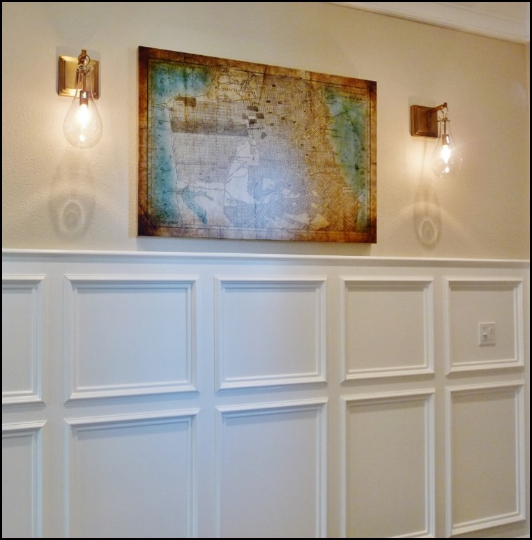
loved some of the lighting that was used in the models. There was a
pair of sconces that I fell in love with and was curious enough to find
them online after a bit of searching……

This
area was a hallway leading off of the entry to the guest bedroom and
office area. I also loved the wainscoting in this model You will have to
excuse my photography skills or lack of.
These sconces really grabbed my attention. So much that I actually went looking on line for them and I found them…
You
can see all the detail and how interesting this fixture actually is. I
could see this a bathroom flanking a simple mirror. They are actually
15in high so they are a nice substantial piece. They just fascinated me
and trust me, they are pinned on my lighting pinboard, HERE!
The other light that caught my eye was actually in the office/den hanging over the desk….
I realize that this is not a light fixture for everyone, but this girl loves it. Just for fun I sourced it, and found it!!!
I don’t think the picture online does it justice, it really does show much nicer in person, and for the price it should!!
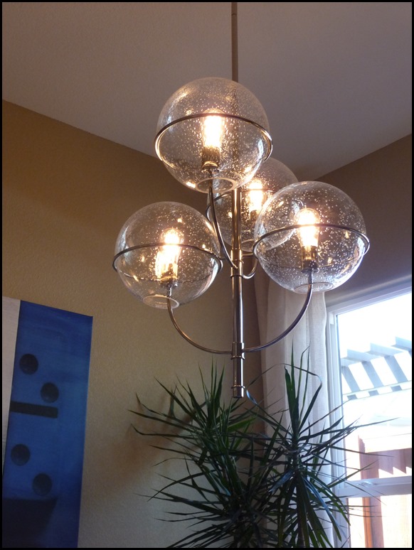
This
next fixture resembles Circa lightings Darlana. However it is not,
because this only has 4 lights and the Darlana has more.
I
still think the style and shape is such a classic that I believe it
will have longevity. All the homes had 10-12 ft ceilings and in person
this particular fixture looked over scale in this setting from my
observations, but the style worked perfectly.
I
found this next fixture to be a bit kitschy, but very interesting and
fun. If keys have a special meaning to you, this is the fixture for you…
This
was their ode to industrial styling. the home itself was what I would
call an Urban Farmhouse exterior so these fixtures paired well with that
look.
In
the actual kitchen they looked crowded to me, one step to far, I think
two would have been sufficient for the size and diameter of these
fixtures. I know the rule of threes, but aren’t rules meant to be broken
so you can maintain your own originality?
When
I was in Cost Plus the other day they had a black metal pendant with a
gold lining very similar to these, or at least the same feel for a
really inexpensive cost. They don’t have it online so they might be
selling the last of them in the store, but definitely worth the look if
you like the looks of these pendants.
Now
here is where three fixtures looked great, I did not take the picture
from the best vantage point so you will have to trust me on this one.
I fell in love with these fixtures, I know they are everywhere right now, but their sparkle is captivating to me.
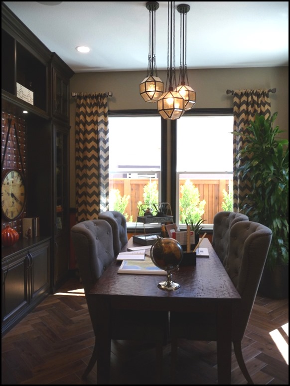
This
room was set up as a dining/office and the lighting really caught my
eye. I like the use of three pendants hanging at different levels.
Interesting. Love a linear chandelier over a bar or a long dining table.
This
was in a bedroom and you will have to trust me on this, but again, it
is too large for the room, it felt like it was coming down on you, even
with the 10ft high ceilings. Scale, people SCALE matters!!
Another
office den with very fun sputnik type pendant and some very handsome
wall sconces. Not my colors but I think this room was done very nicely.
This fixture is going to get a bad review, mostly because of it’s surroundings, but I have to say it was pretty cool in person.
Not for everyone, and not in my home, but in the right setting it is pretty cool, and I liked it.
This was very pretty in person, lots of sparkle.
So
there you have it. There were others I probably should have taken a
picture of, and if I go back I might add to the collection.
Always fun to see what they are showing to the new buyers!! None of what we are seeing is a standard choice.
No Surprise there!!
Hope you enjoyed seeing the lighting!!


I love great lighting. When my husband & I had our place built 16 years ago, I didn't care for the builder's brass lighting. So we paid for the upgrade of the same lights but with a white finish. (I thought I was so smart. Ha!)
ReplyDeleteAfter we moved in & saw them, it seemed like they just took the brass lights & spray painted them white. I get sick whenever I think about how we have to pay for that upgrade on our 30 year mortgage.
As I've gotten older & better at designing my home, I've replaced them all with lights that are more stylish/contemporary.
Thank you for bringing us with you to view the model homes. It's nice to see what's new in design. I have to say though...I'm a little surprised to see the skimpy valance in the den. It looks kinda cheesy to me.
That was a fun read. I liked several of the fixtures. The one with the black tubes made me snicker because we have two wind chimes made with tubes just like those (except no gold accents)! I do like the sconce lights you found- I can imagine them in your home!
ReplyDeleteI am a big on statement lighting and think it can make a room. The first image lighting is amazing. Like you, I think it would be amazing in a bathroom. Happy Tuesday, Kathysue!
ReplyDeleteI love that first sconce too....there is always going to be something better...a better model, better lighting..I got caught up in decorating paralysis when we were building our last home...afraid to make a decision and then see a better option...but I got over it quickly if we wanted to move in in a decent timeframe. You seem to make great decisions as you are very confident in what your vision is for your new home....
ReplyDelete