If you are getting ready to paint a room and are about to choose a new color of paint for your home, this post will probably help you out in your decision making. I am going to tell you and show you how I go through the process in choosing paint for my own home.
When we changed
out the counter top, and the backsplash in the kitchen I noticed that
the paint color in the family room just looked like too much color.
It seemed to me the walls were shouting, “Look at me!” I wanted the walls to blend, and be more of a backdrop to my décor so the search began.
The
color that is on my walls right now has been there for over 30 some odd
years. I know!! That is longer than some marriages can last!
It does feel like I am divorcing the paint color I have had custom blended for so many years.
Out With The Old In With The New!
The sampling began!
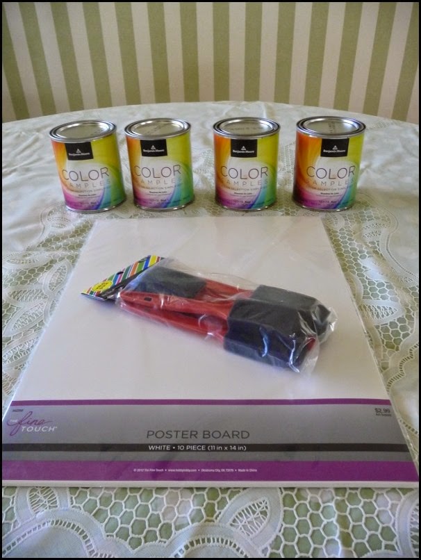
I chose 4 warm whites from Benjamin Moore.
Mayonnaise
Linen white
Marble white
Navajo white
Whenever
I am using lighter colors I always ask to see the pigments, and to see
the formula. This will help me to know what undertones might show in the
color choices I am making.
The formula is almost always on the outside of the can. I do this before they are mixed when I am buying multiples for sampling.
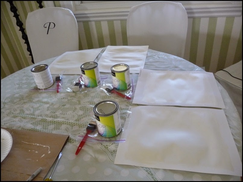
You
will notice I am painting on sample boards vs. the actual wall. This is
the easiest way to narrow it down to one or two colors, and you won’t
have to live with a wall that looks like a sampler quilt.
In all of my years of doing samples I have always sampled on boards for a couple of reasons.
WARNING
I
did have a client that did sampling on her wall, and when it came time
to paint, the sample kept coming through even though we were painting
with the very same color.
The
light went across the wall and because paint will add a layer of skin,
so to speak, to the wall it can sometimes show through because of that
ever so slight layer.
The
other reason I like to sample on poster board is so I can move the
sample around the room during different times of the day.
Lighting plays a huge part on how the color will look throughout the day. Especially colors with less pigment added to them.
When sampling a color always do minimum 2 coats but 3 coats is even better to get the full depth of the color.
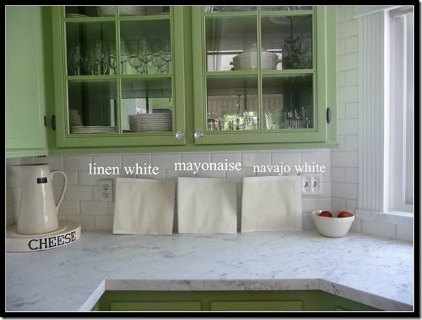
Here are the 3 colors that made the cut, and then I narrowed it down to 2 colors.
I realize that your computer screens will all see the colors differently, but this will give you a fairly good idea.
After living with all three of these colors throughout the day I narrowed it down to the lighter colors……
The formula for the linen white has:
Yellow oxide ( Burnished Gold yellow)
Yellow-Yellow (bright yellow)
Gray (Medium shade)
Red oxide (Burnished red)
Knowing
the pigments tells me that this color will be a bit warmer due to the
red added, and also it will be a bit muddier because of the gray, and
the oxide in the yellows and the reds.
The formula for the mayonnaise has:
Only one pigment, Yellow oxide.
This will give a warm creamy white.
I
actually had a tinter use only yellow oxide for the outside of my home,
which is a nice buttery, creamy yellow. Of course it has more pigment
in a gallon so it comes off yellow not cream.
This shows how it goes with the marble.
At the end of my breakfast bar.
Even
though the color of paint will not be in this part of the kitchen I
wanted to see how it looked in bright light next to the backsplash and
countertops.
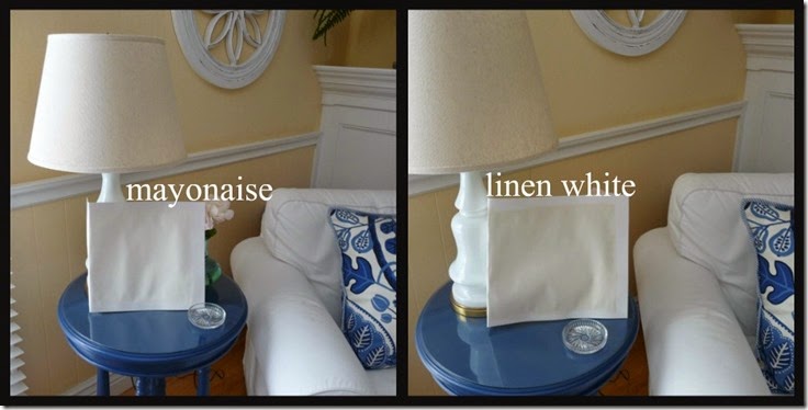
I
also placed the samples by my blue end table with white lamp, and linen
lampshade. I love the color of the linen lampshade so I wanted to see
how they looked there.
So far it is between the linen white and mayonaise!
Both
colors work well with the other fabrics I use throughout the changing
seasons, and to be honest they are quite close in certain lighting.
Next step:
Paint some on the wall!

.jpg)


Great lesson. Worth it's weight in gold!
ReplyDeleteVery smart Kathysue! Great advise...
ReplyDeleteThank you,
Sharon
Very smart Kathysue! Great advise...
ReplyDeleteThank you,
Sharon
There are so many thinks to consider before painting the home!I have never think like this way.We always use commercial painter.Thanks for a wonderful post.I will wait for the next post eagerly.
ReplyDeleteThe proverbial new pillow for the sofa.... Luck! franki
ReplyDeleteI love the idea of a warm white...its going to look great!
ReplyDelete