When I say bright I mean very bright!! Bright vibrant yellow and white to mix with my greens and the galvanized French flower buckets.
I have already reviewed my past table settings and I also visited the idea of using soft to medium valued pinks.
Now I am going to visit the idea of a wonderfully bright and vibrant yellow!!
Let me show you some of the images in my inspiration files…………………
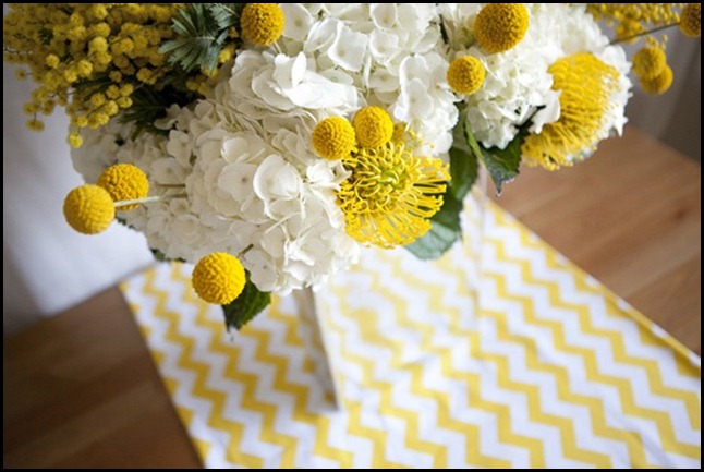
It all started when I saw this image!
I love the brightness of the yellow and white. The table runner reminds me of the rick-rack my Mom use to put on my dresses at Easter time. I am now on the hunt for this fabric!!!
I love when one flower is used in mass like this. The jelly beans make this so fun and festive. I wonder if my sweet hubby would mind helping me pick out the green, white and yellow jelly beans? The other colors will just not work in my color scheme of yellow and white. What else is a girl to do?
Nobody can do an Easter table setting better than Martha Stewart, she gets it right every time.
Such a cute idea to grow alfalfa for place mats. See how pretty yellow,white and green look together. Now just add a French flower bucket in there somewhere and we are in business.
Gingham checks would be great for a tablecloth!!
Love love this idea!!!
These are images that I am really attracted too. When I look at images like these above, I look for their use of not only colors, but there use of scale, texture and shape. I might just glean one element out of the image that will inspire me to do something similar or totally different, but with the same feeling that will apply to my tablesetting.
We have visited the idea of the soft to medium valued pinks and now the bright yellows and whites. My next step is to come up with the elements that would work well in both applications and somewhere in this process I will lean more towards one over the other.
I am such a visual person I can see pictures in my mind’s eye. It is not to say that I won’t tweak my original idea along the way. That is just part of the creative process.
I once read a something that a designer said that has always stuck with me. He said, “There are no mistakes in the design process only opportunities to become more creative!!” I am paraphrasing here but I think it so true.
So come back and see what my next step will be!!!!
“Enjoy the Process” Of:
Looking at several color schemes
for your design plan.
Kathysue


I love spring colors and yellow always says spring to me. I know I've seen a yellow and white fabric like that at Fabric.com.
ReplyDeleteHow beautiful Kathysue, I can't wait to see you pics of what you come up with. You are definately very good at this table scaping business, Im inspired!
ReplyDeleteYour bright idea gave me a bright idea!!! YES! I love your color scheme! Oh and the fabric? Check out fabric.com and search zigzag. You should find the premier prints version of that fabric for about $6.98!
ReplyDeleteokay, fabric.com don't have any more available... try this http://www.premierprintsfabric.com/zzgcys.shtml
ReplyDeleteI will come back. I think you may inspire me to pull out the dishes and whip up a a lil summin summin for the Easter. Wait...NM, I won't even be home. Ahhhh
ReplyDeleteWell looks like I will just have to stayed tuned to get my Easter fix from Ms. Kathysue!!!!
Mr. Goodwill Hunting
Love this color scheme! If your hubs is anything like mine he'll gladly help with the Jellybeans if you frame the request right. Something like, "I need you to eat all of these except the white, green, and yellow ones." Can't wait to see your table.
ReplyDeleteKathysue, I think the yellow & white would look beautiful. I can't wait to see what you come up with!
ReplyDeleteSusan
I'm loving this, kathysue!!!
ReplyDeleteIt feels really, really happy and that vase with jelly beams made me smile!
Beautiful post as always!
Have a wonderful Spring, sweetie!
xo
Luciane at HomeBunch.com
The brighter the better! I love the grass place mats. So perfect for an outdoor Easter table.
ReplyDeleteHave fun planning and setting.
Xo,
E&J
Beautiful photos! I love yellow too, KathySue. It makes everything look so bright and cheerful...Christine
ReplyDeleteBright yellows equal spring! So cheerful and sunny!
ReplyDeletexo Cathy
Yellow is my all time favorite color. You have to smile when you see it. There is really no other option! Can't wait to see it all come together. xoxo
ReplyDeleteI think this is going to be a great table.....love the idea of the yellow...and love that yellow chevron! Cannot wait to see what you come up with.
ReplyDeleteLoved the post! Come visit us at Dovecote Decor to see our fabulous French Basketeer Giveaway!
ReplyDeleteBest,
Liz
Kathysue~ The yellow is so bright and cheery!!!! MUCH NEEDED right now it seems!
ReplyDeleteCan not wait to see what you do with your Easter table!
Have a pretty day!
Kristin
Gorgeous post , you have just inspired me !
ReplyDeleteKaryn x
Well you know you had me at hello on this post :) Love all your images! Happy Spring Kathysue!
ReplyDeletex
Maria
Bright yellows and greens definitely say Spring!
ReplyDeleteI am so looking forward to see what color scheme you definitely go with. I love the images you have shown in both yellow and pink. Hmmm...you are teasing us!
You are singing
ReplyDeletemy song, Kathysue!!!
LOVE this color
scheme right now.
Impossible to feel
glum with yellow
and white all around!
xx Suzanne
All so fresh, pretty and so evocative of spring.
ReplyDeleteI love your really bold, bright yellow inspiration photos Kathysue! Your Easter table will be amazing I'm sure! I like the idea of grouping the yellow daffodils en masse too, but maybe lining the glass container with wide shaped leaves horizontally. Then you won't have to pick out those jelly beans that don't go with your look! haha. Great post my friend. Let's talk soon. I need some KS time! ~Delores
ReplyDeleteThose are real bright inspirations...
ReplyDeleteLove the look you're going for ♥
Can't wait to see how your easter table setting would look like...
do share ♥
Love, love, love that beautiful, happy yellow! The jelly bean jar is such a cute idea for easter, you can send the extras my way :) Can't wait to see what you do with your table. Hugs, Kat
ReplyDeleteLove the idea of yellow for Easter - and I just love the assemblage of the little terra cotta pots with daffodils.
ReplyDelete*** THIS.... WAS.... BEAUTIFUL...!!!
ReplyDeleteThanks for the OH-SO-PRETTY INSPIRATIONS, Ks!!! (I copied many of the photos for MY "inspiration"!!!)...
Warmest blessings,
Linda in AZ *
bellesmom1234@comcast.net
Truly heart-warming! I love yellow, bright and lovely! I'm super addicted to you blog!
ReplyDelete