For the other looks my mantle takes on throughout the year you can go here if you would like to see more.
This summer I decided to do something a little different by adding some watermelon pink to the mantle.
This summer I decided to do something a little different by adding some watermelon pink to the mantle.
First I took away all the accessories to have a blank surface. This mantle is 17ft long with only 3ft 9in. of wall space above it. It is a bit hard to decorate. I have found for my own personal taste I like fewer but larger items on the mantle.
I gathered together the items I thought I wanted to use to create a color story.
I thought I would add a bit of the watermelon pink since that color is also in the room. It all looked as if it would work when I gathered the pieces together.
This is just a picture of the pieces gathered this is not how I placed them!!
This is just a picture of the pieces gathered this is not how I placed them!!
After trying and trying to live with the pink for one day, It was just too much going on for my eye. I felt that my eye jolted from one piece to the other and that is NOT the look I was going for.
I proceeded to take all the pink away and then it finally started looking like the peaceful serene mantle I was trying to decorate.

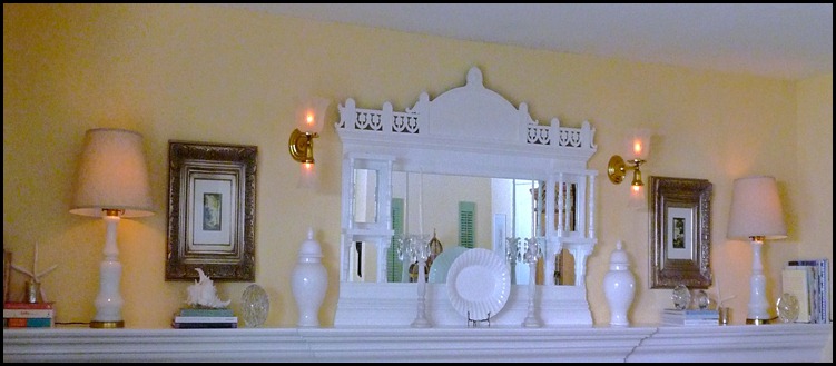
My all white mantle! Simple, Yes, Calming Yes!! Just what I wanted. It is a light and airy feel and it works well in the room. Here are some close-ups of the pieces I used on the mantle.
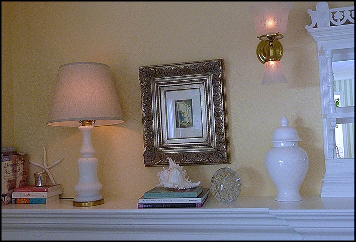
I love the bubble balls, they remind me of the bubbles in the ocean surf. The picture on the wall is of a small sailboat in the distance. I only wish I could be on that little sail boat. You can catch a glimpse of a star fish and a mercury glass votive that glows so pretty in the evening and it also picks up the finish on the picture frame.
This is a close-up of the picture.
This is the picture on the left side of the mantle.
The left side of the mantle.
This is my antique overmantle. It is from the late 1890’s and it is mahogany. We added moulding at the base to make it look as if it is integral with the mantle piece. I had to have white so we painted it to match the white of all the woodwork throughout the house. It is Kelly Moore's Swiss Coffee, a warm white.
So there you have it, my summer mantle in white!!
“Enjoy the Process” Of:
Making fresh,new changes for the summer months!
Kathysue


Hi Kathysue...
ReplyDeleteOhhh my...I just adore your "all white" summer mantel, my friend! It really is gorgeous and so serene! You really just can't beat that "all white" look for summer...so fresh! You know that I love the beautiful blues and greens that you also use, but it's always fun to change things up a bit! Ohhh...and I think you know just how much I love that fabulous ornate mantel piece! I remember when I first seen it at RMS...it just took my breath away!!! Thank you for sharing your beautiful summer mantel with us...such a treat, my friend!
How are you doing, Girlfriend? I see that you are keeping very busy this summer. I hope that my note finds you well! It's been busy, busy...at my place but I've enjoyed every minute of it! Talk to you later, sweet lady...
Warmest wishes,
Chari @Happy To Design
I love the way you did the all white mantel. It is crisp and cool and refreshing to look at. I remember the antique mirror from before - gorgeous! Linda
ReplyDeleteI purchased a big
ReplyDeletebubble ball this
spring and I just
love the look!
I like how you
shared your editing
process, Kathysue....
Sometimes less truly
is MORE! That is
a challenging mantle
and you really made
it sing!
xx Suzanne
Hi Kathysue,
ReplyDeleteI think your mantle looks lovely, soft and pretty. Very summery.
hugs
Sissie
Kathysue, I love this look. I, too, went with mostly white on our mantle for the first time this summer. I'm finding as myself drawn to more serene looks lately- probably because life is so chaotic right now! Gorgeous!
ReplyDeletexoxo Pattie
Beautiful as always, Kathysue. You have just the perfect scale. Not too much and not too little and that is hard to do on a mantel that long.
ReplyDeleteit's soothing, clean and very refreshing!
ReplyDeleteyou must just want to gaze at it all day!!
I love the little touches of pink!
ReplyDeleteYour mantle is looking so fresh Kathysue. You have so much room to work with and you staged it perfectly. I really like the lamps on either end casting a soft glow. I have a confession: I hardly ever change out my mantle. I'm too lazy!
ReplyDeleteYour mantle is so pretty. The detail is awesome. I love it painted white too.
ReplyDeletePerfection! I love it all! The pictures are just gorgeous...the subject matter and the frames! The antique mantel piece is breathtaking! I adore the all white them it is just soooo calming!
ReplyDeleteLove love love!
Cathy
Oh Kathysue, it looks perfect. I love it in all white. You always decorate it so beautifully, but I think the all white is my favorite. Gorgeous and you know how much I love this room. So pretty. Hugs, Marty
ReplyDeleteto really appreciate and enjoy the symmetry I would remove the plate and candles from in front of the mirror. Other than that it looks great and how nice to be able to have lamps on the mantle. Love the bubble balls as well.
ReplyDeleteSo simple, beautiful and elegant! Love it!
ReplyDeleteI would be thrilled for a mantle that long. Our home built in the 20's has 7 foot ceilings and stucco walls meaning no hanging anything unless you are really sure.
ReplyDeleteWe did pick up a lovely piece like the one you show but without the shelves. It just overpowers. Sad.
A beautiful, feminine design asthetic, just as I would expect from you. If someone asked me to design a Kathysue mantel, that's what it would look like! I love the bubble balls!
ReplyDeleteHope you're doing well my friend. I"ve missed connecting with you some this week!
Sally@DivineDistractions
I love it, but I love everything you do, I even liked your idea of the watermelon accents and the look of your gathered items. In my book... you can do no wrong :)
ReplyDeleteLove you
x
I actually love all 3 iterations: the b&w, the watermelon, the all-white. You could teach a course of styling mantles! ;)
ReplyDeletePinkish red is a great color and it looks so good with your white and blue. I think that was a great idea. It's so fun to see changes you make!
ReplyDelete