home about me our home

Thursday, March 10, 2016

Craving Some Spring Color In My Decor


Today I will share with you a method that I use to become very aware of what my client, or in this case, what I will truly love when adding new elements/color to my home.


2b9086feec2550aae3024bd0385d5029
(minus the orange of course.)

Maybe it is the cold rainy days we have been having lately that has me craving some cheerful, happy colors. (However I am very grateful for rain in California, we need it!)
35c8532bfc7e8e17a8b99e9b1184a516

I am a Springtime gal at heart and the colors in my home reflect that.


Blues, greens, mixed with black and white is always at the base of my personal décor. 

This base has allowed me to add other colors easily. Two colors that I want to add for Spring are the colors I predicted as last years colors of the year.


PINK AND YELLOW
2015 color of the year pale blushCOLOR FOR 2013
In looking around at rooms that incorporate these colors as well as the other colors in my room I have actually found a few that I like….


196a5950596ae201f002aec2551df24a

When adding a new element or color to a room, it is a good idea to clip, or pin images of rooms you like, and then dissect them to see what it is that you are drawn to in each image. 

For instance in this image I am drawn to three things, the overall color scheme, the landscape print and the graphic black and white pillow on the center of the couch.

Below you will see a list of elements, and colors that I need/want in my room. This list was made by analyzing every picture in this post.

This is a process I use to take my clients through in order to determine what they truly loved, and needed to have in their environment.

In doing this you will see puzzle pieces emerge and then there will be a definite element or color that is a constant as you will see in the following images that I pinned for my own study.


kirsten_kelli 3
The rug is the first thing that catches my eye in this image. I also love the colors, bright pink, blues, greens with a base of black and white. The blue and white porcelain seems to be a constant in rooms that I love as well.


4ea444fee8332a2bdbc3aca71a7bf0d7

Again we see the same rug that I have in my family room. In this room I am struck by a couple of things.
The nod to the beach with the large clam shell which holds a pink orchid, just the right amount of pink. 

The emerald green lamps with touches of gold are also quite appealing to my design senses.


876141d6e63b8e2e45fcdb9dd3516ef7

This image has many of the same elements I am attracted to in the other images, except there is an addition of one more color, YELLOW!. I love the way it makes the room happy!!


6fbd140c55e07e38f48585b2f1abd8b7
Love it all in this collage. Colors, textures, patterns.

8597478ac935cf2364bb5677791c4ed5
Again, pink flowers, graphic print in the candle box, blue, green, pink and a touch of turquoise.


27228046f01615bc218ff675ae8a619a
Graphic patterns in stripe and pillows. A nod to Greek key pattern in the green pillow. Colors, blue, white, pink green turquoise.

There is definitely a pattern that is happening in my way of thinking about what I like in a room!!

dddfec89dd71131bf82716a466e8a986
Colors, patterns and large artwork.

e823243e3a9f7d4031206810682d48ff
Bright emerald green is the star here, with touches of pink and a citron yellow. 

Chinoiserie is another favorite look which would tie in with the preppy side of my brain.

27da3bc064db2e2c1d7d5d9ddaffa1d7
Navy and white, pink and white on a blackish bench. Graphic pillow patterns and Greek key motif. Touches of gold.


0967a46d807bd935b7fcd49569a09046
Blue and white with greens and pink. Touches of Chinoiserie, and graphic patterns.


101b8bd26c9845e64e6b51b50fa0b436
You know the drill by now, all the colors and elements are here! This makes me smile!!


906548bc7a0201704297db1d9318865f
This wallpaper is a favorite of mine as are all of the colors here. Notice the art piece with the yellow background the two Chinese porcelain urns and pink flowers. LOVE that!!!


ef4d8386bf16f6bcf69518faef1d9cfb
I won’t be using any gray but I will be using the other colors in this image in some shape or form.


1be4ee5df11a2f02db1157b3f710cdfe
I can not think of the addition of pink in my room without thinking of Jennifer from Pink Pagoda blog.

She has used the blue and white with pink in her home for as long as I have read her blog. 

She does an impeccable job with this color combination. Always with a classic touch. 

The above picture is of the re-do of her entry hall. Be sure and visit her blog and you will see how talented she is, and why she is a good one to follow if you love pinks and blues, and just good design!


Below is the list I told you I was making of all of the elements,colors, and textures that are appealing to me. I created this list as I analyzed each picture in the post. 


This is a very easy process to do and you will see a pattern emerge as you analyze your favorite images.

I have found this to be a very good method to really come to terms with what a client, or in this case, what I will love in my rooms additions.

1. Large graphic artwork

2. black and white graphic prints

3. blue and white porcelain

4. black and white graphic rug

5. nod to the beach

6.  fresh pink flowers in the room

7. the introduction to some bright emerald
    green

8. add happy yellow in at least one area

9. Chinoiserie influences

10. Greek key motif

11. touches of gold metal


I hope this little exercise will help you out with some of your future projects. It is a really fun exercise to do, and it is one that will only work if you are being completely honest with yourself in what you truly love in a room.


Stay tuned to how I plan on adding some of the above elements into my family room for Spring!!

All of the above images can be found on my pinterest board……


Monday, March 7, 2016

There Is A Method To Mixing Pattern And Color


Choosing the Star fabric for your room!”
Sometimes decorating can be like casting actors in a play. 
After all aren’t we setting a stage, so to speak.
Today I am going to take you through one of the final processes in the coordination of fabrics for a room.
Once you have all of your swatches in hand it is time to start mixing and matching.
The first step is to decide on the STAR!!!
In playing with swatches for my Spring pillows for my family room I tried, and tried to make the addition of yellow the star.
I was considering this fabric by Schumacher…….
Schumacher yellow pillow
Since this was a standout pattern it was a natural for the role as the star.
So why did it not work?
As much as I tried different combinations of coordinates in supporting roles, this one particular fabric was just not strong enough to take on the role of, The Star!
When one star player does not work start looking in your stack of swatches for a new star……
Ribbet collage The contenders spring pillows family room
What makes a fabric a star?
Boldness of color
Scale of design
A Pattern standout.
At a glance I could see several possibilities, but for my particular design aesthetics the blue with white patterns felt like they could be the star.
So I began with my star possibilities…….
Ribbet collage Spring pillow Stars
(Samples are on their way!)
With one of these in mind, I began to play with lining up some supporting actors.
I knew that I wanted a blue, green, yellow and black and white combination so now I just needed to narrow it down.
I started with my next most important color to add to the room….
YELLOW
With the blue fabrics  scale, and design I knew it needed to be a very  easy on the eye, non-committal fabric, you know a pattern that could mix with just about anything.
For me, that would be a smallish sized geometric pattern.
il_570xN.288510721
The other thing I needed to keep in mind was the value of the yellow, not too light, and not too bright because that is what my room requires.
The next fabric choice  almost as important as the yellow was finding the right green. It needed to be fresh and crisp in order to elevate these two patterns to a Spring look.
I had three good options to work with….
Option #1
Ribbet collage spring leaf green
A larger scale pattern that both the blue, and yellow would work with. It is a good idea to vary patterns scale when mixing patterns. A general guideline is small, medium and larger scaled patterns will make a good mix.
Option #2
Ribbet collage Spring Green opt. 2
This is a very large scale pattern so this is also a possibility.
Option #3
Ribbet collage spring pillow opt. 3
This pattern is a bit more of an all over pattern in a med-large scale, but what is attracting me to this particular pattern more than the other two, so far, is it’s vibrancy and freshness.
You see, you need to take all things  into consideration when choosing fabrics for your room…….
.
Scale
Color
Design
What pleases your own personal eye.
The last but not least color option is the black and white. I have a black and white striped rug in my room so I only need a touch of black and white to add to the mix.
Again I have a few options, so lets see how they pan out.
Option #1
Ribbet collage Spring pillow Greek key in black
The Greek key pattern has always been a favorite of mine and I think it mixes nicely when used with a Chinoiserie pattern as in the blue fabric.
Option #2
Ribbet collage Spring pillow black trellis
The black and white trellis pattern is also very nice, but it might be shouting too loudly with the other fabrics, in this scenario. Of course all of these opinions are subjective based on my own taste.
Option #3
Ribbet collage Spring pillow Quadrille fabric
This is another trellis pattern but a bit larger scale and the white is more dominant in this pattern, which is a good thing since I am creating a brighter, more cheerful combination for a Spring look.
The next step is to mix, what you think might be your final choices with the other permanent elements in your room as far as patterns and colors.
My last collage………
Ribbet Edit Spring family room almost final
At this point in the decision making I am leaning more towards this combination. I will only make my final decision, once I have all samples in hand. It takes time and planning to get things right, but once it is done I know I will be happy with my final decision.
I have learned if something feels a bit off, or when in doubt, don’t. 
Remember doubt is always there for a reason.
 You might not see it right off the bat, but if you wait it out, it will reveal itself to you as you let some time pass before jumping in with both feet. 
This is actually a rule I try to apply to my life in general, not just design decisions.
I am in hopes that following along with me in this little exercise will possibly help you out in your next project where you have to mix patterns and/or elements in your room.


Tuesday, March 1, 2016

6 Years Of Easter Table Inspiration


I am like the rest of you in that I love to create. I like to try and create something different from what I have done in previous decor, or decorations for special holidays like Easter.

I thought I would review what I have done in the past six years in order to make sure I do something a wee bit different for this years Easter table.


One Easter I did an all white theme……………..


IMG_0737
This was the centerpiece. Fresh spring green grass, real gerbera daisies and white roses. One more special little element that any good spring arrangement needs, sweet little porcelain birds.


The next year I chose to do a whimsical forest scene. I wanted the bunny to look like a huge chocolate bunny. I chose little chicks, mushrooms and clay pots full of chocolate eggs…………..


2 (640x480) 


1 (640x477)
Bright pink, bright yellow and white were my color scheme for this year.


3 (640x480)
I chose to use things from my garden by using rocks, moss and real flowers from the garden.


untitled (640x480)


The next year's table started with an inspiration from Anthropologie…….

My Easter 2010 004 (800x600)
I started with this darling ceramic robin egg blue egg holder, which I can use in my refrigerator after Easter to hold my eggs.

I already had the striped quilt that I used as a table cloth and I had the bright yellow plates from the year before. So it was settled, bright yellow and blue it will be.

Next I needed to decide  what elements  would work with this color scheme. First came the obvious, eggs, some kind of yellow and white flowers, and for greenery some wheat grass.

 Yes, that will work just fine. Here is the table setting I did ..........

Easter table 2010 005 (800x600) 


Easter table 2010 006 (800x600)
Daffodils, Daisies and Moss!!


Easter table 2010 001 (800x600) 


Easter table 2010 003 (800x600)

I have used an all white, a bright yellow and bright pink color scheme. Then I used bright yellow and robin’s egg blue as my color scheme for Easter.
 This years table was very bright sunflower yellow and green. I chose to use galvanized metal containers to hold moss and little yellow button flowers and white daisies.


Last year I went for a much softer look. I chose an ice blue table cloth and all white tulips and dishes.


2015's table was a story in soft blue, white and a touch of black and white. I kept it simple and something easy that anyone could do.

P1150008 (800x600)
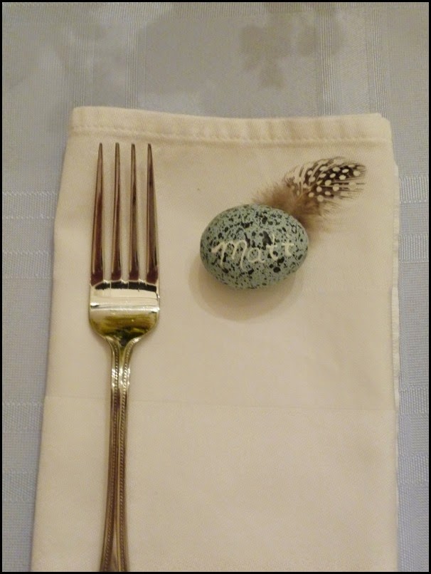
The elements this year are eggs, broken shells and feathers that represent, “New Birth!” 

After all that is what this Holiday is all about, Christ sacrifice of love that we might have rebirth in him.

I used my 39 in. long zinc tray that I purchased at Restoration Hardware. (this tray has proven to be so useful in our home.)

The darling black and white polka dot feathers are from Guinea hens, and I found them on Etsy. 

I have always been enamored with these sweet feathers, and they felt perfect for this centerpiece. 

P1150007 (800x600)
I had forgotten all about this vintage blue and white feather vase. I am glad I remembered it! The color and the theme  tied in nicely.


P1150006 (800x600)
I love the sweet smell of stock, they just smell like Spring to me. The clustered flowers added a nice texture to the overall design.


P1150007 (800x600)
It looks as if a lot of new little chicks escaped the confines of their shells, leaving a few feathers behind.


P1140994 (784x800)
I hung some white glittered silhouettes with black and white bakers twine above the centerpiece.


P1150002 (800x606)
I have had these for years and it was fun to find them in my Easter storage box, another element I had forgotten all about. This years table truly just evolved on its own.


P1140999 (600x800)
Each guest gets their own pale blue speckled egg with their name written with a chalk pen.


P1140993 (538x800)
The best part about this table will be having my family here! This table is always much more beautiful with my loved ones eating, laughing, and visiting.
Have fun finding your own inspiration for your Easter table.