home about me our home

Thursday, January 8, 2015

How To Wear Plaid Pants

   Women's Clothing - New Discount Sweaters, Dresses, Shoes, Women's Boots & Skirts - J.Crew Factory
Plaid has been on the fashion scene for several years now.

We can all wear a cute plaid shirt in cotton, or flannel with our jeans, and feel in style, and quite comfortable. 
 

However when it comes to plaid pants we are not all quite as brave, or adventurous.

Plaid pants were huge in the 80’s, and they were a staple in my wardrobe back then. I had a black watch plaid pair, and a cute red plaid pair of pants that were go-to wardrobe staples in the winter months.

plaid pants with blue coat, cutevia

I was one happy lady when I saw plaid pants emerge again. 

I purchased a black watch plaid pant at the beginning of the winter season, and I must say those pants have become my go-to pair of pants.

Since I have enjoyed wearing my plaid pants I thought I would share a few ways to wear them that are appealing to me.

plaid pants and mustard

When I saw this outfit I immediately ordered a mustard sweater. I knew it would make a good combination for me, since mustard is a color I can seem to wear with my coloring. 

One very important detail  I want you to all notice is the proportions of this outfit. 

The sweater is not pulled down around her hips, which is a good thing it would only shorten her legs.

She also has a V-neck sweater, which is also a good idea since  that will elongate her neck, and make her look thinner. If you don't have a V-neck sweater try wearing a long pendant to elongate your look.

She accessorized with one great statement necklace, and  simple cuff bracelet. This was a very smart choice. She kept the plaid, and the pop of color in the sweater the focus.

02-tartan-plaid-trousers-pants-denim-shirt-asos-red-bag-cross-body-sweater-knit-red-pumps-zara
I love the pop of the red shoe with this outfit. It feels a bit unexpected, and makes this outfit more fun, and interesting.

The layered tops are dark enough to make your top look slimmer. 

The shirt peeking out of the bottom of the black sweater is fun, but to be honest it is peeking out just a tad too much. If you decide to wear the peeking shirt tail make sure it is just barely peeking out.

Also remember with this look you are creating a horizontal line  across your body that is going to stop the eye unless it is close to the color of the pant. 

A simple black purse would have been a bit more classic, and I would have added pearl stud earrings, and a simple strand of pearls. I almost always wear one gold bangle so that would have been my choice of bracelets.

I know layering of bracelets is in style and I love the look, BUT and I do mean a big BUT,you do not want to over accessorize, and become a TREND-ZILLA. So keep that in mind when adding layer upon layer.

Helpful Hint:
When you know you are wearing one very current trend try to not overload on other trends, keep the other pieces more classic and simple. Let the trend speak for itself.

LE FASHION BLOG OUTFIT COLLAGE Theyskens Theory Fiola Tee Elizabeth and James Crescent Sunglasses Iosselliani Twisted Multiwires Necklace Tibi Plaid Skinny Beatles Pants Pour La Victoire Butler Large Haircalf Tote NARS Nail Polish in Dovima Jennifer Zeuner Jewelry Ariana Band Ring Christian Louboutin Particule 100 Leopard Print Pumps
I pretty much love every element of this outfit.

Unfortunately I can no longer wear a high heel so I would opt for a leopard flat, but every other piece is a smart and classic look.

For the winter I would also wear this ensemble with a black turtle neck and a simple long gold pendant necklace.

Plaid and Leopard for fall

In this outfit collage you can see the person shows 6 different  shoe options. 

I personally would not choose the nude shoes, only because I think the plaid needs a little more weight as in the leopard or the black shoes.

The chambray shirt is fun, but with the accessories I think the shirt needs to have a bit more tailoring, and I would never wear a huge statement necklace with a shirt that has two pockets. 

Too much going on in one small area. A more tailored chambray in a darker color would be a more classic choice for me personally.

HELPFUL HINT:
When choosing a necklace keep in mind what is going on around where the necklace will be placed. If there is a yoke, collar and pockets, keep the necklace simple, or do not wear one at all, try statement earrings instead.

Two pair of plaid pants that I like……..
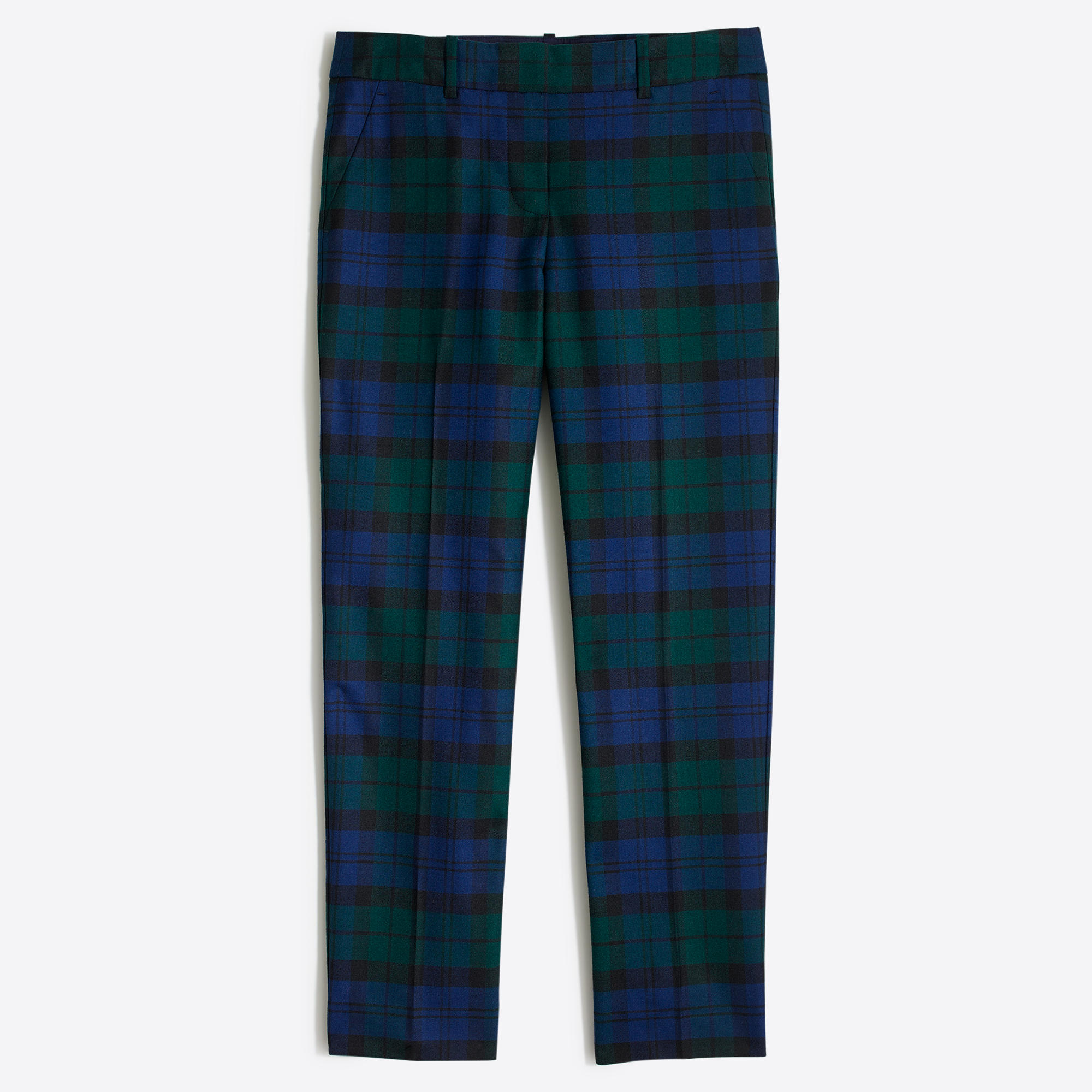
Classic black watched plaid, slim cut ankle pant.

Fun red, cobalt and black plaid on a winter white background. Slimmer cut ankle length pant.

The current way to wear plaid pants is a slimmer cut, and hemmed at the ankle. 

When wearing this look make sure you can see skin, that is key. 

I just ordered these pants at a great sale price of $29.99 marked down from $89.00. 

One thing about these pants, they will hem them to your desired length, and if they don’t fit you can still return them, now that is what I call great customer service, and the hemming is FREE!!

FUTURE TREND ALERT, OR SHOULD I CALL IT AN ALARM?!!
Not to be an alarmist, but have you seen what is out there  that is new in pants?

Cropped culottes (NOT happening here, who wants to look like Bob Square pants? Not me)

I love fashion almost as much as I do interior design, and I hope you enjoy my post on fashion from time to time.

I am not an expert by any stretch of the imagination, however I do like to dress well, and feel good in my clothes, so that keeps me on my toes with my ever changing body at this age, if you know what I mean.

Have fun with your wardrobe, study what is out there and find the looks and proportions that are right for your body type.

I have 18 pinboards on fashion that are at the top of my pinterest page if you would like to see what I like to wear.

Click HERE to go to my pinterest page.

More post on wearing plaid can be found:


Monday, January 5, 2015

I Thought I Would Never Find It, But I DID!!!!


A Girls Quest For The Perfect RED Lip Color! 

I have admitted in the past that I am probably a lipoholic!

Lipoholic: One who can not pass a makeup counter without purchasing a new lipstick, or gloss, and usually both. This person can not have dry lips, their lips must have color, or a sheen, and feel moist at all times.

Yes, I made that up, but it is exactly what describes me.

In my addiction I have been on a quest for the perfect red lip color for me. I have truly looked for years. 

Those that know me, or have shopped with me, know I am always on the hunt for a red that will look good with my coloring without being too harsh.

Well, I am happy to announce I have found the perfect red lip color for me, finally!!

Bare Minerals Marvelous Moxie Lip gloss…


GAME CHANGER
game changer red lip color
They describe this color as Red Carpet red! It is a gloss, but to be honest it is more like a semi-sheer lipstick.

It gives me plenty of coverage. It looks a bit orange in the image, but it is not orange base at all, or I would not wear it!! 

I fill in my lips with a lip liner first by Bobbi Brown (mauve), it is very close to my natural lip color, and then top it with this wonderful color for a red lip that is not too harsh.

red lip color game changer

Since I have spent years looking for a good  red that was not too harsh, trust me on this, you will love it.

Bare Minerals has another red that I might also try it is described as a watermelon red, and I do love that color so I think it is worth a try and at $18 it won’t break the bank.

high roller red lip color swatch

It is called High Roller


high roller red lip color

I was just so excited to find this I had to share it with you all. If I find something that I love, you can bet I will be sharing it with my wonderful readers!

I have a couple more new to me products that I am happy with, more on those later. Be sure to check out these two colors if you are looking for a red lip color, you can thank me later Winking smile


Friday, January 2, 2015

My COLOR Pick(s) for 2015


In years past I have tried my hand at choosing a color that I think we will start seeing more, and more of in the upcoming year. 

I try to do this before the new year starts. I usually start zeroing in on a certain color the previous year. As I see it emerge more and more.

Trust me I am not an expert on this matter, just someone that is observant about color in my life.

Past years I have chosen…….

2011  COBALT BLUE

COLOR FOR 2011
This is a color I think we are still seeing, or at least it’s cousin Indigo!!


2012  KELLY GREEN

2012 color of the year


2013  YELLOW
COLOR FOR 2013

In 2014 I did not choose a new color because I was still insisting that this color was  going to start showing up in homes and on the runways. I can be stubborn like that!

For 2015 I am still saying yellow will be showing up more, and more, BUT I also have another color that has been on my radar for the last few months.

If you check out my pinboard you will see I have been pinning this color for quite awhile now… 

CLICK HERE TO SEE MY PINK BOARD

My Color Choice For 2015 is….

PALE BLUSH PINK
2015 color of the year pale blush

Pink/blush is not a color for everyone, and for me personally it is a color I would use sparingly, but it is a lovely, romantic and soothing color.

using pink sparingly is just the right touch

A touch here and there is all you need.

Yarn for my next scarf! Yummy Super Soft Merino yarn from PurlSoho.com in Ballet Pink, also known as Pantone 9241. take2theyresmall.com


blush pink decor #drapery
A touch of romance.


Blush can come with different undertones ranging from blue undertones to yellow undertones.

blush // via the kinch life
For my own personal taste I  tend to like a blush with a bit of a yellow undertone as in a soft cameo pink.


#lantern, #lighting, #dining-room, #pendant-light  Photography: Tracey Ayton - traceyaytonphotography.com  Read More: http://www.stylemepretty.com/living/2014/03/24/the-doctors-closet-home-tour/
A touch here, a touch there, just enough to make you whisper PINK, but not to shout PINK!!


Dusty pink
The softest of pinks.

#pink and blue moodboards  trend-daily.blogspot.com
We all know how big indigo has been this past year and just look how lovely a soft pink looks with this classic color.

Summer Trends 2013: 60s Prep. Navy and pink preppy pillows in mixed patterns. The secret to mixing is to choose a color scheme, then a variety of prints: one large scale (the quatrefoil), a geometric (the pink bamboo), and a floral (notice the floral is not too dense of a pattern nor is it too loose with lots of negative space). Its all about finding balance and proportion.

Brass/antique gold has been emerging the last few years and there is nothing prettier than pink, and gold together.

coral, pink and gold girl's room. pattern mix. upholstered headboard with nailhead detail.

Another metal  that has been emerging the last few years as well, is copper. 

When you look at the undertone of a polished copper piece you will see pink undertones. It is a wonderful combination to mix copper with blush pinks.

blush pink
Such a pretty combination, pink and copper.


barstools
You will notice there is no other pink in the room, other than the flowers, and bar stools that are pink, and yet it seems to be the perfect addition in this kitchen mixed with white, marble and brass accents.

Pretty Glam Pastels Office space. John-Richard Collection Horchow’s Lexington Office Furniture & Pagoda Etagere
I have shown you by using subtle touches of blush it can be soothing, and romantic if used with a restrained hand. Now I am going to show you my TWO COLOR CHOICES for this year together.

2015 color of the year pale blushCOLOR FOR 2013

I believe we will see more and more of these two colors emerging in design and in wardrobes.

Kleur Inspiratie: Fluor kleuren in je interieur. | http://anoukdekker.nl/fluor-kleuren-in-je-interieur/

The yellow used here is a bit more citron, but you can see that these two color families marry well when used in a room together.
Wedding colour palette: pastel peach, lemon, gold and neutrals

We all know how big the color gray is in home interiors and the above combination shows how to mix both yellow and pinks together with the neutrals of gray and beige.


You have to do it right to carry off pink in the living room - and I think this is right!
Just a touch of yellow is used with the pink in this room and notice the brass shelves which represent the yellow family.

Do you think you could use pink and/or yellow in your home?

We always need to personalize our color choices for our homes and wardrobes. Sometimes we need to tweak the colors a bit.

I have been thinking about it for quite awhile now, and with my cobalt blue and white I think it could work by using a brighter version of pink as you will see in the pillow below…….

THROW PILLOWS 24x24 Navy Blue Denim Throw Pillow Covers 24 x 24 Euro Shams Pink Yellow Ikat Decorative Throw pillows missoni
via

Can You Believe It's Horchow?
There is a lot of indigo blue in this room and notice the pop of pink flowers on the table.  Even the books on the shelves have a pinkish hue.

This is how pink can be added to a room without taking over the room.

Layout
The touch of pink in this room brings life to a very subtle room.

Love the blues!

When you like a color, or want to add a new color to your already established mix, find images that are pleasing to your eye, and study how the designer applied the color you are contemplating using.

You will notice in the last few pictures I have shown you how I would apply pink in my home that has a color scheme of blue and white with touches of black and white and accents of green…..


I will easily be able to add a touch of pink, and/or yellow to my room in the form of pillows, or flowers.

There are always ways to add  a color spot of a new color if you do it with a restrained hand. A book on a table, a small votive candle holder, a throw on the arm or back of a chair or sofa.


~~~~~~~~~~~~~~~~~~~~~~~~~~~~~~~~~~~~~~~~~~
 
HELPFUL TIP:

Keep in mind when certain colors become the new kid on the block, you can personalize it to your liking. I am not a blush girl, but I do love pink in a medium value, and that is the shade that will work in my personal home and in my wardrobe.
~~~~~~~~~~~~~~~~~~~~~~~~~~~~~~~~~~~~~~~~~~

Bottom line is to always choose the colors that make YOU smile, and live with them in your home, and in your wardrobe, no matter what is being featured in the design world, or on the runways.

I love color, and I have fun from year to year predicting what I think we will be seeing more of.

Sometimes I am spot on and sometimes I am way off, and then there are times I am ahead of the game.

I hope you enjoyed my little prediction for 2015 and remember

LIVE WITH THE COLORS THAT MAKE YOU SMILE!!!

color scheme, minus the 2 darker shades on the right.

Click Here for my Pink pinboard
Click Here for my Yellow pinboard
