home about me our home

Monday, March 18, 2013

My New Family Room Sofa Reveal


I thought I should show you my sofa before its makeover before you see it's new look!!

Family room summer look May 2011 026 (800x600)_thumb[6]


mantel for Linda 003 (800x600)

This picture was taken right before the upholsterer came to pick her up.


Background story:

This sofa was purchased about 7 years ago. I thought I needed something really different from my old sofa which we had for 10 years, it was uphostered in a blue ticking stripe with a contrast yellow cord welting. 

I truly loved that sofa, but you know when you have the chance to get something new, you want something totally different.

I chose a floral! Big mistake for my personal design aesthetics. Beautiful fabric, pretty colors that worked well in my home, but I am not a floral girl when it comes to large pieces. I can do a floral pillow, but not big pieces.

Lesson learned:
Stay true to who you are, when in doubt go and look in your closet, Kathysue, all your clothes are solids, checks or stripes. Patterns are in scarves only.

Now for the good part:

I researched and found the fabric my old sofa was upholstered in……

essex sky blue


The family room has a new rug, and a new looking sofa. I still have a lot to do to pull it all together, but we are getting there.


So here she is in all her blue striped glory………


new sofa in room 001 (800x576)

I am beyond thrilled. My upholsterer did an amazing job and I couldn’t be any happier. I just noticed the arm covers are on, oops!! 

The cord welting is on the diagonal and I debated on doing a contrast in white. I am so glad I kept it simple.


It is so fresh, crisp, and clean looking in person…….


new sofa in room 004 (800x600)
Here is a close-up of the cushion so you can see the welting.

What’s next?……

  1. Stage the new look of the mantel (Yes we gave the mirror a new look! reveal coming soon)
  2. Pillows are being ordered.
  3. Two different light sconce choices are on their way, to see which one will work in the room.
  4. Two matching mirrors are on their way.
  5. Lamp shades on floor lamps must be replaced from linen to white drum shades.
  6. Continue looking for artwork
I am pleased as punch (however pleased that might be) with the new/old look.

It was so exciting when it got here on Friday. It was new looking, but at the same time it was like a really good old friend coming for a visit, but guess what?

 This old friend gets to stay here!!!

Friday, March 15, 2013

It Is Time To Get Serious!!


It is official, it is time to get serious about Easter plans.

Have you decided what you are going to do for a centerpiece for your Easter table yet?

If not, I think this post might just be what  you need to get inspired.

When I start thinking of a tablescape for a Holiday or special occasion, I always begin with color combinations.

I am going to give you several different color combinations to help inspire your own creativity. 

These might not be the colors you always think of using for Easter. Maybe not the traditional pastels we all think of at this time of year, but still beautiful.


Cobalt blue and deep purple are gorgeous together and I think a bit unexpected for Easter, but I can see this on a crisp white table cloth, can’t you?


This is another combination using purples and blues, but this time with eggs and flowers. Love the spattering of paint on the eggs.

Speaking of cobalt, let’s add a touch of turquoise to our cobalt and see what we get out of the mix……..


On this table the entire center piece is done in different shades of cobalt. 

They chose to add a touch of turquoise in the stemware. I love using all of one color of flower in an arrangement. It always makes such a beautiful statement.

I am going to remember this idea:
By adding a colored glass to an all one color centerpiece you will get a  dramatic look!

So simple and so pretty, again using a darker blue with a mix of green and turquoise. Who knew colored foil eggs could look so pretty.

T
urquoise with an addition of lavender is such a pretty combination for Easter. Love the simplicity of the bunny silhouette used as a place card.


How about varying your colors in an almost ombre affect using yellowy gold to  bright greens. Napkins are another way to add color to your tables.

Now let’s see what kind of centerpiece would work with this colorful array of napkins……..


Simple and easy is the name of the game here, and look how pretty this looks with the stack of napkins in the above image.


This one would work well with the stacked napkins in the above image.

When I think of Easter I almost always will think of the color yellow. 


How about mixing it up a little bit and add a touch of black to the mix for something unexpected.

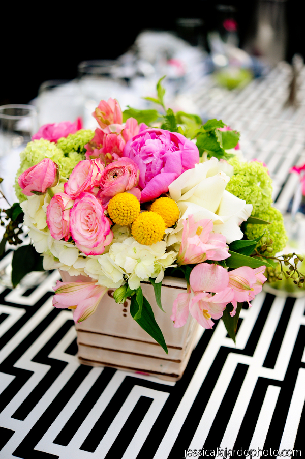
Speaking of black how about an all black and white Easter table? Can that be done!! Yes indeed it can if you use some of these ideas……..

After all today we are looking at color combinations that are a wee bit different than what we would normally use.


How sweet is this idea, it looks like the mother hen left a few of her soft feathers to cushion the egg in the cup. Love this look.


By getting creative with a black marker you can really have some fun inventing new looks for the traditional Easter egg.


This is one of my all time favorite uses of black and white on Easter eggs.

We have talked about different combinations of colors, but how about just using eggs in their own natural color made by nature?

Don’t you just love when you go to the grocery store and they have a carton full of beautiful brown eggs?

How about using the natural color that nature has provided with a touch of soft turquoise…….


By using a chalk pin you can decorate natural brown eggs with Easter sayings and images.


So simple, So pretty!

Today I wanted to show you some different colors combinations used for Easter. There are so many more, just let your imagination take over and see what you can come up with.

If you need a little more inspiration be sure and visit my Easter Pinterest board, HERE! I have 470 images to look at on this years Easter board.

I also have a board for last years inspiration, HERE! It is all about soft blues and white.

What color combination will you be using on your Easter table this year?


Wednesday, March 13, 2013

Do You Live With Colors That Make You Smile?


Color is back in a big and beautiful way!!
 
Everywhere I look I am seeing bright, beautiful colors.

I am sure you have all noticed in Spring fashions we are being shown beautiful and fun color combinations.


You don’t have to find color inspiration at the clothing stores, or even in home design centers, just look around you. Color inspiration is everywhere.

If an image is attractive to you, study it and figure out what it is that you love about it. It does not have to be a literal translation.


Look at an image and write down the key words that refer to the colors, texture, feel of the image and then see how you can translate those words into your room.

Today I am going to show you some images that inspire me and how they can translate into home décor.

Inspiration……


Mother nature is always the best colorist, just look at this gorgeous clematis in blues and greens.

Translation:

Obviously this room with it’s bold stripes is not for everyone, but you can see how natures color scheme can translate to a room.


Inspiration:

Spring time pastels work well with a black and white backdrop.

Here is a room that shows just how well it can work…..


Inspiration:


Blues, greens, yellow and neutrals all tied up at a boat dock. Look around you will be surprised at how colorful our world is and how many winning combinations it has to offer.

Let’s look at these colors translated into a room………


This is not a literal translation but all the color cues are here, the rough textures of the basket luggage are found in the rug and the blinds.

Inspiration:

Beautiful blues and greens with the rough natural texture of a basket. Notice the blue in the denim jeans as well.


Translation:


Blues, greens, neutrals they are all here, even the rough texture has been translated in the finish of the cabinet.
Inspiration:


Translation:


Even though this blue and yellow combination is not as bright as the above it still gave us our color inspiration in a more traditional manner.

Inspiration:


A stack of beautiful cashmere sweaters ranging from turquoise to greens. You might see something similar when out shopping for clothing. Look around at how they display colors in the stores.
Translation:

Again this is not a literal translation but the color cues are here.

It is so important to surround yourself with elements that are pleasing to your eye. So many live in a colorless world or one filled with colors they don’t really love.

Today start looking at your world a little differently. Look around you for color combinations that are attractive to you. 

Think of ways you can add them to your own home in a manner that is pleasing to your own personal design aesthetics.

QUESTION TO ASK YOURSELF:

Are you living with the colors that make you smile!?