There will be a brief intermission in blog post, I am NOT having fun experiencing the flu bug. This guy looks better than me right now! This stuff is brutal!!
Sunday, February 21, 2016
Tuesday, February 16, 2016
6 Easy Switch-UP's For Spring Decor!
It is time to switch it up for Spring!
Spring
is by far my favorite time of year. I love all the colors, the fresh
grass greens, pretty pink and yellow blooms, clear skies and white puffy
clouds.
When Spring is getting close I like to add some elements to my room that will make my room feel a bit more fresh and happy.

I
usually do this with pillows as I have shown in previous post, but
there are other ways to decorate for Spring without becoming a totally
thematic room, full of birds nest, eggs and bunnies. (all of which I
dearly love)
First and foremost we have to be careful and use some……
RESTRAINT!
We
are not decorating a store so we need to keep a handle on just how much
decorating we do so we don’t look like things just might have a price
tag attached to our displays.
First Step!
Choosing Spring Accent Colors
Before
we begin remove everything except the pieces that will always stay in
your room, furniture pieces, wall décor and lighting.
Next look at the colors in your room and think about the colors that you love that could be added to your room to freshen it up.
Take a look at a color wheel if you need help in finding complimentary colors for your room.
Find
the main color in your room and go directly across to find it’s
compliment. The group of colors directly across are the strongest
compliments but you can choose color families from each side of the
compliment color as well.
Such
as Blue’s compliment is orange, yellow-orange or red-orange. Using any
of these color families will make the blue more vibrant in your room.
If you want a softer compliment choose the color families on each side of blue, such as blue-green and blue-violet.
Another way to pull colors out in your room is to look at any existing patterns in your room and pull the colors from there.
These are just a couple of very basic guidelines.
Next is time to make a list of Spring elements that are pleasing to you that you might want to add to your room.
Keep
in mind to not choose things that are overtly Spring that could make
your room look like a store display, as I previously mentioned.
Try to add elements with texture, color and life.
SIX SWITCH-UPS!!
#1
FLOWERS
Flowers are a natural choice when it comes to Spring décor, but so are touches of natural greenery, or blooming twigs.

I like to use flowers and greenery in my home all year long, but especially during the Spring months.
This is the perfect time of year to display your favorite blooms.

White tulips are a favorite of mine and using this rough hewn bowl full of tulips will make anyone get in the mood for Spring!
#2
COLORFUL GLASSWARE
Using clear colorful glassware is a nice touch to add a bit of sparkle to a room. You can use a single piece or a group…..

Adding some blooms to your composition looks very fresh and perfect for Spring…..

Simple greenery from your yard is a favorite element I like to use in the Spring.

#3
BOOKS
Brightly colored books used as lifts for a decorative item, or just stacked on a table can add a touch of Spring…..

If
you will notice the books colors are pulled together with the floral
arrangements colors. The black of the vase is accentuated with the black
and white spines of the books.
Bright pink as in the flowers and even a pop of orange as in the center stamens of the flowers. Details, details!

Another great example of how the flower and vase colors are pulled into the stack of books.

Another option is to cover your existing books with colorful papers or material.

#4
ARTWORK
If your artwork is not expensive, and it can easily be replaced for a minimum cost, changing it out can totally change a room.
I
have found Etsy to be a great resource for some lovely prints that can
be easily framed in standard size frames from hobby stores.
Let me show you a few that have caught my eye…….

This particular piece has all the elements I love in a room for my own home so naturally I gravitated towards this piece.
Kerri Ship has some brightly colored watercolors that will be sure to please your design aesthetics. You can find her work here. Colorful and affordable.
Art.com
has some very affordable options in all different styles of artwork. I
chose this one from my artwork pinboard which has many pins of artwork
that is appealing to me, personally.

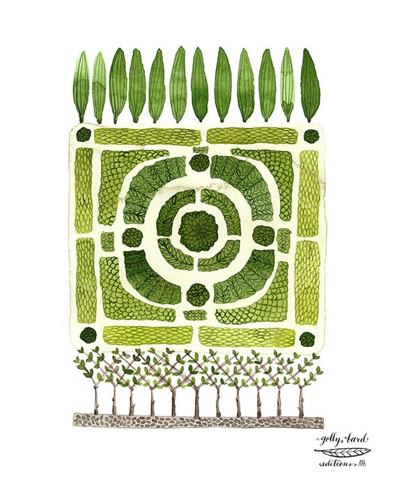
Green
is the color of Spring. Nothing prettier than the color of fresh, new
grass. I love the depiction of this knot garden to add freshness and a
touch of Spring to a room. This is neutral and could work in just about
any setting. Found HERE!
#5
THROWS AND RUGS
If
you are like me, you like a throw to wrap up in even in the warmer
months. When I quit for the day, and lay down on my couch to watch some
mindless TV, I like an adult blankie/throw!

This
is where you can add pattern and/or color easily to your room. Your
imagination is your only limitation when it comes to choosing.
There are so many sources for both rugs and throws on the internet.
Ikea and Target are probably the least expensive with some great variety to choose from when it comes to Home accessorizing.
If you are looking for more of an investment piece then your options are pretty limitless.
Just
keep in mind your over all feel, color scheme, and patterns in the
room. Keep patterns, and texture of the throw, light and airy for a
Springtime feel.

However sometimes a pop of a solid color throw is a great way to introduce interest, and maybe a new color in a room.
#6 LAMPSHADES/LAMPS
If
you room can accommodate some pattern and or color take a look at the
options for lampshades. Target is a great source for affordable
lampshades and they offer both color and patterns.
A happy yellow Ikat can mix well with many patterns.
I like to switch out my darker lampshades with white shades for summer.
You can add a little trim around the top, and bottom if you feel the need for a bit of embellishment, but keep it simple.
Or you can add trim just to the bottom like this homeowner did……

RECAP:
1. Clear room of all accessories.
2. Choose your color scheme based on existing permanent elements. (one primary color with two accents is a good guideline)
3. Start
with one main print or star, if you are choosing any patterns, then
work off of that pattern for colors and other prints that will
coordinate.
4. Add Spring colors to your room by using lighter and brighter values of complimentary colors in your room.
5. Add texture with spring time branches in bloom.
6. Add life to your room with fresh blooms or simple greenery in vases.
7.Use everyday colorful book spines to use as lifts on tables, mantels etc.
8. Purchase some fresh, colorful artwork and frame in simple black or white frames purchased from the Hobby store.
9. A new fresh, cheerful color/patterned throw is comforting and will add a touch of Spring easily to your room.
10. Area rugs are easy to change up. Use one for Fall/Winter months and one for your Spring/Summer months.
Remember,
none of the above have to be costly, just well chosen. Make your plan
of attack before making any purchases so you know it will all work well
together.
Once
your plan is made then the fun can begin. It takes time and patience,
but in the end you will be so happy with your end results.
“Enjoy the Process!” Of:
Switching it up for Spring!
Sunday, February 14, 2016
A Touch Of Black & Sparkle To The Dining Room
I have a story about a chandelier. It is a simple chandelier, really nothing fancy at all, but it has just a touch of elegance with a little shimmer, and that is what makes it perfect.
In our last home I had two beautiful vintage crystal chandeliers, one in my living room and a smaller one in my kitchen.
My dinette is right across from my kitchen so I needed something for the dinette.
One day while at Lowes I saw this chandelier on the bottoms shelf on clearance ($29.99), there was only one left.
It was black, so that was a plus, and it had just a little bit of crystal glimmer. The black was perfect for my house, and the crystal droplets were a nice tie in to go with the vintage crystal chandelier in the kitchen.
We put it together, and actually rearranged some of the glass parts, and even eliminated a few until it felt right for our home.
As the story continues we sold our home, and I had to have my chandelier come with us.
We purchased an inexpensive chandelier that actually cost more than the clearance fixture, but still an inexpensive replacement.
(replacement chandelier for selling our home)
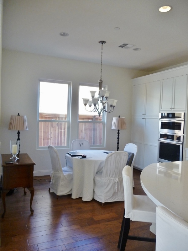
I knew from the beginning that I would replace the brushed nickel fixture in our new home.
This part of the house needed something black. This past week I had my sweet hubby hang the chandelier from our previous home and as I thought it looked perfect, or at least in my eyes.
I will be adding my white slip covers to the chairs and the fresh roses will go into a clear vase to mimic the sparkle in the glass components of the chandelier.
Having a blue and white ginger jar on the low boy, and the blue and white vase is just one step too much for me, so I think the clear vase will be more pleasing to my eye. New white lampshades on the black floor lamps and I think we will be on our way!
As always.......
Monday, February 8, 2016
Giving Balance In A Room Without Symmetry
I am a girl that loves symmetry and there is one space in my home that is off balance in my mind. I knew the day we found out that our fireplace would be off set that I would have a challenge in my future.
We purchased this home from looking at blue prints, there was no model to be seen, however we did get to go into another home that had this floor plan, but that was after we had already chosen the home, lot and signed on the dotted line.
The blue prints were not very clear so they actually had to confirm that YES in fact the fireplace was off center.
Since we have moved in it has not been a problem, in fact just the opposite. I enjoy watching TV and having a fire in the fireplace at the same time.
I wrote in another blog post about how the TV actually balanced the wall for me, which was another surprise.
Well, that was our older, smaller TV. So what once felt like a problem that we would need to address immediately got put on the back burner.
UNTIL.....
In comes a newer, bigger version!!
My husband has waited for years to get the BIG screen TV and we are now the proud owners of a 55" TV. When he installed the larger TV, my mind started spinning all over again. You see with the larger TV, the wall became unbalanced again.
WHY?.......
This TV is not only larger but it is not as black, the other TV had a shiny black frame, and it grounded the room. This one has a thin line of black and the screen is actually a charcoal.
Throughout the day I always have music on and with that there is a beautiful slide show of scenery playing so it is hardly ever off to show the dark charcoal looking screen.
The other TV looked prettier to me, this just looks, ordinary and plain.
STAYING POSITIVE!!
"There are no mistakes in design, just another opportunity to become creative!"
I heard this once and I have never forgotten it, so with that being said I needed to get more creative.
PLANS.....
We have plans on making this fireplace wall a feature, but felt we could wait so it fell lower on the To-Do list.
However we are adjusting that list with the addition of the new BIG TV!!
One thing that was blaring to me was now the mirror that I once loved above the fireplace looked like a postage stamp.
I knew I needed to give the area above the actual fireplace more presence. The console table that I love now is too small in scale to balance the larger TV.
Luckily I have saved copious amounts of inspiration pictures. What I originally thought I wanted needed to be simplified. I realized that after living here and having shutters installed, simple is better for that room.
Keep In Mind The Completed Look Desired.....
Even though we are not going to do the entire wall right now, we still need to have somewhat of an idea of what we are going to do in the TV niche.
All possible moldings will need to at least be chosen to make sure they will marry well together in a cohesive design.
It is not a good idea to choose one piece of molding and apply it to the wall without considering the other moldings that will be going in the room in the future.
Because our home is open concept I need to think about the rest of the home as well so that means I also have to think and plan clear to the entry hall.
Oh my! That does seem a bit daunting, but trust me it is important to take the time to do it in the beginning and it will save heartache, or any major mistakes down the road.
So with that in mind and keeping in mind the overall feel I want our home to have, I think I have come up with a good plan.
I want our great room to have a traditional Nantucket/Hamptons vibe so that means more of a traditional type molding treatment.
Before we moved in I thought I would go much more casual, however once we started living here the house basically told me what it needed and that was a little more of an elegant but comfortable look.
Throughout this post you have seen pictures of fireplaces with molding treatments that were in my pinterest file. Here is what we plan for above the fireplace to balance the new BIG TV!!
As soon as the TV went up even my husband could tell it was in need of some balance so what was once a project that was on the back burner was moved forward a bit.
In my last post I talked about placing sconces above the mantel. The sconces arrived on Saturday and they are perfect. Simple, classic design with a soft, not harsh bronze finish, more blackish than flat black. I am beyond pleased.
Thomas O'Brien's Bryant sconce can be found HERE!
I made a simple mock up of the design I would like to apply above the fireplace and as soon as it went up I knew this was the right direction...
The mirror is not the actual mirror I will use, I still have to play with that a bit, however a round mirror seems to be the right shape for this area.
In this mock-up I have added the TV console that is larger in size which will also help balance the TV. As you can see it all seems to flow nicely.
There will be molding added to the niche as well, but for right now we just want to balance the TV with the treatment above the mantel.
By giving the fireplace more presence and weight it will balance the larger size of the TV.
I feel very fortunate that my hubby is a very handy guy and can do beautiful molding, his want-to is declining so we need to move quickly, if you know what I mean?
I will keep you posted on our progress, wish me luck!!


