Over a year ago I started a Next House pinboard, just for fun. I figured we would move someday, we just did not know when.
I thought it would be fun to explore what I might do in A NEXT HOUSE! Little did I know I would be accessing it this soon.

I
am so glad I made that board because it really did help me zero in on
some of the quick design choices I had to make for our new home.
Pinterest,
or saved clippings of what you truly love is a valuable resource when
it comes time to zeroing in on a style, or color choice for your home.

If
you line your images up you will see a pattern start to form, there
will be repeats of colors and styles. This will be your clue to what
direction you will be able to live with long term.
I
already shared our countertop choice. The reason I started with the
counter top is it was the main star of that part of the room, and I knew
that every other design choice would hinge on the style, and color of
our counter top.
Something to keep in mind when making design decisions….
…..I
think it is a good idea to choose the least available element first. I
knew I would be limited on my choices for the counter top due to the
color, and feel I wanted, and also I was limited by the builders
offerings.
Lyskamm, quartz by Arizona Tile.
So many people want to start with a paint color because it is a fast quick fix, but that is not the best approach in design.
There
are limitless colors of paint, or you can have a custom mix made, but
something like a rug, or in my case, a counter top will be more limited
in choices.
As
I wrote in my post about the counter top choice, I needed something
light and bright with a bit of movement due to the size of my kitchen
island which is over 9ft long and almost 4 ft. in depth.
At one point I considered a white on white, without movement until I saw the huge helipad of an island.
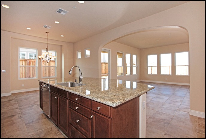
This
is a model of my kitchen, but my personal kitchen is going to look
different. The layout is the same but the materials and paint color I
chose are quite different.
You can see how it looks into the great room, This is what I loved the most about the model we chose.
Let
me show you some of the images from my Pinterest board, “Next House
board,” so you can get a pulse of the direction I tend to like.

My
heart almost stopped when I saw this kitchen. I know the island being a
different color than the perimeter cabinet is a trend, and one that
will not be here forever, however I really love this idea, and thought I
would do just this very kitchen color combination going into the design
meeting.
I
went back, and forth in my mind on whether I wanted to take a risk
doing something that would look dated in the near future, or just go for
it.
Well
my decision was made for me by my friend Mr. Budget. In order to have
the island painted a different color was just going to be too costly,
and our budget would not allow for that.
We had priorities of MUST HAVES, and those had to be met before a WANT. So in comes the all white kitchen!!!
To
be honest when I looked at my kitchen boards they were mostly all white
kitchens. I had even debated on painting my green cabinets to white in
our last home when we did the reno, but after thinking long and hard, I
knew for that particular home the green cabinets were perfect.
Now
I had the opportunity to do something different for me and it still
felt classic enough to have staying power even though I know white
kitchens have been done to death it is still a favorite look of mine.

I
toyed with the idea of black counters, and was drawn to images of such
kitchens. I played with the idea for an entire day, looking and pinning
kitchens with white cupboards and black counter tops.
At
the end of the day, I realized I tired of the all black counter tops
for my own personal home. I still love them and think they make a
gorgeous kitchen.
I am going to show you the image of my kitchen design once again so I can explain the changes that we made in the design.
First visualize white walls and white cabinetry with the Quartz counter tops! Are you ready!
Let’s
start with the back of the island. This was one of the main elements I
wanted changed. We will have panels that will go with the door fronts
we chose, so it will be painted panels of wood.
(this is the actual door front we chose)
The
upper cabinets will not be in an up and down configuration and the
space above the cabinets will be less. Our ceiling height is 10 ft. The uppers will be 42in. instead
of standard 32, they will also have a larger crown above them 7 in.
instead of the smaller 3 1/2 in.
( here it is in wood. I think you can see the detailing better in this image. It is simple and classic)
The two cupboards flanking the stove hood will have glass doors. I am really excited about these changes.
We
chose the standard simple mushroom nickel knobs and will change those
out in the future according to the design direction I go.
I hope you can visualize for now! WE only have to wait 5 more months to see it all come to fruition.


