I love color and I love patterns mixed in a room. In fact I have been known to use as many as five different patterns in a room.
Right now bold graphic patterns are very in vogue. When you mix bold graphic patterns with the bright pops of colors that are also in vogue, I believe one must be careful in how many and what kinds of patterns we mix together.
There is no definite science to mixing patterns just some good guidelines.
A nice mix will consist of a common color story and also a mix of scale to keep it interesting as seen below………
You can see the color story was taken from the floral. The patterns are varied. The scale is large in the floral, medium in the stripe and a bit smaller for the Ikat and the grid patterns. A nice mix of patterns, color and scale. This is just a good guideline that will almost always work nicely in a room.
Below are the bold graphic patterns that are being seen in many room designs right now............
TRELLIS
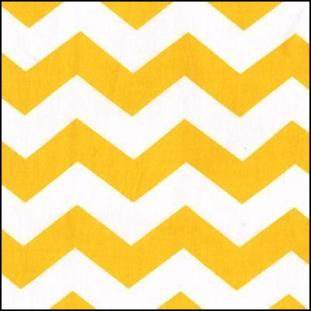
CHEVRON/ZIG-ZAG
IKATS
As you can see they are very bold in nature and they will demand attention in a room.
My question to you is, are we over-using these patterns in our rooms? I know there are no absolute rights or wrongs in design, it can be very subjective to the taste of the observer.
I have been observing what I would call an over-use of too many graphic patterns in one room. I think we as consumers can sometimes go over board on a good thing, especially in design trends.
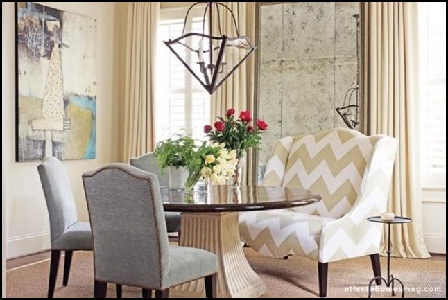
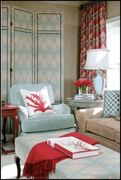
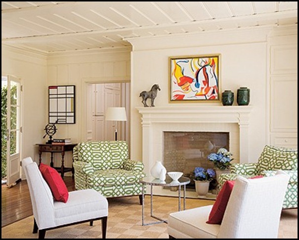
I am going to show you several rooms. I will let you be the judge whether you think the room is done well or possibly it has an over-use of graphic patterns. I have several examples of both.
I have my own opinion but will not be giving it on each room that I show. I was just made very aware of the over-use of these patterns while perusing blog land the last two weeks and that is what has prompted this post.
I will let you be the judge……….
There you have it!! Did you notice the rooms that had variations in scale and colors in the patterns they chose. Could you pick out the color stories origin in the rooms?
I hope this little exercise will help you be discerning in the amount of graphic patterns you choose to mix in one room. I know that once I started seeing it’s over-use in blog land it really made me much more aware of how patterns were being mixed, and which rooms were pleasing to my eye.
“Enjoy the Process” Of:
Editing the patterns you use in a room according to:
- Color
- Scale
- Style
Kathysue


