I am sure some of you
are wondering why I write blog post like my last post that tells you the
process I go through in decorating my own home.
The
victories, the disappointments, the mistakes are all part of any design
process. Whether you are a professional, or a homeowner that just loves
to decorate.
Sometimes it can be a slam dunk, but more times than not it is a lot of planning and experimenting.
I want you, my reader to become brave enough to try new things and wise enough to admit when it does not work in your home.
Both are part of the design process, and will help you get to the point of a well designed room that you love.
So with all that being said shall we continue where I left off in my last post?

My
original plan of adding turquoise in the form of pillows to my family
room for a summer look was not working as I thought it would.
I had pinned images that made me think it would work and in my minds-eye it could work.
For some reason it was just too strong of a statement, so that sent me back to the drawing board.
It helps to write down why certain elements don’t work, and then you will see what possibly will work in your room.(this is where you will be like Goldilocks, too small, too dark, not the right color etc.)
After
reevaluating what the room needs to make it cooler for the summer I
realized that maybe, just maybe, I need to keep it’s base all blue and
white and only add touches of turquoise in the form of books, vases and
accessories.
It will still give me the coolness of blues, but will be more of a visual flow for my particular room.

Notice how this room is all blue and white and the only turquoise is in the vase?
The room still reads nice and cool and reminds me of summer. Now this is more of what I think I need.
The
hunt began for blue and white fabric that had a larger scaled pattern,
different shades of blue. The Ikats were not the direction for me so
that meant something with a bit of a flow to it.
In comes my next three fabrics…
#1 is Pindler & Pindler’s Nebula in sapphire
#2 is Pindler & Pindler’s Batik in azure
#3 is Robert Allens Jacobean in indigo
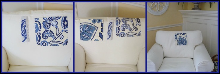
I tried each one in the family room……

First image is #2-Jacobean and#3 Batik. fabrics. The middle image is all three choices, and the third image is #1-Nebula fabric.
It is always a good idea to line them up and compare all the aspects of each fabric, pro’s and con’s.
After lining them up the smallest swatch was eliminated because of the smaller scale and lack of different shades of blues.

It was a very close race for #1-Nebula
AND
#2- Batik
This
is the point that it is important to put the fabrics with all of the
existing fabrics in the room, and to view it in the different lighting
throughout the day.
After doing this there was a clear winner…….
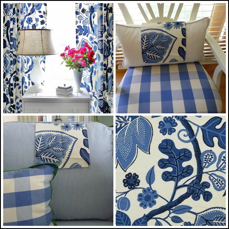
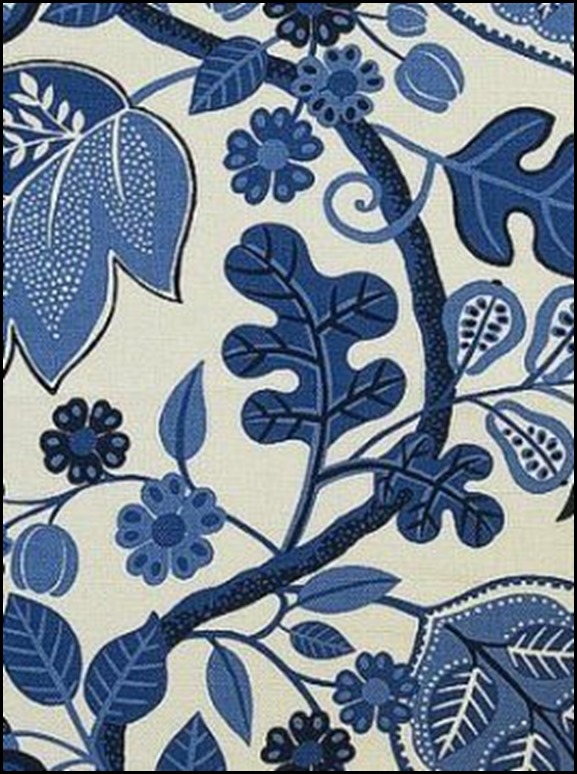
Pindler & Pindler’s Nebula in sapphire.
Here are the reasons why this fabric was the clear winner….
The Nebula fabric worked with every fabric in my room. The colors stayed consistent in all lighting.
Even
at night it maintained it’s crisp blue and white look. It has just a
touch of black outlining which is perfect with my black touches
throughout the room.

There
was a lot of research that went into finding these fabrics. I love
blogland, and the generosity of fellow bloggers. I can not end this post
without thanking two lovely ladies……..
I would like to thank Jennifer of The Pink Pagoda blog for giving me the name of the Batik fabric. Jennifer used this in her home in pillows and in draperies.
I would also like to thank Karianne from Thistlewood Farms blog. Once I googled this fabric and found it on her blog, she was so gracious to give me the name and manufacture of the fabric.
The fabric has been ordered and when I receive it I will have my pillows made!
As always,
To Be Continued………


Thinking alike! That was my first choice when I saw the samples. I follow both the lovely ladies who you mention. Great blogs and beautiful homes, and they are in good company with you, Kathysue. This makes me want to redo our sunporch in these colors. I brought in a rust with blue, when I had new cushions made last time. Now I think I want to redo the cushions in just blue and white. A little late for this summer, but I can get going on the plans for next summer. Thanks for sharing your process. It's refreshing!
ReplyDeleteOh my goodness... love this post. Your fabric choice would have been mine as well.. have you said where you got the blue and white buffalo check fabric? That is "exactly" what I've been looking for for the kitchen draperies... fondly ~lynne~
ReplyDeleteThanks so much for the sweet mention, Kathysue! The fabric you chose is PERFECT in your room and absolutely gorgeous. I can't wait to see it as pillows!
ReplyDeleteHi Kathysue, I was wondering if your wall color was fighting the other colors? All the example pics you show have a very white background and aqua might not stand well with your walls. Also, if your wood pieces had a deeper stain, you'd get that high definition you're looking for. Just my 2 cents.jd
ReplyDeleteHi JD,
ReplyDeleteVery good point. In most peoples view the wall color would be better in white, but if you were in my home you would see how and why it does work. I actually thought about changing it out from the beginning of the re-design of the room, but after thinking long and hard about it, it is a color that makes me happy and to be honest, family and close friends cringed with the thought of me changing it. Thank you so much for chiming in, I so appreciate reading my readers comments,
Kathysue
I love that fabric. Can't wait to see your pillows. I know they will look wonderful.
ReplyDeletegreat choice Kathysue - just love all of the blue and white. you are so talented but its good to know that I'm not the only one making mistakes out there! I'm going to start blogging more on what not to do!!!
ReplyDeleteOooh - it's going to be so pretty, Kathysue. You gave some great advice and I just know your room is going to be so lovely when it's all put together. Can't wait to see more!
ReplyDeleteGREAT
ReplyDeleteLOOKING FORWARD TO THE FINISHED GORGEOUS PILLOWS!!
I too was thinking of the wall color as all the pictures you posted with the turquoise showed grayish colors or white. I think the blues you chose work well with the wall color. It's usually about paint in my house, at least first. Love your pattern choice. Can't wait to see the final post. You've made huge changes in that room this summer! Congratulations!
ReplyDeleteLove all those fabrics and any would look wonderful in your room.
ReplyDeletei love your "thinking out loud" design posts kathysue, so helpful
ReplyDeletegreat choice! thank you for taking us through the process
xx
debra
I love a happy ending. Beautiful choice, Kathysue!
ReplyDeleteKathysue I love your choice, it will be perfect. I love the curtain panels in Nebula as well!
ReplyDeletexoxo
Karena
2013 Artists Series
Kathy Sue,
ReplyDeleteWhat a wonderful post! I love that fabric and I'm sure it's going to be amazing! Thank you so much for the shout out and have a wonderful day!
karianne
It's looking good! Love your fabric choice!
ReplyDeletelove your choice--fabulous, and you will never miss the turquoise!
ReplyDeletehugs.
michele
Enjoy the Process!!! I am :)
ReplyDelete